
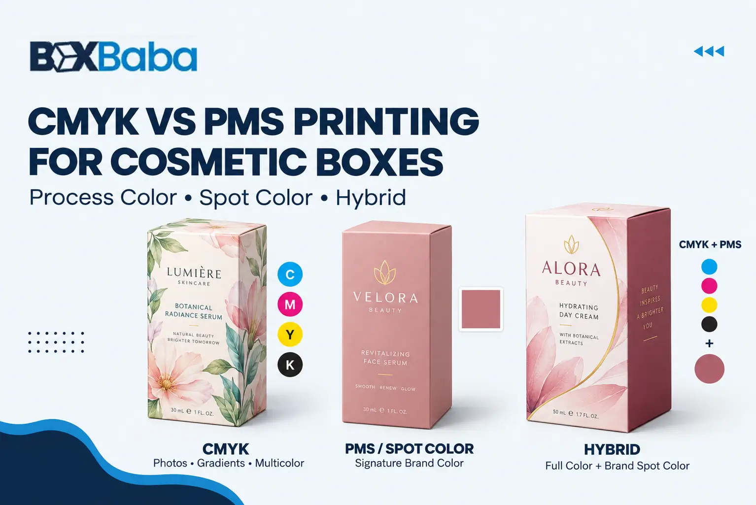
Choosing between CMYK and PMS for cosmetic packaging is not simply a choice between a standard and a premium printing option.
The better color system depends on the artwork, the importance of specific brand colors, the printing process, the packaging material, the final surface treatment and how color will be approved before production.
CMYK is usually the practical starting point for photographs, gradients, illustrations and multicolor artwork. PMS/Pantone is worth evaluating when a specific solid brand color needs a clearly defined physical reference.
Many cosmetic boxes use both.
Artwork Requirement → Color Importance → CMYK / PMS / Hybrid → Printing Process → Substrate → Finish → Proof → Production
Brands developing the complete printed package can review Custom Cosmetic Boxes. For the wider design workflow—layout, hierarchy, dielines and artwork planning—see Cosmetic Packaging Design Tips.
CMYK vs PMS for Cosmetic Boxes: Quick Answer
Use CMYK process color when the artwork contains photographs, gradients, illustrations or many colors.
Evaluate a PMS/Pantone spot color when an important solid brand color needs stronger reference control and the selected printing process supports a dedicated spot ink.
Use CMYK + PMS together when the same cosmetic package contains full-color graphics and one or more brand-critical solid colors.
Decision Factor | CMYK | PMS / Pantone Spot Color |
Color creation | Four process inks | Dedicated spot ink where supported |
Photography | Strong fit | Usually not the main approach |
Gradients | Strong fit | Not usually the main role of one spot ink |
Multicolor artwork | Strong fit | Multiple spot colors can increase complexity |
Signature solid brand color | Can reproduce or approximate | Often worth evaluating |
Color outside normal CMYK gamut | May be limited | Some spot colors can extend beyond CMYK |
Substrate affects appearance | Yes | Yes |
Finish affects appearance | Yes | Yes |
Physical proof useful | Yes when color matters | Especially useful for critical brand colors |
Can be combined with the other system | Yes | Yes |
Artwork Element → Color Requirement → Color System
CMYK, PMS, Digital and Offset Are Different Decisions
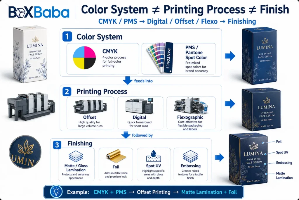
A common packaging mistake is putting CMYK, PMS/Pantone, digital, offset, flexographic, foil and Spot UV in the same category. They describe different parts of the production system.
Decision Layer | Examples |
Color system | CMYK, PMS/Pantone spot color |
Printing process | Offset, digital, flexographic |
Finish / surface treatment | Lamination, foil, Spot UV, embossing |
CMYK / PMS → Color System
Digital / Offset / Flexographic → Printing Process
Foil / Lamination / Spot UV → Finishing
A cosmetic box might use CMYK through offset printing, CMYK through digital printing, or CMYK plus one Pantone spot color through a compatible production process. These decisions are connected, but they are not interchangeable.
What Is CMYK Process Color?
CMYK stands for Cyan + Magenta + Yellow + Black. These four process inks are combined in screened percentages to reproduce a wide range of printed colors.
CMYK is especially useful when cosmetic artwork contains many visual tones, such as:
- Skin-tone photography
- Product photographs
- Botanical illustrations
- Ingredient graphics
- Gradients
- Multicolor backgrounds
- Patterned artwork
- Large SKU families with changing graphics
CMYK → Builds Printed Colors From → Four Process Inks
This makes CMYK particularly suitable for visually complex cosmetic packaging.
When Is CMYK the Better Starting Point?
CMYK should generally be evaluated first when the artwork depends on many colors or continuous tonal transitions.
Photography
A foundation carton with a model image, a serum carton with ingredient photography or a skincare package with lifestyle imagery normally requires process-color reproduction.
Gradients
A soft pink-to-purple gradient or a multicolor fade is more naturally handled through process printing than by treating each visible tone as a separate spot color.
Illustrations
Flowers, fruit, leaves, skin diagrams and other complex illustrations often contain many tones that can be reproduced from CMYK.
Multi-SKU Artwork
Beauty ranges frequently change colors or imagery between products. CMYK can support this type of artwork architecture efficiently.
Complex Multicolor Artwork → CMYK Often Provides the Better Starting System
What Is PMS / Pantone?
PMS stands for Pantone Matching System. Pantone provides standardized color references that help brands, designers and printers communicate a target color.
A Pantone reference is not itself a printing process. Where the production workflow supports spot colors, a selected Pantone target may be printed using a separately prepared spot-color ink.
Pantone / PMS → Defines → Target Color Reference
Spot Ink → Produces → Dedicated Printed Color
Pantone Reference vs Dedicated Spot Ink
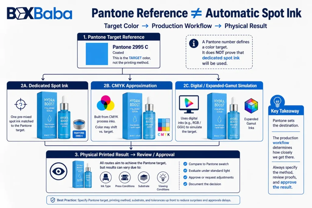
Suppose a beauty brand specifies Pantone 2995 C. That tells the packaging supplier which color the brand is targeting. It does not automatically prove that the job will be printed using a dedicated Pantone spot ink.
Depending on the production setup, that target might be printed as a dedicated spot color, reproduced through CMYK, simulated through an expanded-gamut digital workflow, or produced through another compatible color workflow.
Pantone Reference ≠ Automatic Dedicated Spot Ink
A brand should confirm both the target color reference and how that color will be produced before approving production.
When Is PMS Worth Evaluating?
PMS becomes especially relevant when one or more solid colors carry strong brand identity. This might include a signature logo color, a master brand background, a distinctive color used across every SKU, a solid field whose CMYK reproduction is not satisfactory, or a color that needs an agreed physical reference for repeated production.
Signature Brand Color → PMS Worth Evaluating
Cosmetic Boxes Can Use CMYK and PMS Together
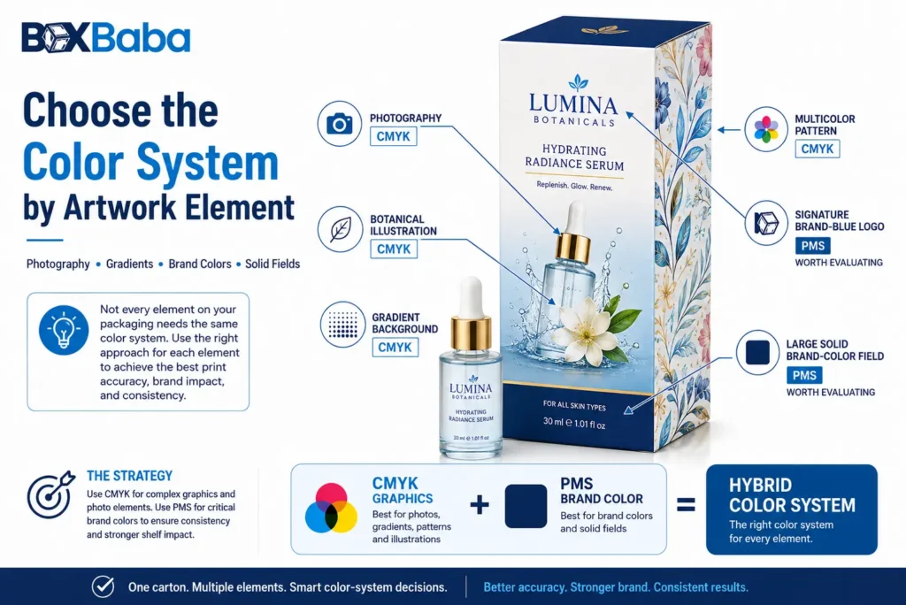
A cosmetic box can use both systems when different artwork elements have different color requirements. Imagine a serum carton with full-color botanical photography, ingredient illustrations, a gradient and a signature blue logo.
CMYK → Photography + Illustration + Gradient
PMS → Signature Brand Blue
CMYK + PMS → Hybrid Color Strategy
Choose the color system by artwork element—not necessarily one system for the entire box.
Choose the Color System by Artwork Element
Artwork Requirement | Starting Direction | Reason |
Product photography | CMYK | Many tonal/color combinations |
Skin-tone photography | CMYK | Continuous color transitions |
Botanical illustration | CMYK | Usually contains multiple colors |
Gradient background | CMYK | Process printing supports smooth transitions |
Multicolor pattern | CMYK | More practical than many individual spot inks |
One signature logo color | PMS worth evaluating | Stronger reference control may be useful |
Large solid brand-color field | PMS worth evaluating | Solid-color control becomes more visible |
Photography + signature logo | CMYK + PMS | Different artwork elements have different needs |
Metallic appearance | Review ink/finish route | Metallic ink and foil are different |
Fluorescent / neon requirement | Specialist review | Normal CMYK gamut may not reproduce the target |
These are starting directions, not universal rules. The final decision should be confirmed against the actual artwork, substrate and print process.
Why Large Solid Brand-Color Areas Need More Attention
A small logo and a full-panel background create different visual risks. If a brand color covers only a small area, minor process variation may be less noticeable. If the same color covers the entire front or back panel, changes in density, screening, surface appearance or substrate can become more visible.
Color-Critical Area Size → Influences → Color-Control Requirement
A large uninterrupted brand-color field is worth reviewing carefully when deciding whether CMYK reproduction is sufficient or whether a dedicated spot-color workflow should be evaluated.
CMYK Does Not Automatically Mean Inaccurate Color
A common oversimplification is that CMYK is inaccurate and PMS is accurate. That is not technically useful.
A well-managed CMYK production process can provide professional and repeatable cosmetic packaging. The real question is whether the intended target color reproduces appropriately within the selected CMYK workflow.
CMYK ≠ Poor Color Control
PMS ≠ Automatic Requirement for Professional Packaging
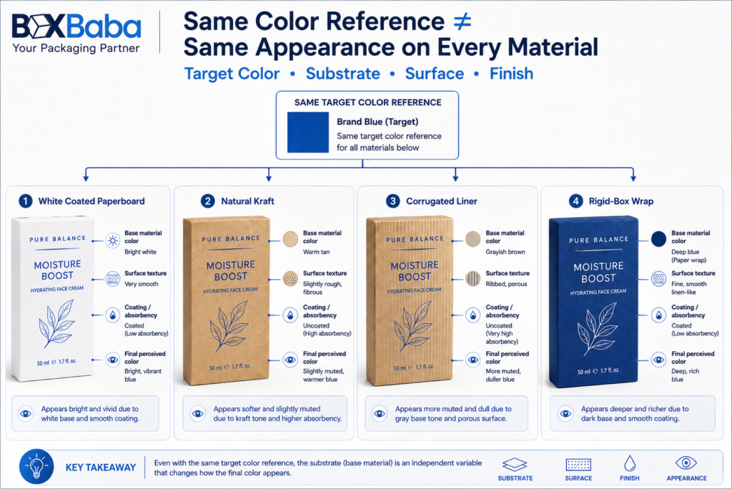
PMS Does Not Guarantee the Same Color on Every Material
A Pantone reference improves color communication, but it does not remove the physical effect of the material. Printed appearance can change because of substrate, ink, surface treatment, printing process, production conditions and lighting.
Consider the same brand lavender used on coated white paperboard, natural kraft, corrugated liner, rigid-box wrap and a bottle label. The target color may be the same. The physical surfaces are not.
Same PMS Reference ≠ Guaranteed Identical Appearance Across Every Substrate
Brand Color Reference → Production Substrate → Intended Finish → Physical Review → Approval
What Do Pantone C and U Mean?
Pantone references often include suffixes such as C for coated and U for uncoated. These references help communicate how a color is represented in the relevant Pantone guide condition.
The suffix should be included when supplying a brand-color reference. Pantone 186 C and Pantone 186 U should not casually be treated as interchangeable approval references.
However, a C suffix does not mean every coated packaging stock will make the color look absolutely identical. Likewise, U does not guarantee identical appearance across all uncoated materials.
Pantone Reference + Actual Substrate → Color Review
How White Paperboard Affects Printed Color
Bright white coated paperboard can provide a relatively neutral starting surface for many cosmetic graphics. This can be useful for pastels, light colors, skin tones, fine typography, high-contrast graphics and detailed illustrations.
However, paperboard is not one universal surface. Whiteness, coating, texture and absorbency can vary between grades.
Paperboard Grade → Influences → Printed Appearance
For broader substrate decisions, review Best Materials for Custom Cosmetic Boxes.
How Kraft Affects CMYK and PMS
Natural kraft introduces its own brown base color. That changes the visual starting point. A pale pink, white, yellow or pastel blue may appear differently on natural kraft than on white paperboard.
Same Ink Specification + Different Base Material → Potentially Different Appearance
This is true even when a Pantone reference is supplied. PMS does not erase the visual influence of the substrate.
When Non-White Materials Need Additional Print Planning
Some cosmetic packaging uses kraft, colored paper or another non-white substrate. If the artwork depends on bright whites, light pastels or strong opacity, additional production planning may be necessary.
Depending on the material and printing process, this could involve an underprint, white ink or another suitable production approach. Availability varies by process and substrate.
Non-White Substrate → May Require → Additional Color / Opacity Planning
How Corrugated Packaging Affects Color
Corrugated beauty mailers, PR kits and ecommerce boxes use a different printing surface from a compact folding carton. The result may depend on liner color, liner smoothness, flute profile, direct printing, litho-laminated printed sheets, artwork detail and selected print process.
Corrugated Board ≠ Automatically Poor Print Quality
Corrugated Surface + Printing Route + Artwork → Final Graphic Result
How Rigid-Box Wraps Affect Color
Rigid cosmetic boxes commonly use a printed or specialty paper wrap around the structural board. The color is therefore being produced on the wrap material, not on the thick structural board itself.
Rigid Board Core ≠ Printed Surface
Wrap Material → Influences → Printed Appearance
For the structural differences between these packaging formats, use Folding Cartons vs Rigid Boxes for Cosmetics.
Finishes Can Change Perceived Color
The final surface treatment can influence how printed color is perceived. Gloss reflects light differently from matte. Soft-touch treatment creates another surface response. Spot treatments create contrast between finished and unfinished areas.
Printed Ink + Final Surface Treatment → Perceived Color
For a deeper explanation of lamination, foil, Spot UV, embossing and related treatments, review the Cosmetic Packaging Finishes Guide.
RGB vs CMYK vs PMS
Packaging artwork is usually created and reviewed on screens. Screens normally display color through RGB light. Printed packaging uses physical inks.
RGB Screen Color ≠ Printed CMYK / PMS Color
Screen Design → Print Color Specification → Substrate → Finish → Proof → Production
This is especially important for highly saturated blues, greens, purples, oranges and fluorescent or neon-looking colors. If such a color is central to the brand identity, evaluate it before production rather than relying on monitor appearance.
How CMYK and PMS Work With Digital, Offset and Flexographic Printing
Printing Process | CMYK | PMS / Spot Color |
Offset | Common | Common where specified |
Digital | Common | Pantone targets may be simulated depending on equipment |
Flexographic | Possible | Spot colors commonly used in suitable applications |
Specialized processes | Project-specific | Project-specific |
Pantone Reference ≠ Proof That a Dedicated Spot Ink Will Be Printed
Many digital workflows reproduce a Pantone target using available process or expanded-gamut inks rather than a separately mixed spot ink. Capabilities vary.
Color Target + Printing Process → Production Color Workflow
Does Order Quantity Determine CMYK vs PMS?
No. Quantity can influence the practical printing route, but it should not decide the color system by itself.
Artwork + Brand-Color Requirement + Printing Process + Substrate + Quantity → Color-System Decision
A large production run containing photography may still use CMYK. A relatively simple solid-color project may use spot color in a suitable workflow.
Does PMS Always Cost More Than CMYK?
No universal rule applies. Cost can depend on printing process, number of colors, plates or setup, spot-ink preparation, wash-up/changeover, substrate, quantity, proofing and finishing.
PMS ≠ Automatically More Expensive
CMYK ≠ Automatically the Lowest-Cost Option
Complete Print Specification → Cost
Metallic PMS Ink and Foil Stamping Are Different
Beauty packaging frequently uses metallic gold or silver effects. A metallic spot ink and foil stamping are not the same.
Metallic Spot Ink
A metallic ink is printed onto the substrate using a compatible printing process.
Foil Stamping
Foil applies a separate metallic or pigmented foil layer/effect to selected artwork areas.
Metallic Spot Ink ≠ Foil Stamping
They can differ in reflectivity, surface appearance, artwork preparation, production method and cost drivers.
Color Planning Across Cosmetic SKUs
Cosmetic brands often use color for two different purposes: brand identity and product differentiation.
Brand Identity
- Logo color
- Signature background
- Master brand blue
- Core pink
- Brand accent color
Product Differentiation
- Lipstick shades
- Foundation families
- Serum ingredients
- Fragrance editions
- Mascara types
- Seasonal collections
PMS → Core Brand Color
CMYK → SKU-Specific Graphics / Variant Colors
Brand Consistency + SKU Differentiation → Hybrid Color Architecture
Should Every Cosmetic SKU Use a Separate Pantone Color?
Not automatically. Suppose a lipstick range contains 24 shades. Using a different dedicated spot ink for every shade could add unnecessary production complexity.
Depending on the artwork and printing route, the brand may instead use PMS for master brand elements and CMYK for shade identification.
The correct strategy depends on number of SKUs, number of brand-critical colors, artwork complexity, printing process, run quantity and substrate.
Why Proofing Matters for Cosmetic Packaging Color
Color-critical packaging should not be approved only from an on-screen PDF. Different proofing routes approve different things.
Proof / Reference | Useful For | Should Not Automatically Be Used For |
PDF / screen proof | Layout, text, position, artwork | Physical color approval |
Digital printed proof | General physical appearance | Assuming exact final press ink behavior |
Pantone reference | Communicating a target color | Assuming identical result on every substrate |
Material/color sample | Reviewing color + substrate interaction | Proving complete package performance |
Production-representative sample | Stronger production reference | Guaranteeing every future production condition |
Proof Type → Determines → What Can Be Approved
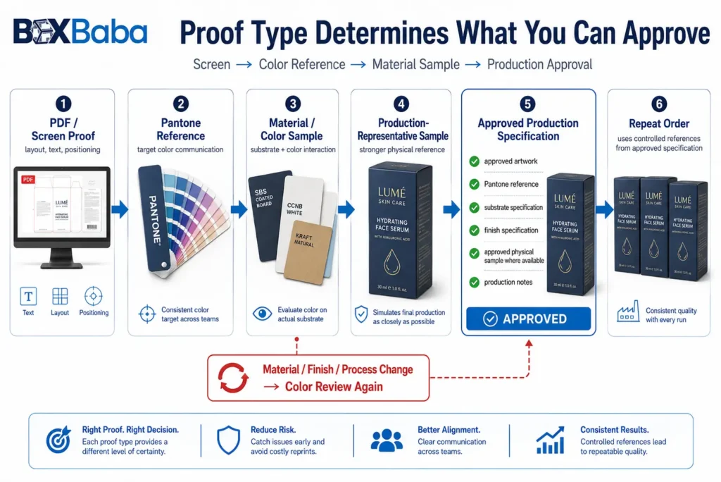
PDF Approval Is Not Physical Color Approval
A PDF can confirm artwork placement, spelling, panel orientation, logo position, barcode location and general graphics. It cannot show exactly how ink will interact with white paperboard, kraft, corrugated liner, rigid wrap, lamination or other physical surfaces.
Digital Artwork Approval ≠ Physical Color Approval
Avoid Universal Color-Tolerance Claims
Color difference can be measured numerically, but one universal production tolerance should not be copied from another packaging supplier and applied automatically to every cosmetic project.
Acceptable variation can depend on target color, substrate, print process, ink system, proof/reference, customer requirement and measurement conditions.
Critical Brand Color → Requires → Agreed Reference + Project-Specific Approval Criteria
Repeat Orders Need Controlled References
A repeat order should not rely only on memory, screenshots or an old monitor preview. Useful references may include an approved Pantone reference, final approved artwork, approved substrate specification, approved finish, previous approved physical sample where available and production notes.
Repeat Order ≠ Automatically Identical Production Condition
Material / Finish / Process Change → Color Review
What Changes Should Trigger Color Review?
Review color again if a repeat order changes paperboard grade, kraft vs white stock, corrugated liner, rigid-box wrap, lamination, coating, print process, spot-ink specification, artwork or major color conversion.
Specification Change → Potential Color Change
Artwork Preparation for CMYK and PMS Cosmetic Boxes
Before submitting production artwork, clearly identify which graphic elements are intended as CMYK process color, PMS/spot color, foil, Spot UV, embossing/debossing, cutouts or structural areas.
For Pantone colors, provide the full reference consistently. Do not use a CMYK build in one artwork file and label it loosely as Pantone blue elsewhere.
Approved Box Structure → Dieline → Color Specification → Proof → Production
For overall cosmetic artwork planning, Cosmetic Packaging Design Tips provides the broader design context.
Common CMYK and PMS Cosmetic Packaging Mistakes
Mistake | Better Approach |
Treating CMYK and offset as equivalent | Separate color system from printing process |
Calling PMS a printing process | Treat PMS as a color-reference system |
Assuming a Pantone reference means a spot ink will be used | Confirm the actual production workflow |
Assuming CMYK is inaccurate | Evaluate the actual target color |
Assuming PMS guarantees identical color everywhere | Review the intended substrate |
Ignoring Pantone C/U suffix | Supply the complete reference |
Using monitor color as final approval | Use an appropriate physical reference when needed |
Designing only in RGB | Prepare artwork for the intended print workflow |
Ignoring substrate whiteness | Review the materials underlying color |
Ignoring kraft’s brown base | Evaluate printed artwork on kraft |
Ignoring final lamination | Review perceived color with the intended finish |
Assuming PMS always costs more | Compare the full production specification |
Choosing color system from quantity alone | Start with artwork and color requirements |
Using many spot colors for photographic artwork | Use process color where appropriate |
Treating metallic PMS ink as foil | Evaluate them as separate processes |
Using one Pantone reference as proof of identical cross-material color | Review each substrate |
Approving a brand color from PDF only | Confirm appropriate physical proofing |
Changing material on a reorder without review | Recheck critical colors |
Finalizing artwork before structure | Approve the dieline first |
Request Custom Printed Cosmetic Box Pricing
The decision between CMYK, PMS and a hybrid color strategy should begin with the artwork and required level of brand-color control, not with a generic belief that Pantone is always better or CMYK is always less expensive.
Artwork → Color Importance → CMYK / PMS / Hybrid → Printing Process → Substrate → Finish → Proof → Approved Production Specification
Brands planning printed skincare, makeup, fragrance and beauty packaging can review Custom Cosmetic Boxes.
If the project includes foil, Spot UV, lamination, embossing or other decorative treatments, review the Cosmetic Packaging Finishes Guide before final artwork approval.
BoxBaba minimum order quantity for custom cosmetic boxes starts from 100 boxes.
When requesting pricing, provide the product or box dimensions, box structure, material, artwork, Pantone references where applicable, quantity per SKU, finishes and delivery destination.
If a brand color is critical, provide the target reference and intended production substrate rather than relying only on an on-screen color.
Proofing or sample routes are confirmed during quotation. Standard production takes 5–9 business days after final artwork and project specifications are approved. BoxBaba provides free shipping across the USA. Production and transit time are separate.
FAQs About CMYK vs PMS Printing for Cosmetic Boxes
What is the difference between CMYK and PMS?
CMYK creates printed colors by combining cyan, magenta, yellow and black process inks. PMS provides standardized Pantone color references, and suitable printing workflows may reproduce selected Pantone colors using dedicated spot-color inks.
Is CMYK or PMS better for cosmetic packaging?
Neither is universally better. CMYK is generally suited to photographs, gradients and multicolor graphics, while PMS is worth evaluating for important solid brand colors. Many cosmetic boxes use both.
Can CMYK and Pantone be used together?
Yes. Where the printing process supports the combination, CMYK can reproduce full-color graphics while a PMS spot color is used for a signature logo or solid brand color.
Does Pantone guarantee an exact color?
No. Pantone provides a standardized target reference, but substrate, ink, coating, printing conditions, finish and lighting can still influence the final appearance.
Can CMYK reproduce a Pantone color?
Many Pantone targets can be approximated through CMYK, but the result depends on the target color, print workflow and substrate. Some targets may be more difficult to reproduce within the CMYK gamut.
What do C and U mean in Pantone colors?
C generally refers to a coated Pantone reference, while U refers to an uncoated reference. The full reference should be supplied, but the suffix does not guarantee an identical result across every coated or uncoated packaging material.
Can the same Pantone color look different on kraft and white paperboard?
Yes. Natural kraft and white paperboard have different underlying colors and surface properties, which can influence the final appearance.
Does digital printing use actual Pantone spot ink?
Not necessarily. Many digital systems reproduce a Pantone target through their available process or expanded-gamut inks rather than using a physically premixed spot ink. Capability depends on the equipment and workflow.
Does PMS always cost more than CMYK?
No. Cost depends on the complete print specification, including the printing process, number of colors, setup, substrate, quantity, proofing and finishes.
Can CMYK be used for a brand color?
Yes, when the target color can be reproduced acceptably through the selected process. PMS is worth evaluating when a dedicated solid-color reference is important.
What is the difference between metallic Pantone ink and foil?
Metallic spot ink is printed ink. Foil applies a separate metallic foil effect. The appearance, reflectivity and production method are different.
Can I approve cosmetic packaging color from a PDF?
A PDF is useful for layout and artwork approval but should not automatically be treated as a physical production-color standard.
Does matte lamination change how color looks?
It can change perceived appearance because the surface reflects light differently from gloss or an unlaminated print.
What happens if the substrate changes on a repeat order?
Changing the substrate can change the visual result. Critical brand colors should be reviewed again when material, finish or print process changes.
Should every cosmetic SKU use a different Pantone color?
Not necessarily. Some brands use PMS for core brand elements and CMYK for SKU or shade differentiation, depending on the artwork and production requirements.