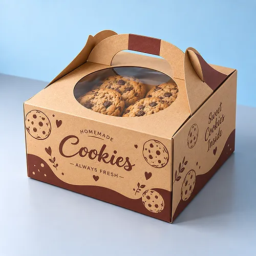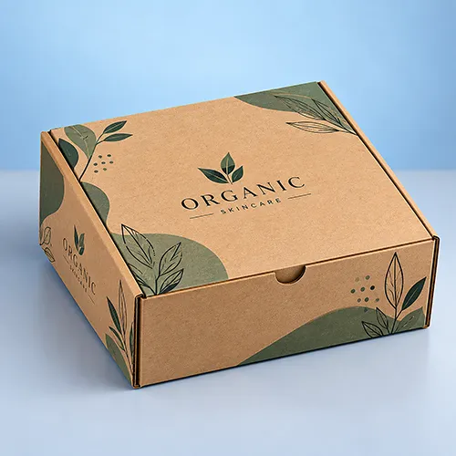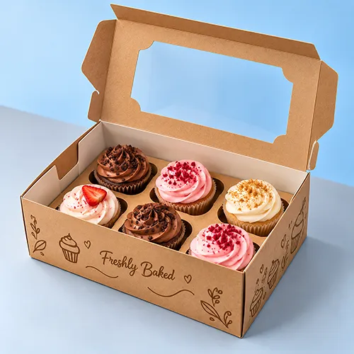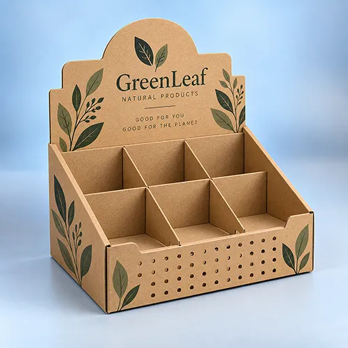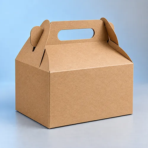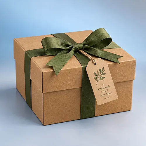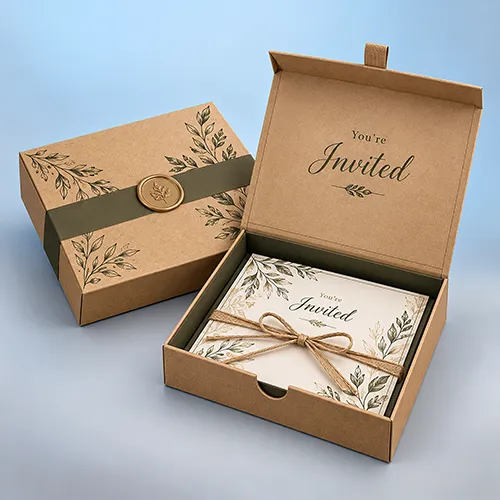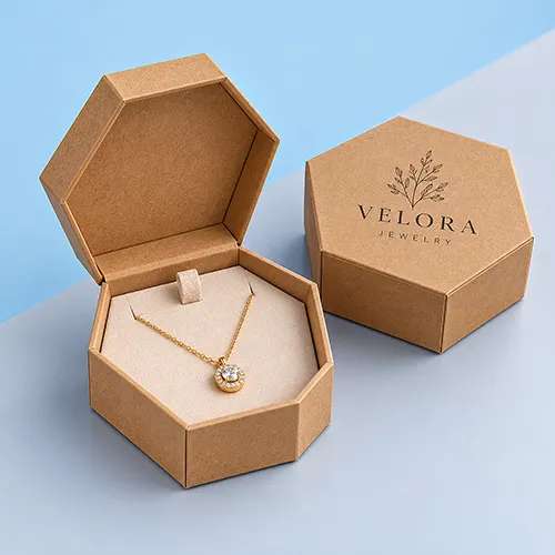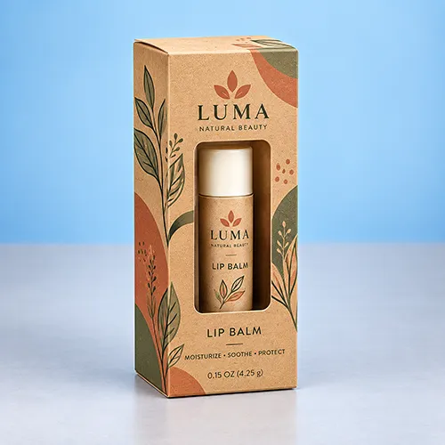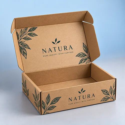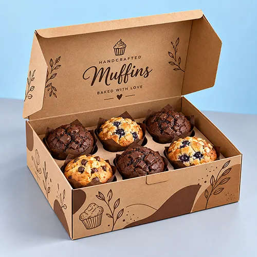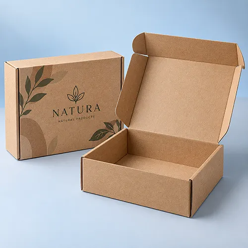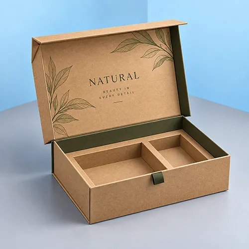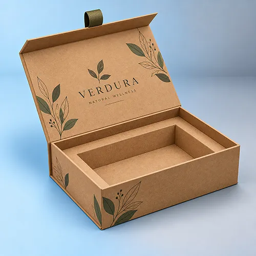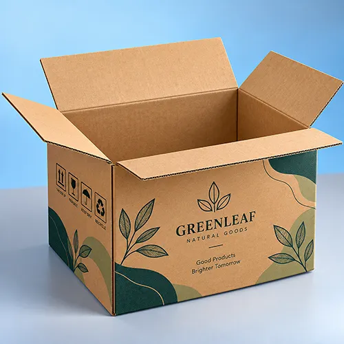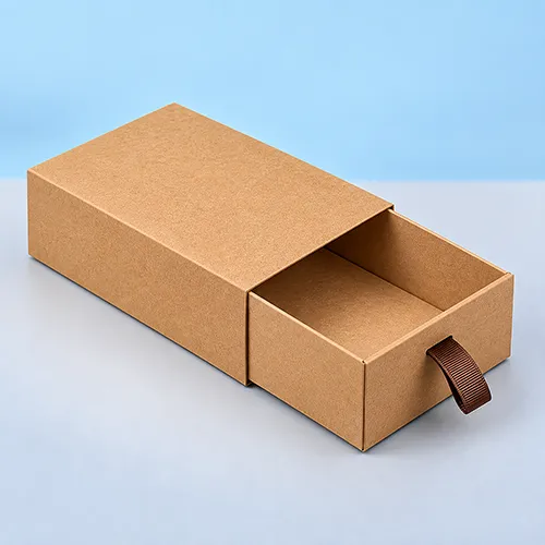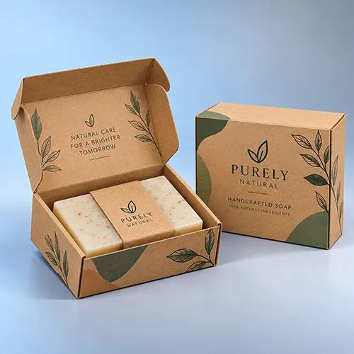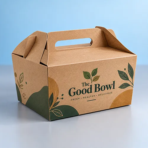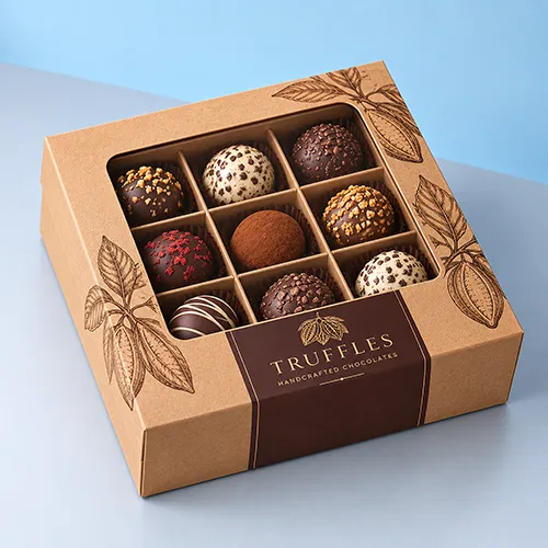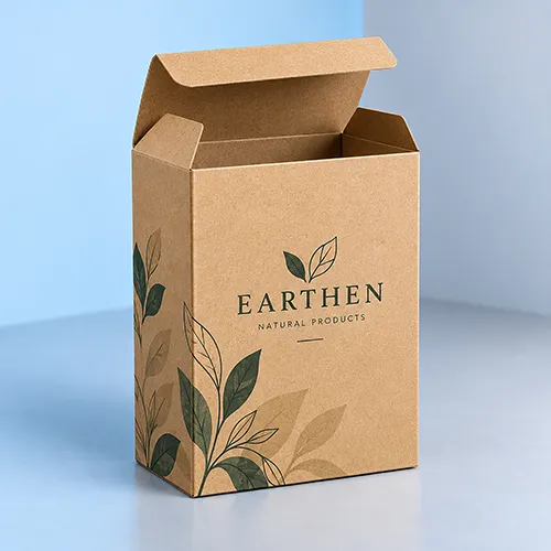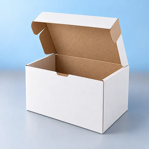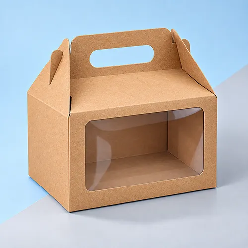

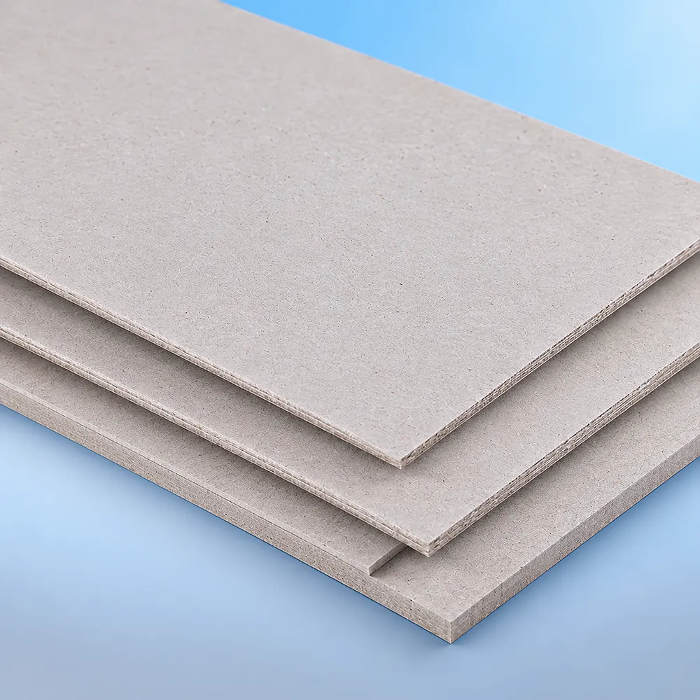
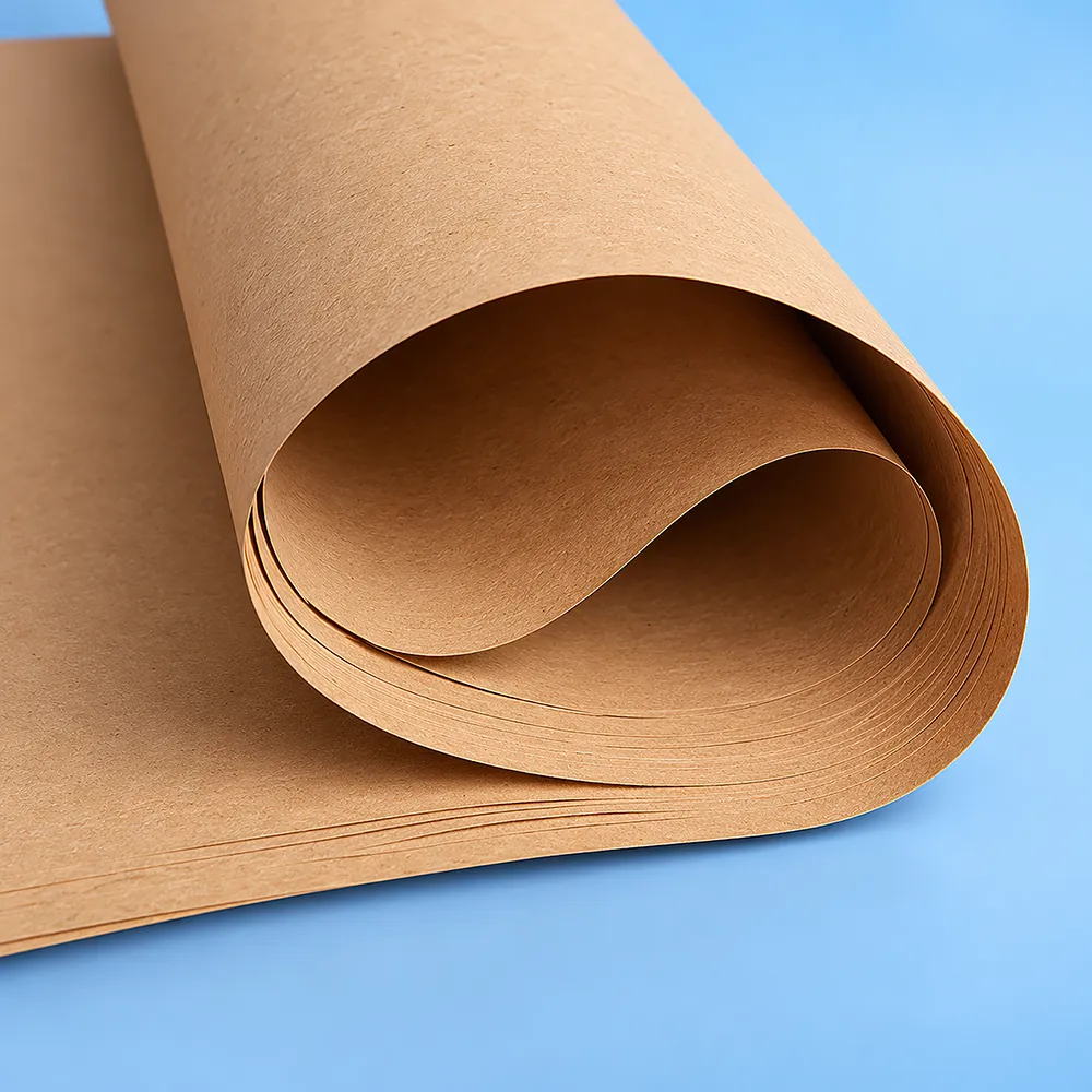
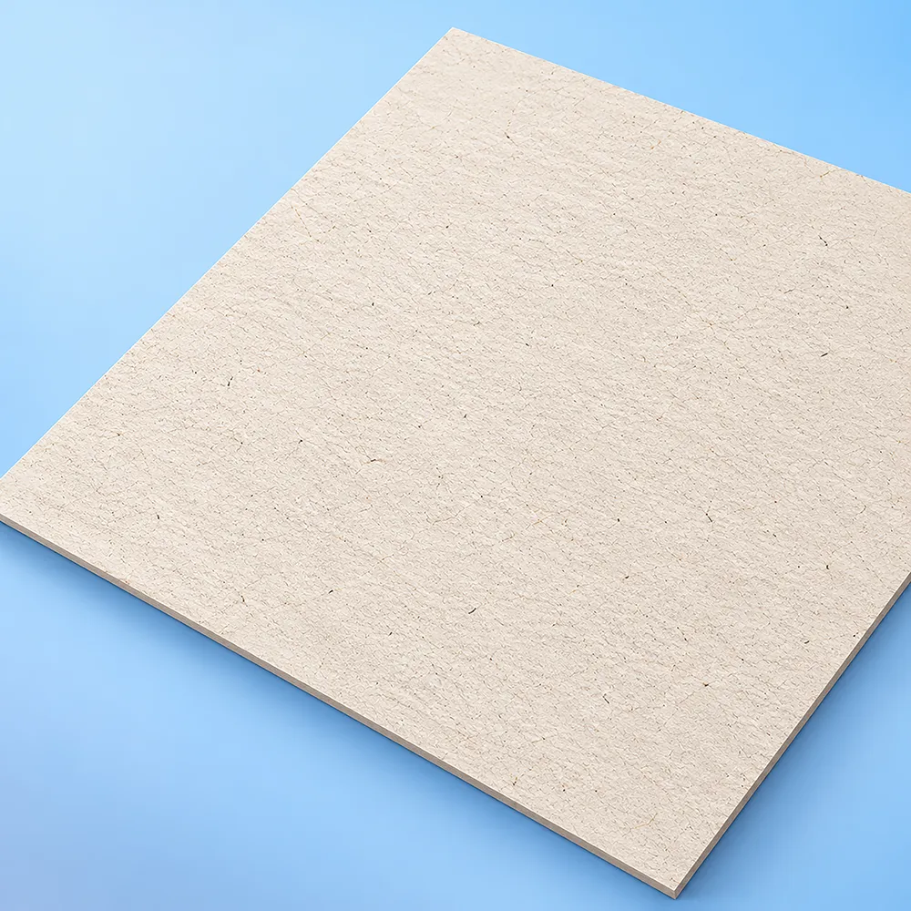
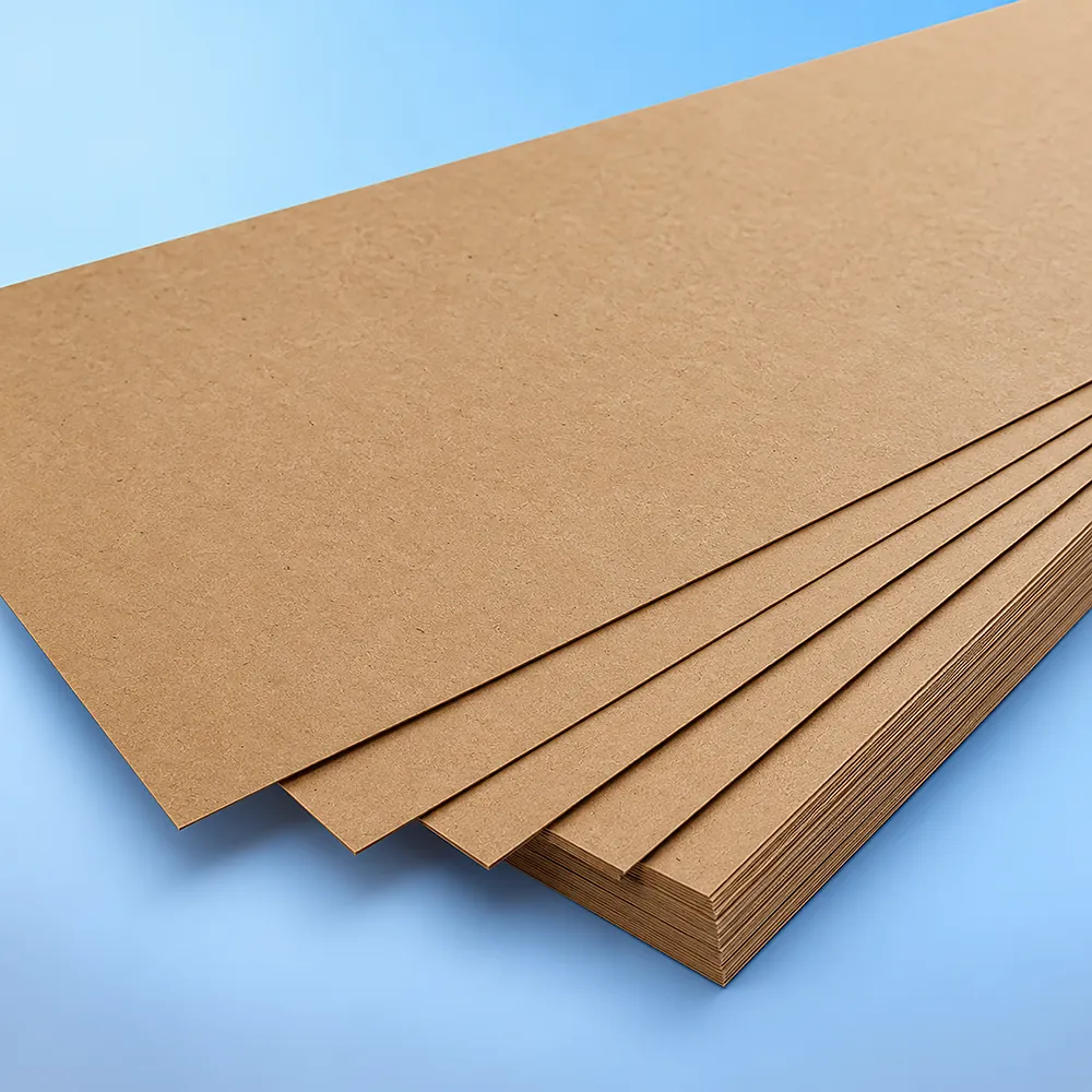
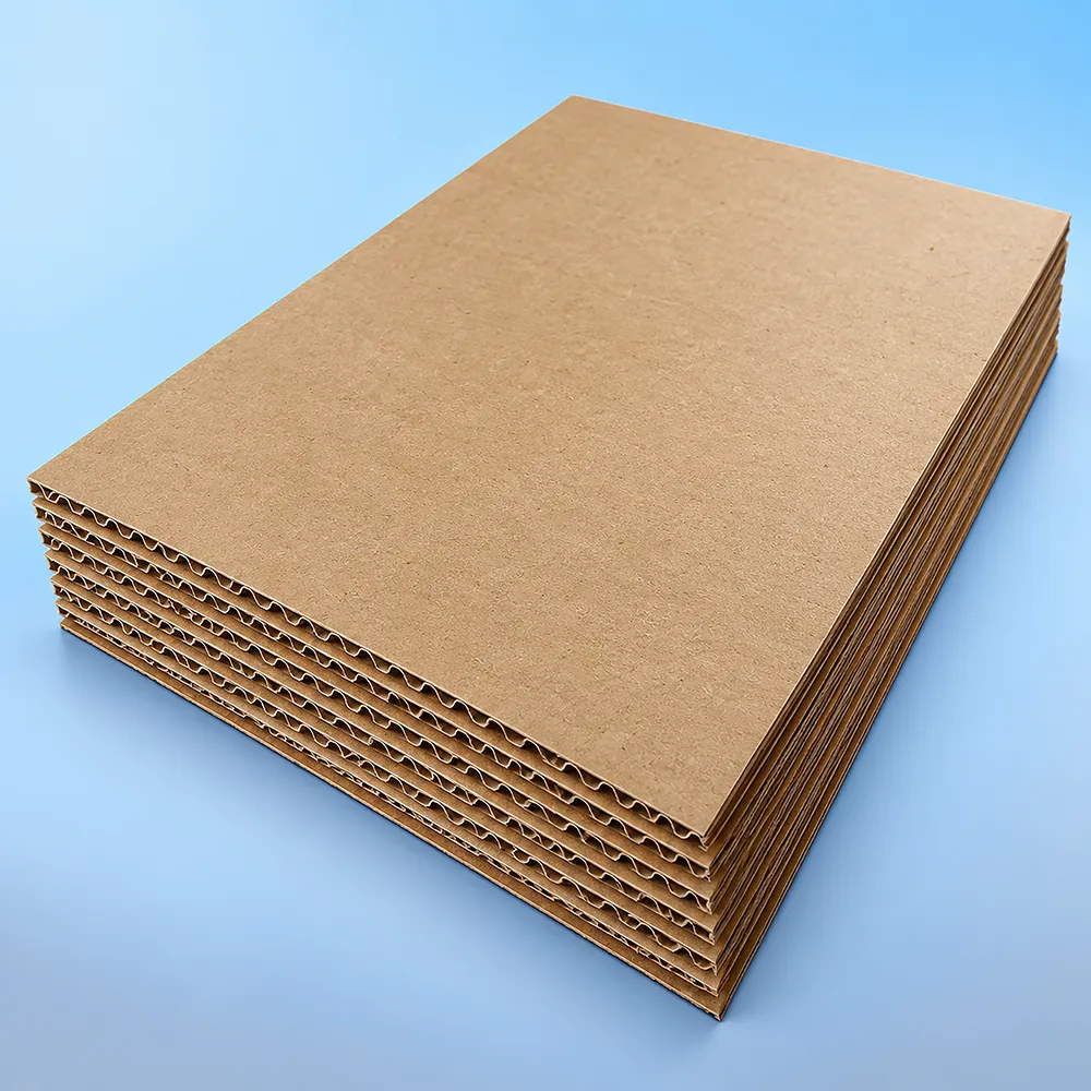
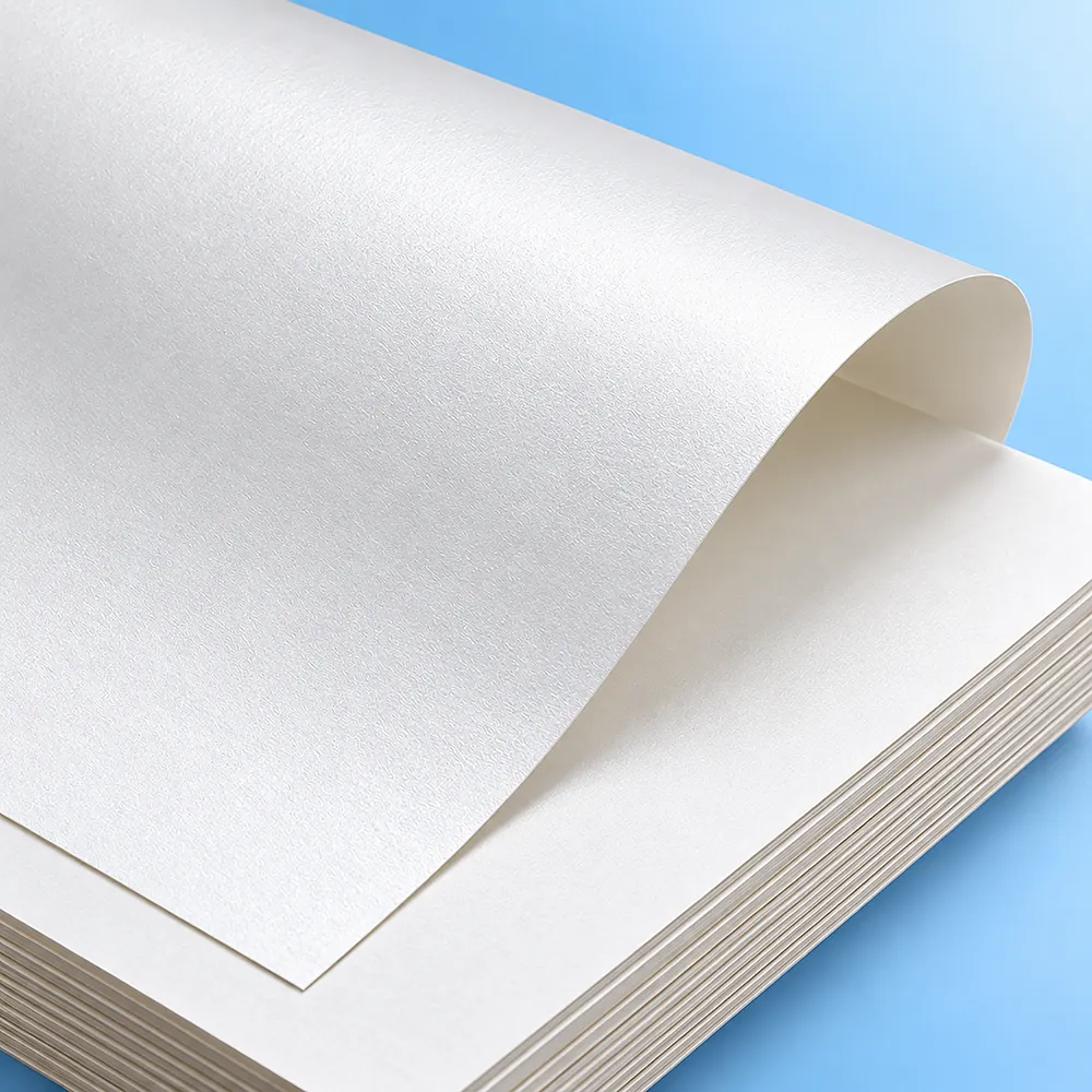
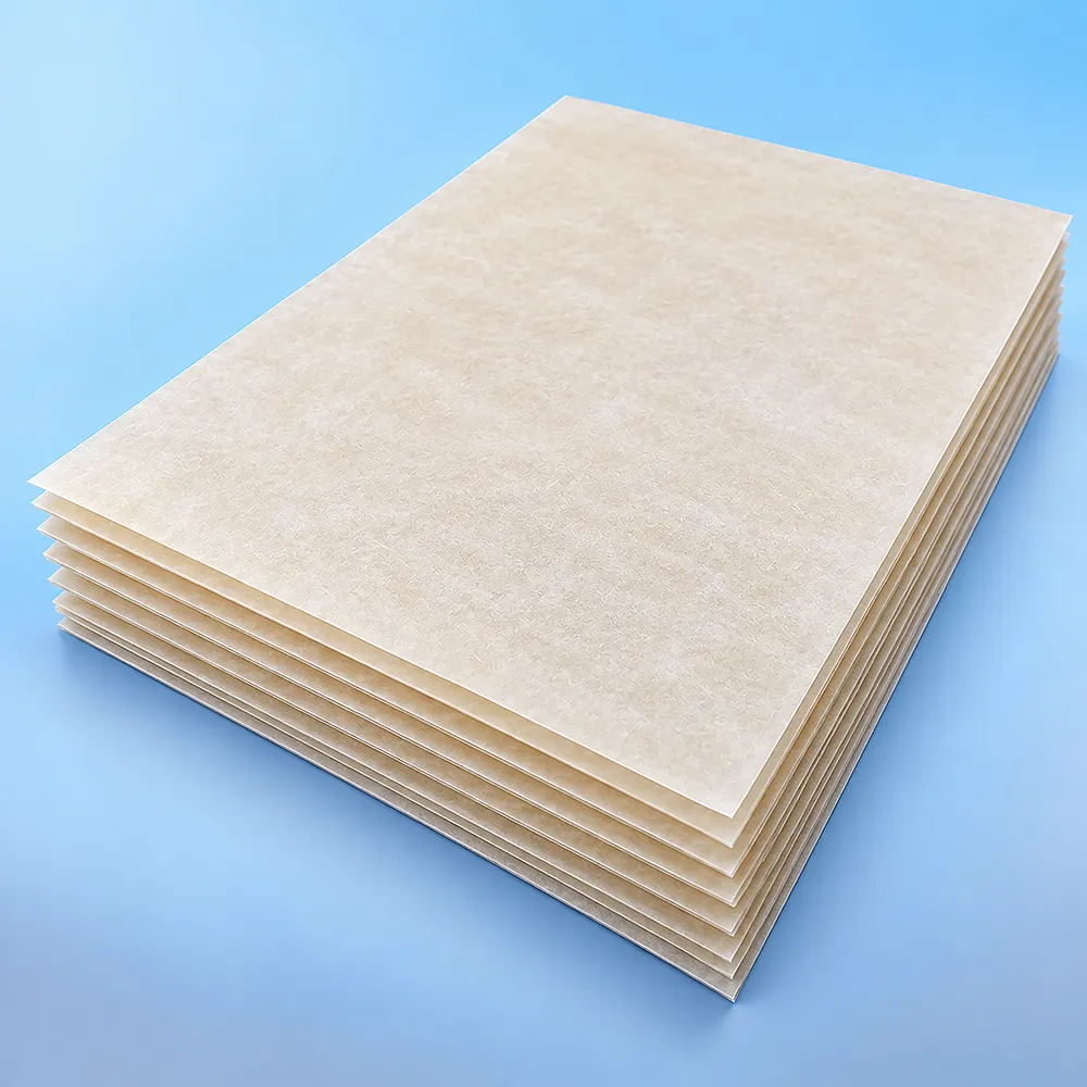
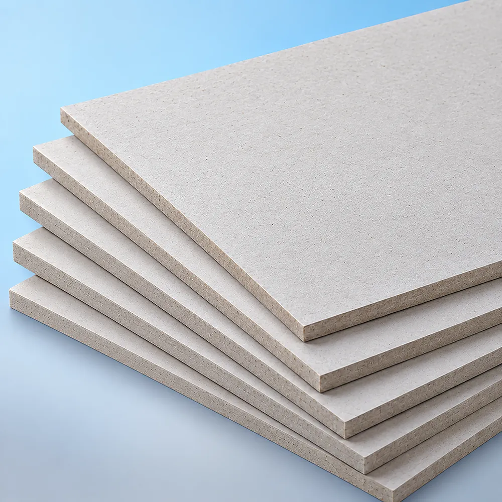
Packaging materials do more than hold a product; they influence protection, presentation and overall box performance. Cardboard provides a smooth, durable surface for custom printing and everyday retail packaging. Kraft paper offers a natural, sturdy option with an eco-conscious appearance. Corrugated stock adds extra strength for heavier products and shipping applications. We offer carefully selected paper stocks that balance durability, print quality, sustainability, affordability and premium presentation.
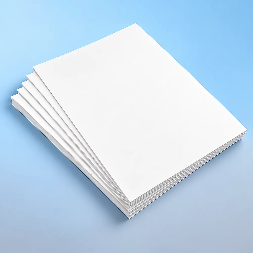

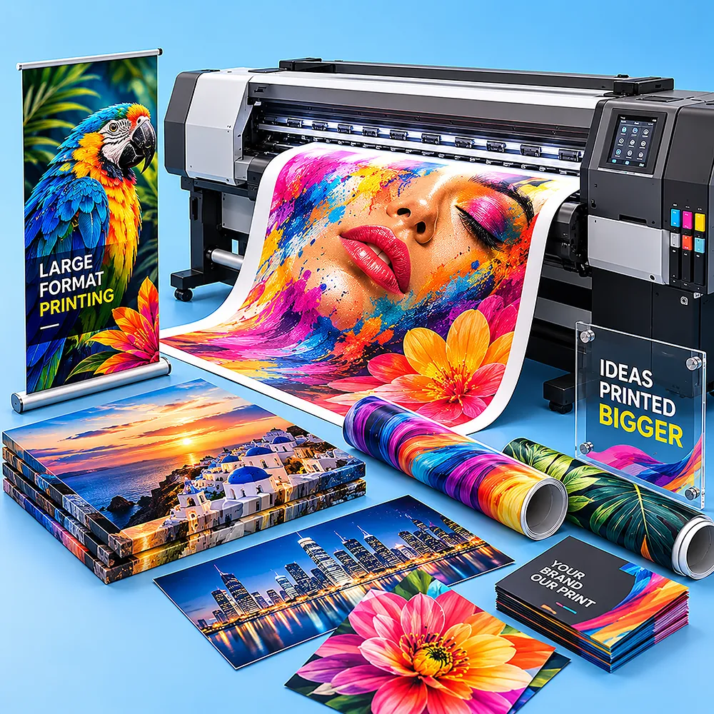
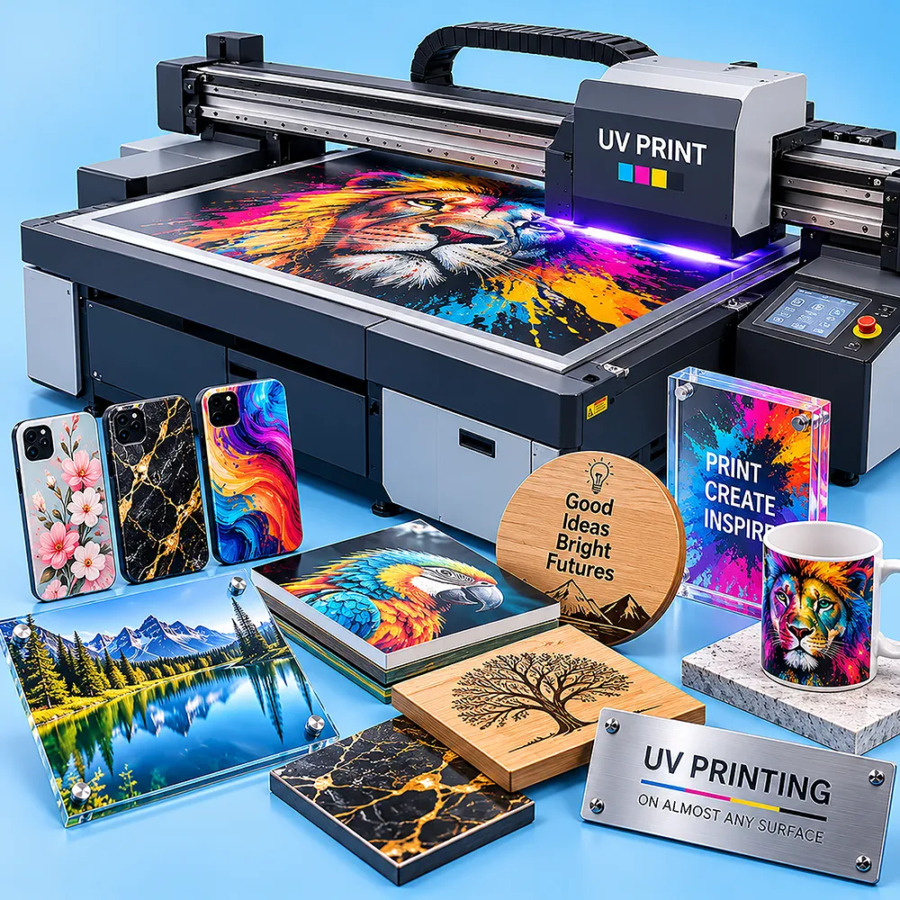
Printing methods enhance how your packaging looks and represents your brand. Digital printing delivers sharp details and vibrant colors, making it ideal for flexible custom packaging designs. Offset printing provides consistent color accuracy and crisp image quality for larger production runs. Screen printing creates bold, durable graphics on selected box surfaces and materials. We offer the latest printing methods to turn your creative ideas into realistic visuals, showcasing logos, patterns, artwork and branded graphics with clarity and precision.
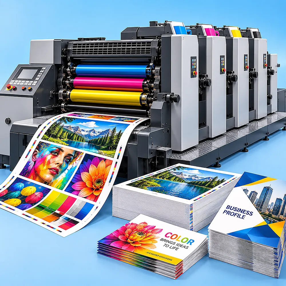
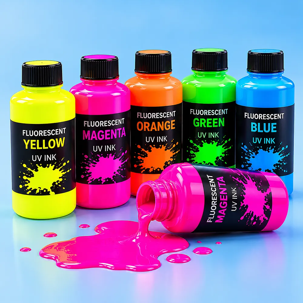
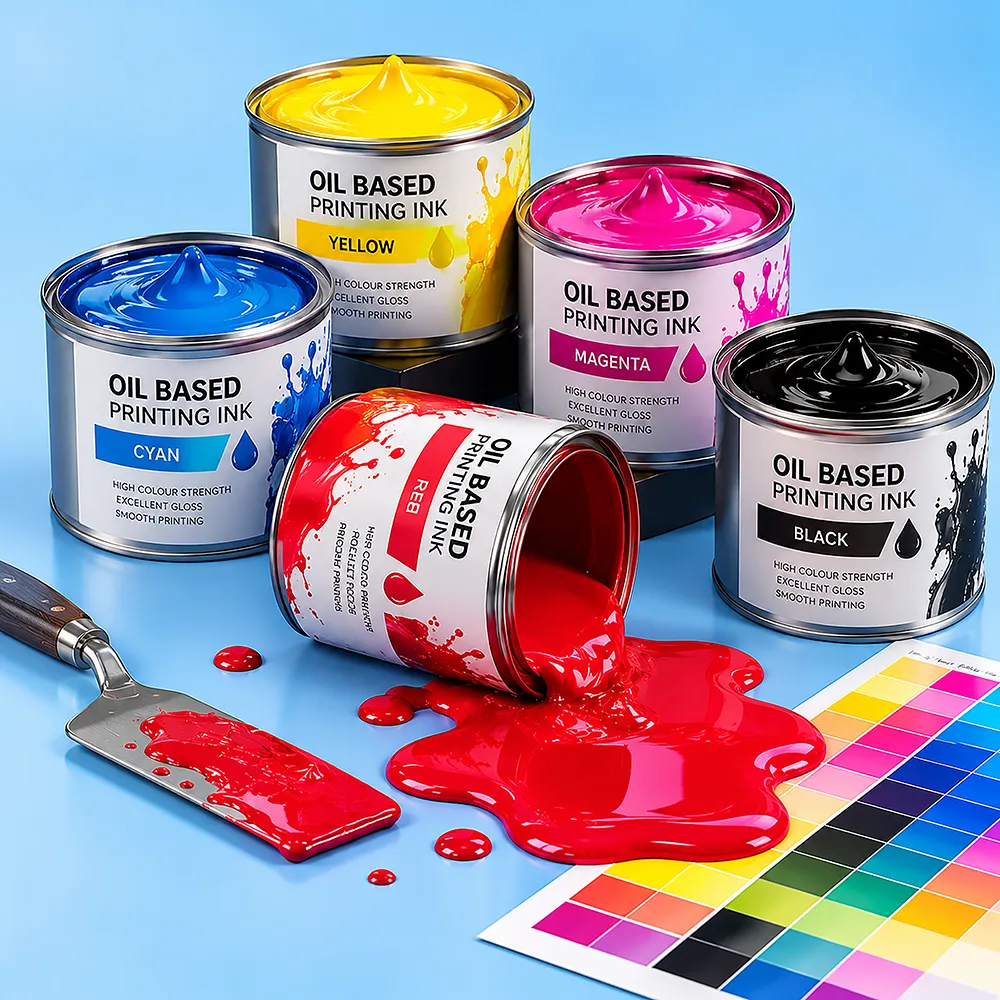
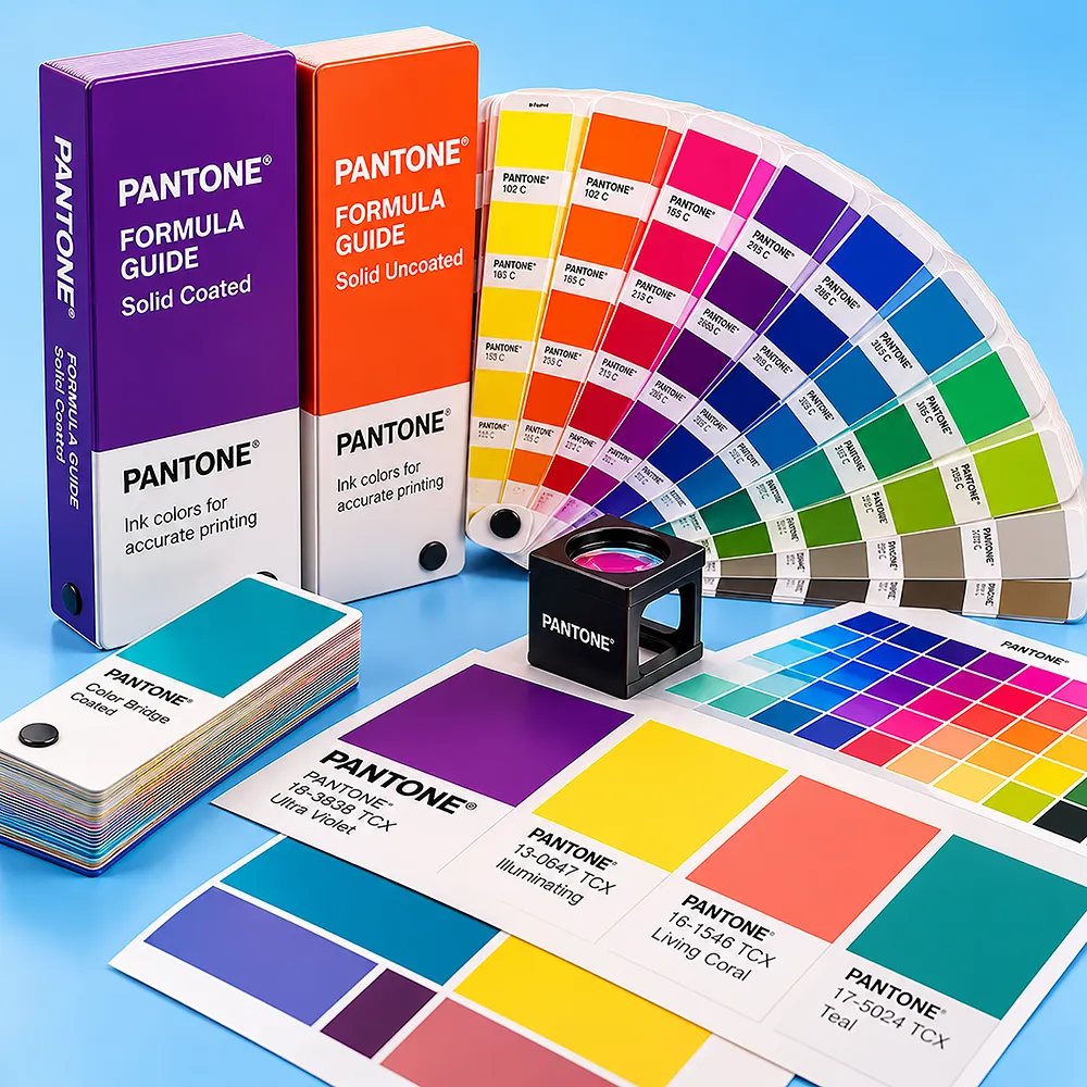
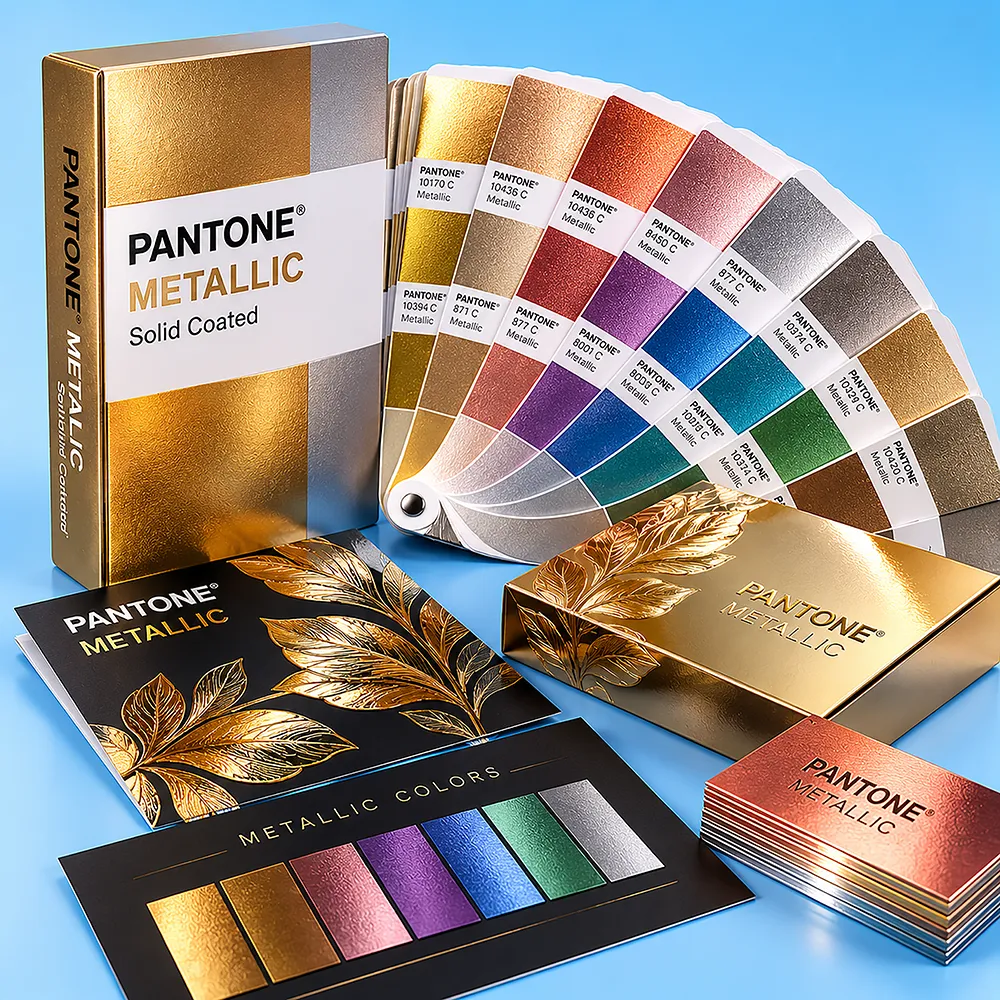
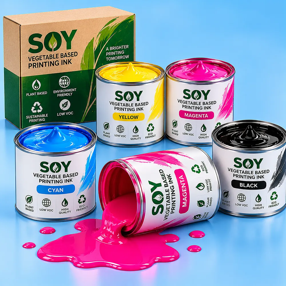
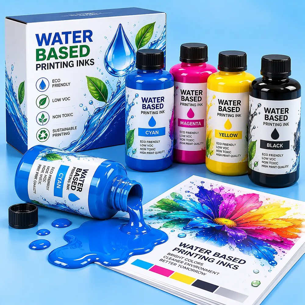
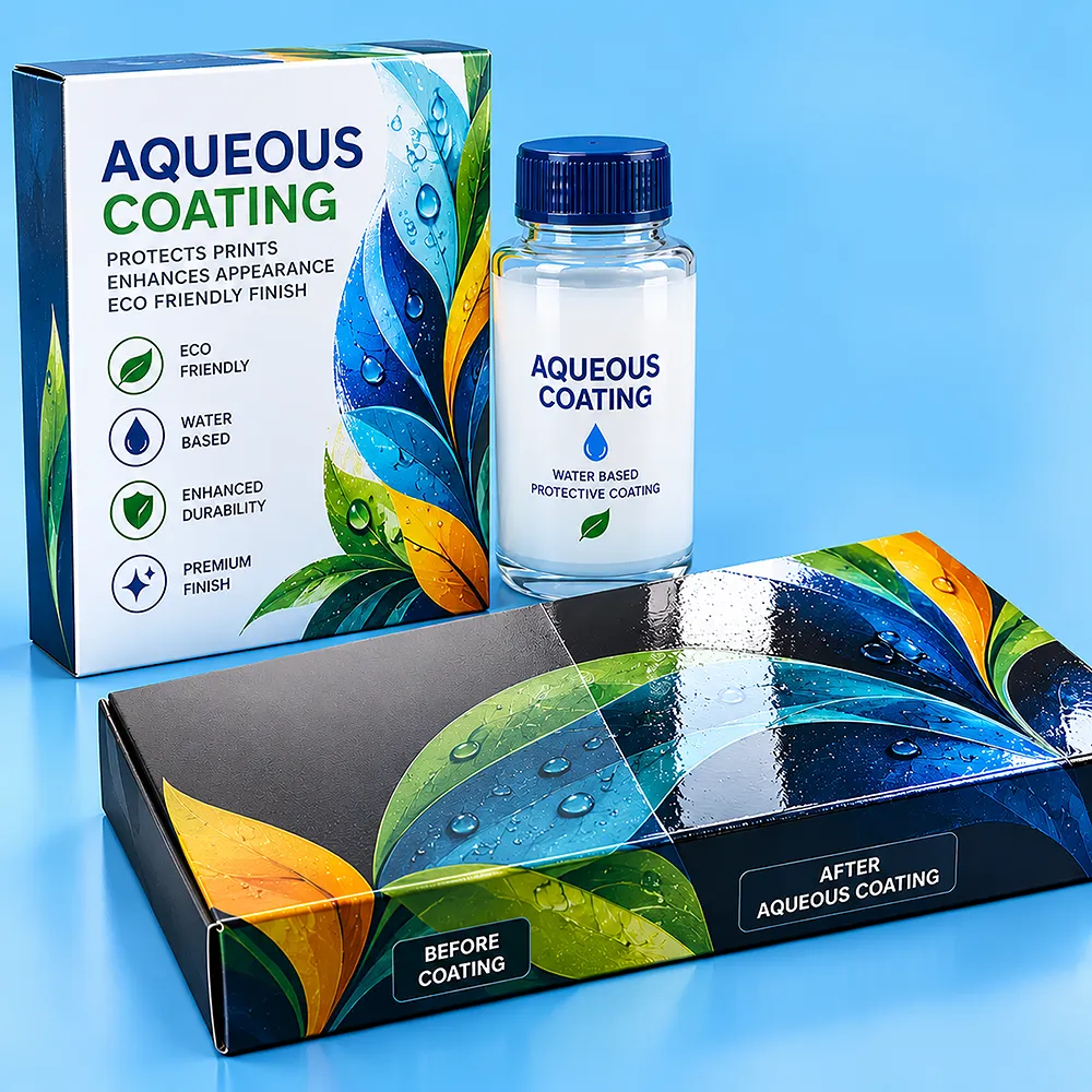
Printing inks bring packaging artwork to life with vibrant colors, clear details and consistent brand presentation. We offer a wide range of ink options, including Pantone colors, Pantone Metallic inks, oil-based inks and fluorescent inks for distinctive visual effects. Soy and vegetable-based inks provide versatile color reproduction, while water-based inks offer another practical printing option. Choose the right ink to reproduce logos, patterns, illustrations and branded artwork, turning creative ideas into attractive visuals with striking color and clarity.
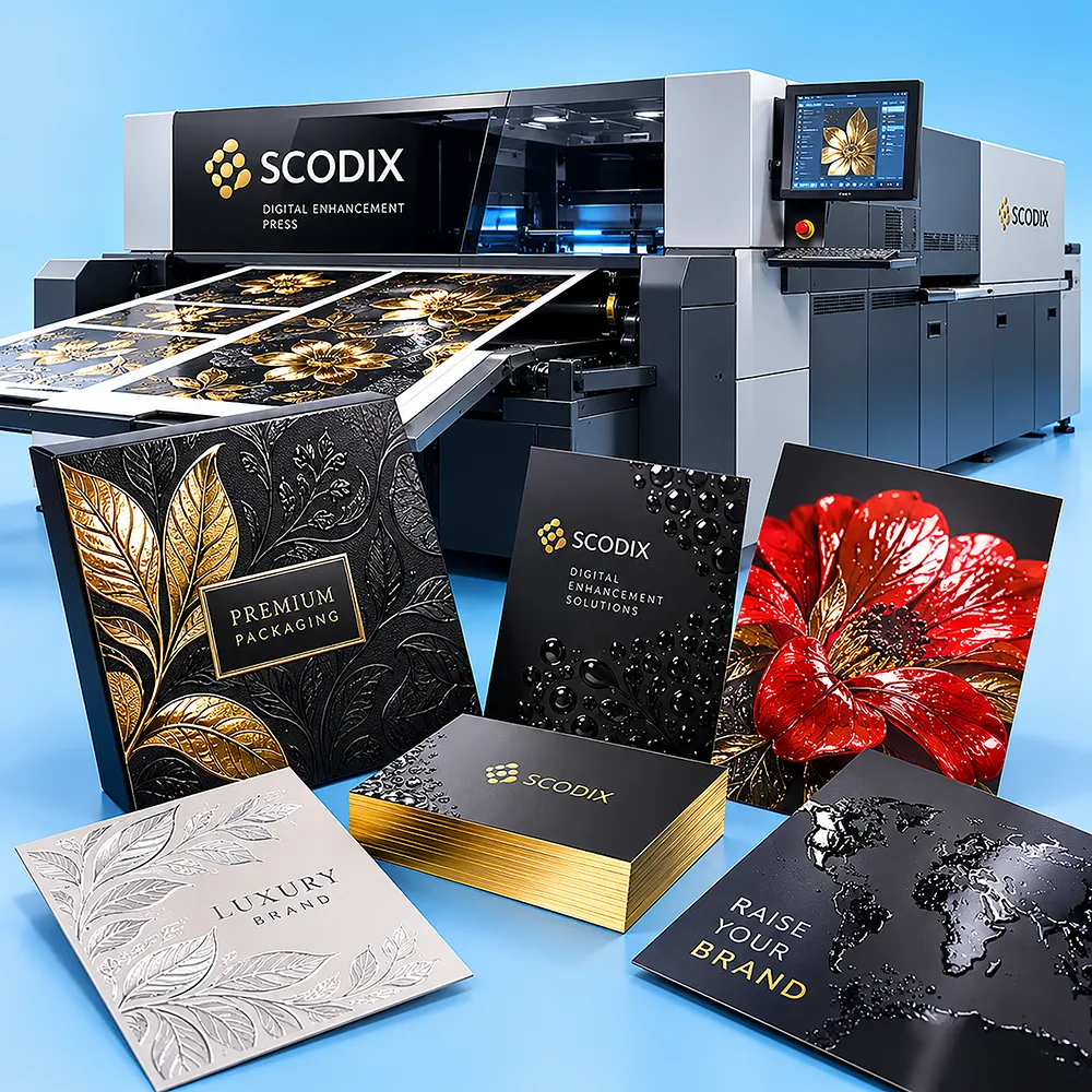
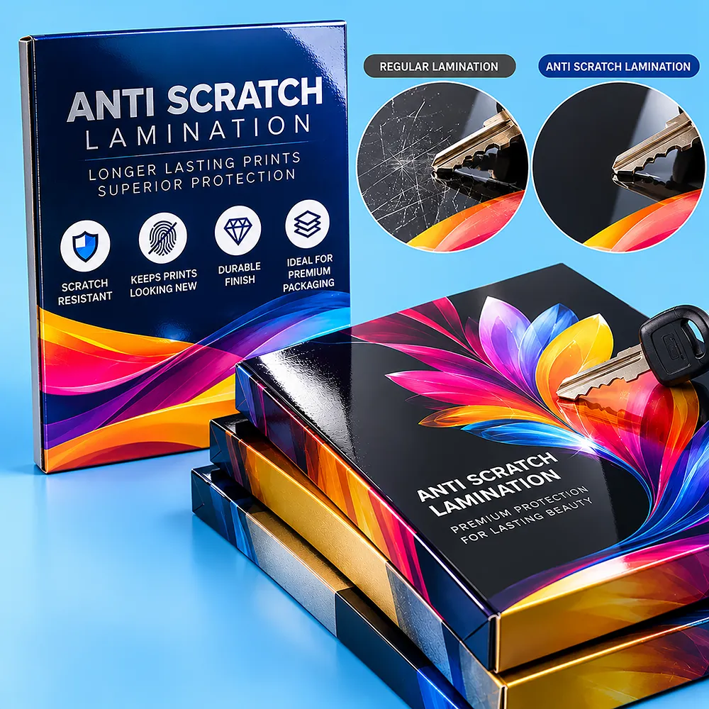
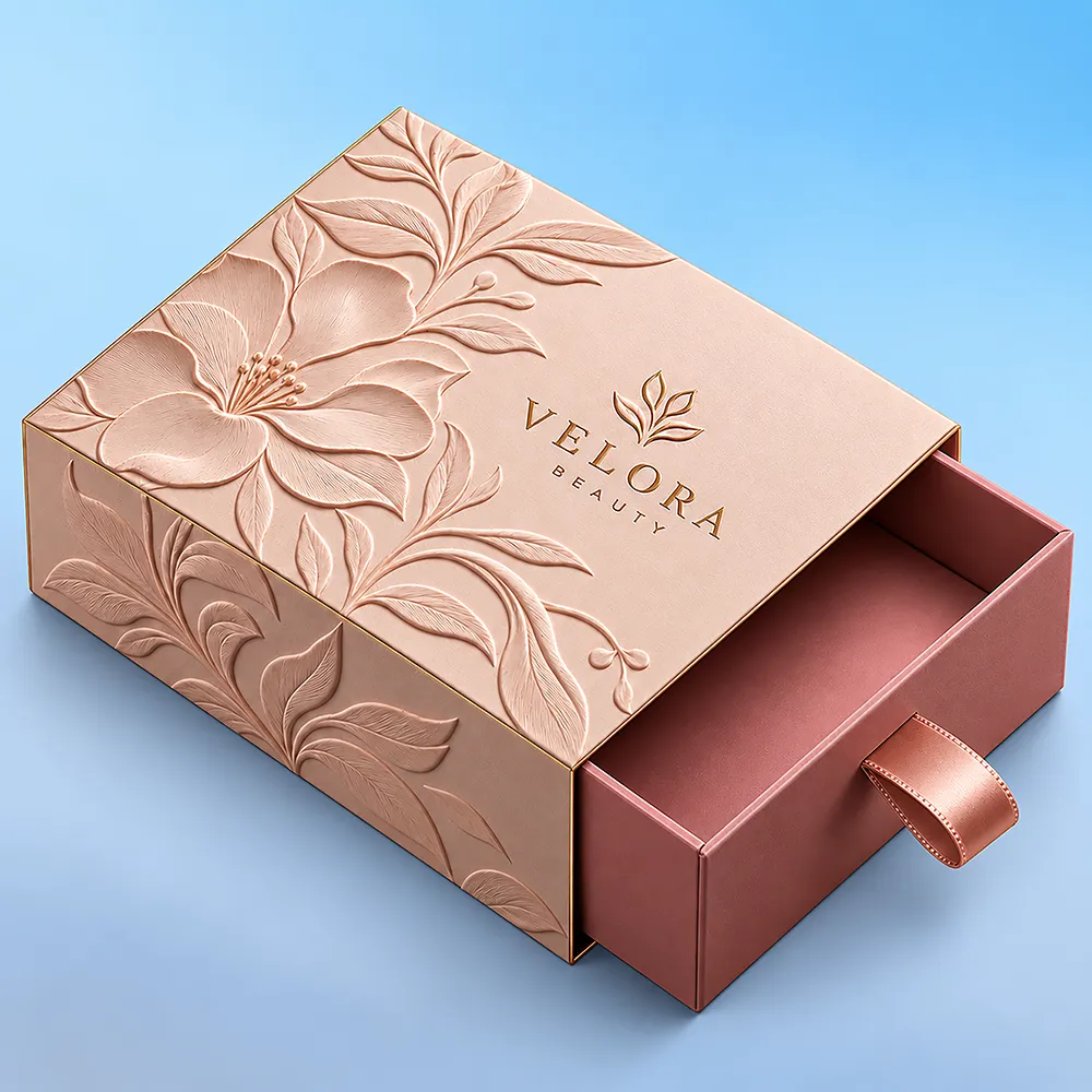
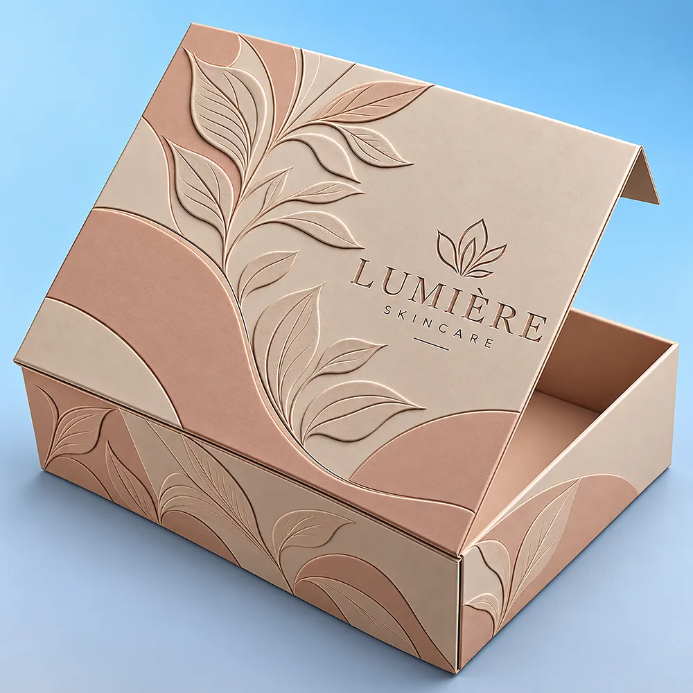
Premium finishes enhance the appearance and overall aesthetics of custom packaging. Matte and gloss laminations create smooth visual effects, while soft-touch adds a refined tactile feel. Foil stamping introduces metallic accents in gold, silver and other shades, while embossing and debossing add dimensional detail. Spot UV highlights selected design elements with added contrast and shine. Choose from versatile finishing options to make logos, patterns and branded artwork look more distinctive, polished and premium.
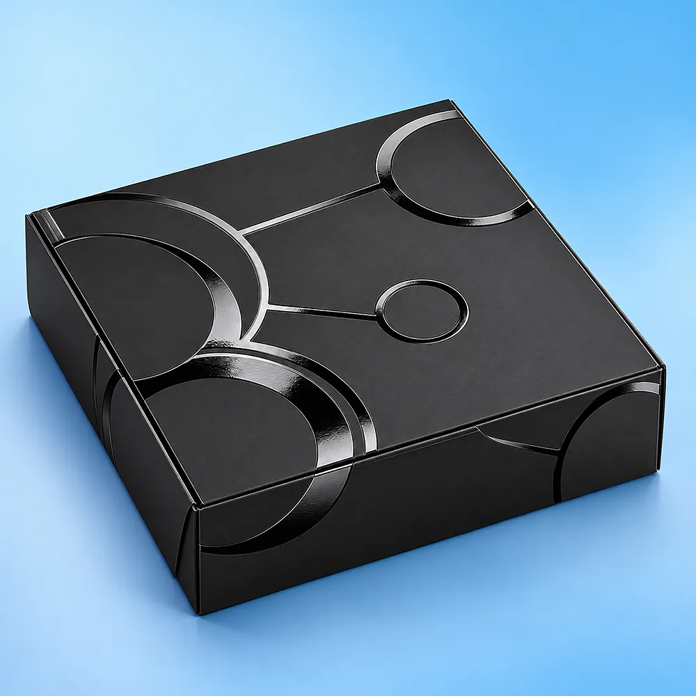
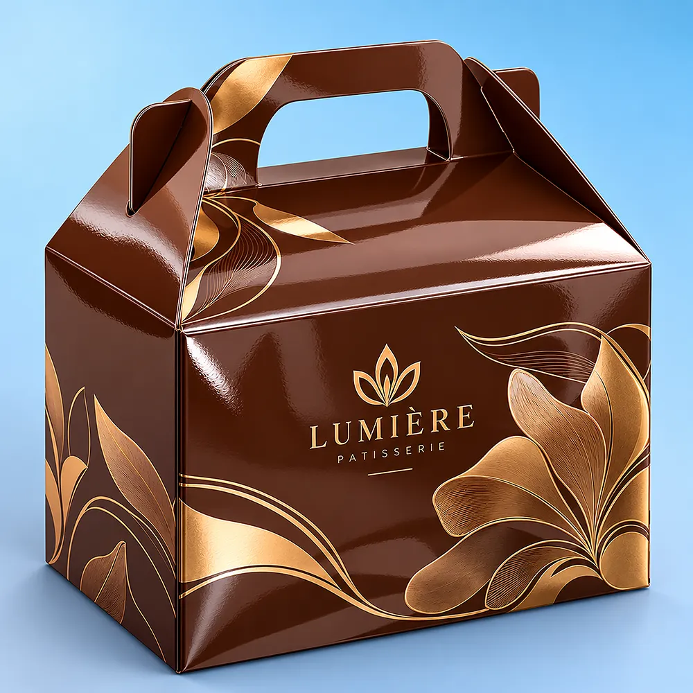
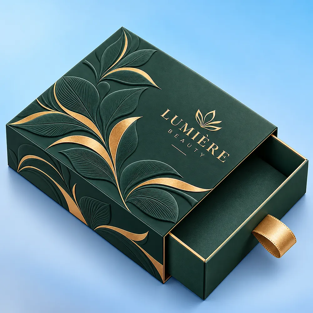
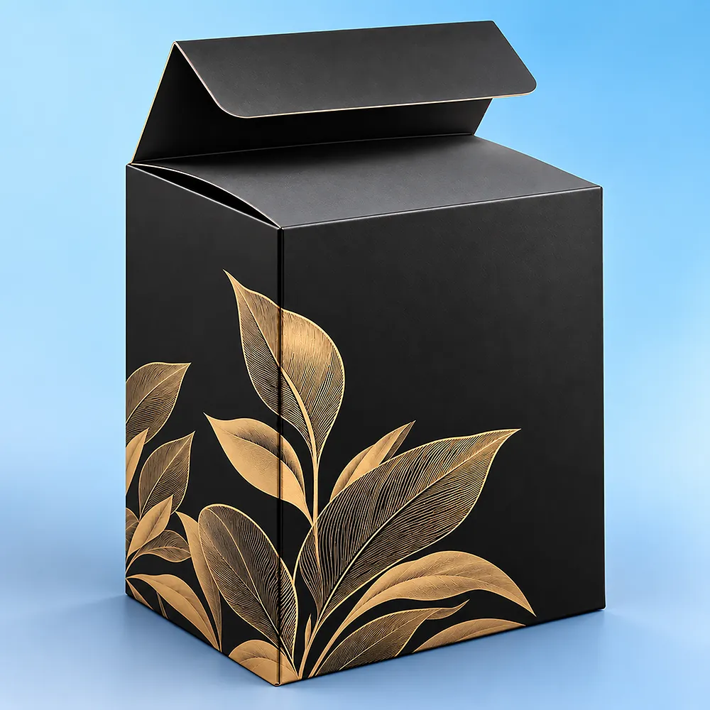
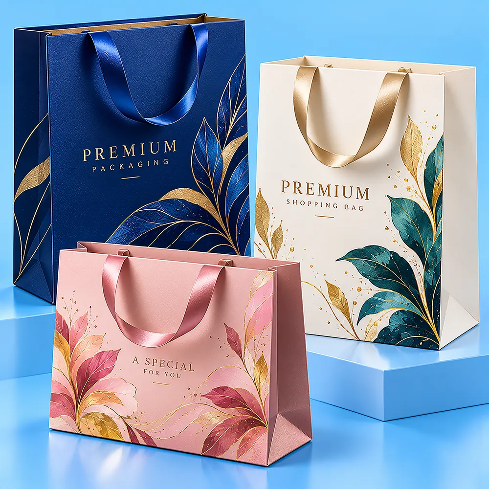
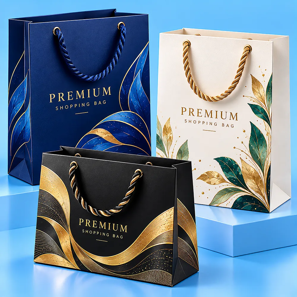
Packaging add-ons make custom packaging more attractive, presentable and visually captivating while increasing its perceived value. Gold foil adds a rich metallic accent, while silver foil creates a clean and sophisticated look. Holographic foil introduces eye-catching reflective effects that help selected design elements stand out. Embossing raises logos or patterns for added dimension, while debossing creates a refined recessed effect. Ribbons and handles add both decorative appeal and practical convenience, giving packaging a more distinctive and premium presentation.
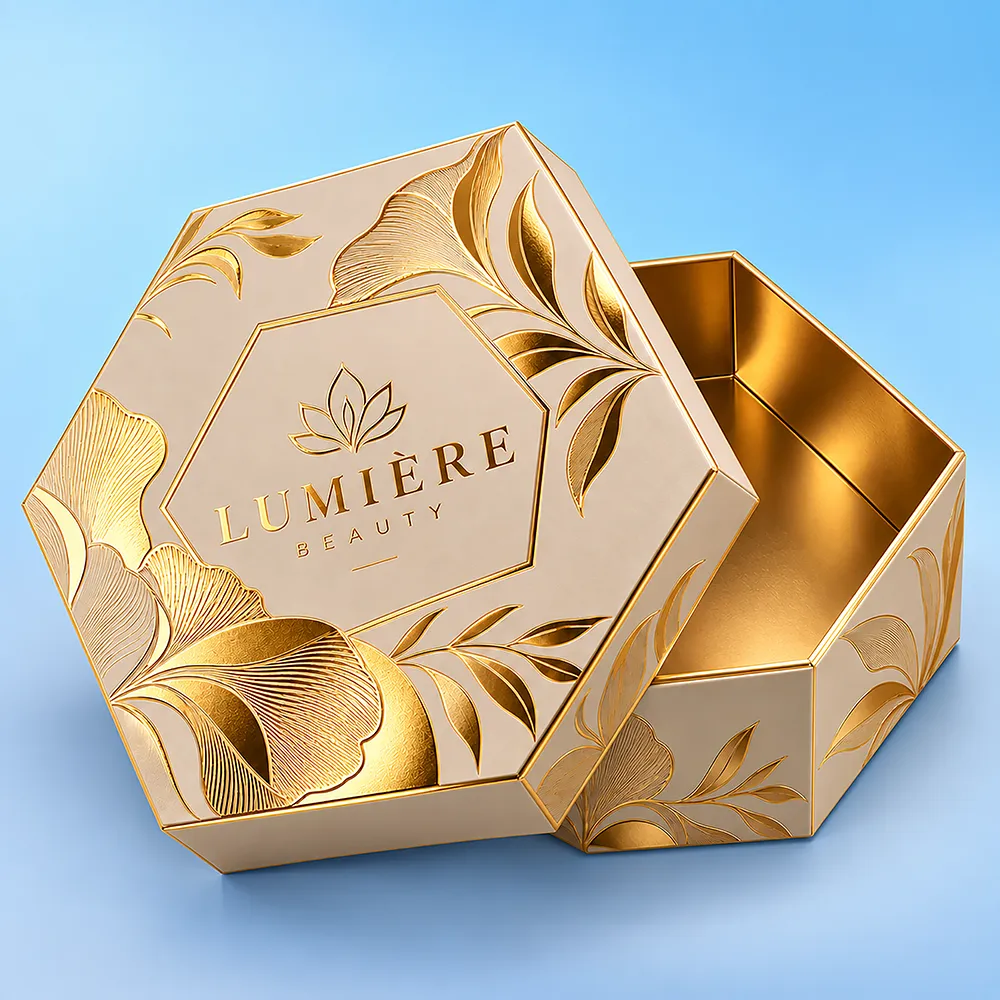
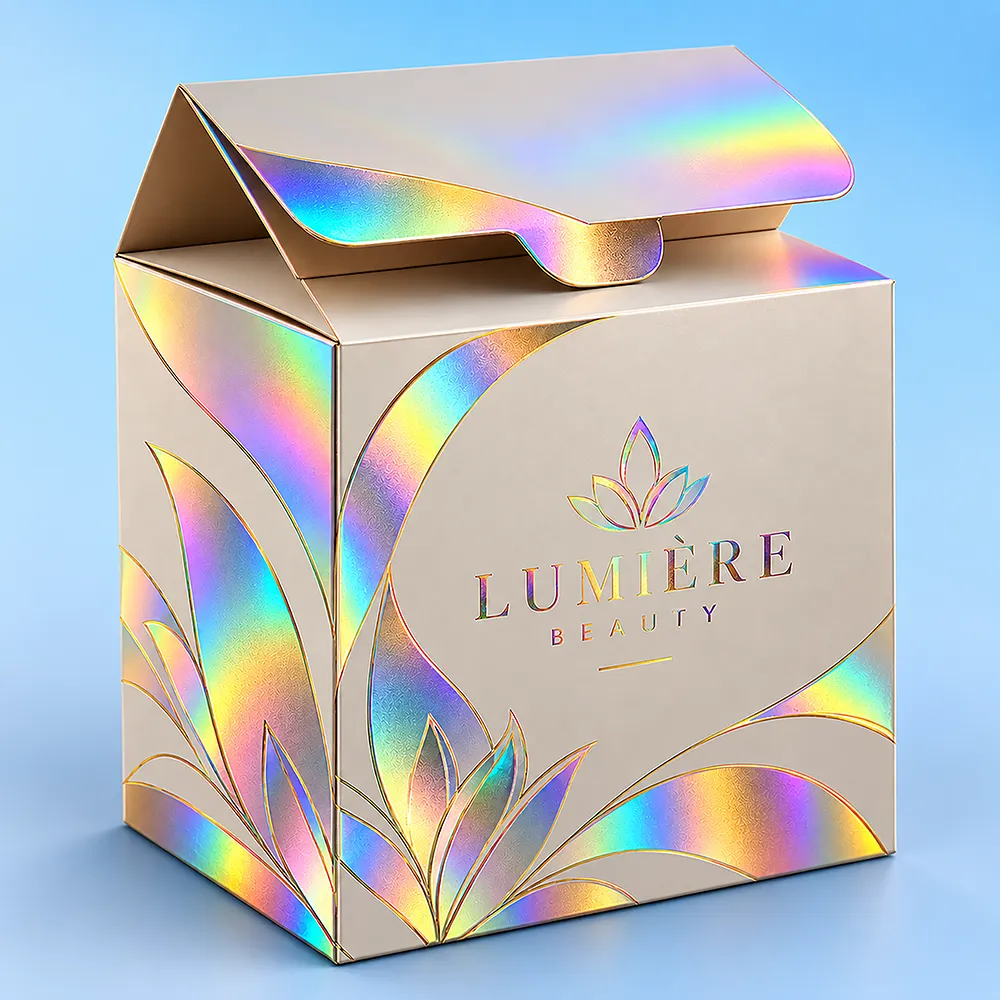
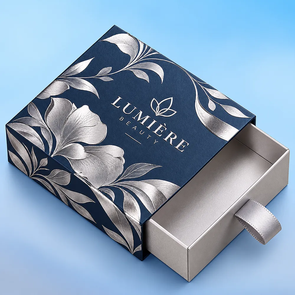
Fill out the form below to receive a customized packaging quote with competitive wholesale pricing and premium quality solutions.
Custom Kraft boxes are paper-based packages developed to a specified size and structure while using Kraft as part of the material or visible surface specification.
The most important distinction is:
Kraft Material / Surface ≠ Box Structure
A tuck carton, mailer, shipping carton, sleeve or box with a separate lid can all potentially use a Kraft material direction, but those packages do not perform the same job simply because their visible surfaces look similar.
A better specification sequence is:
Finished Product → Packaging Role → Structure → Board Construction → Kraft Surface → Artwork → Proof → Production
For lightweight folding cartons, Kraft Paperboard Boxes provide the more specific material route. Where ecommerce delivery and a self-contained mailer structure are already part of the requirement, Kraft Mailer Boxes provide the more relevant structural option.
A buyer should not begin with Which Kraft box looks best? The first question is what the package must do after the product is placed inside it.
| Packaging Requirement | Better Kraft Direction | Typical Use |
| Lightweight retail product | Kraft paperboard folding carton | Cosmetics, supplements, soap, accessories |
| Ecommerce presentation | Kraft mailer construction | Apparel, kits, subscriptions, branded deliveries |
| Distribution or higher transit requirement | Corrugated construction | Ecommerce fulfillment, wholesale and shipping |
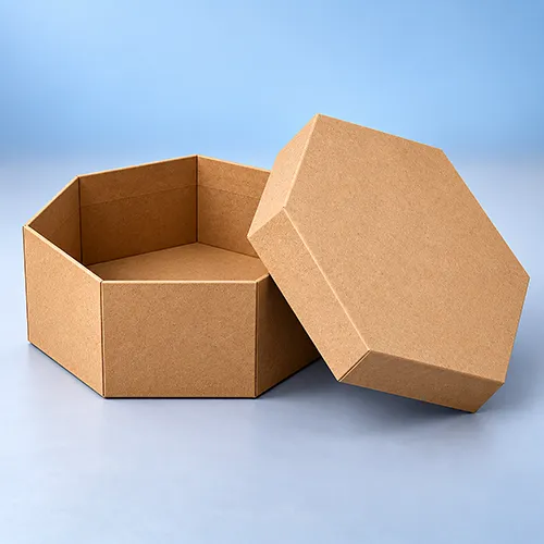
| Separate top-and-base opening | Kraft box with lid | Gifts, apparel and presentation products |
| Controlled product positioning | Kraft packaging with insert | Bottles, jars, sets and multi-item products |
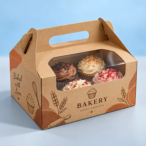
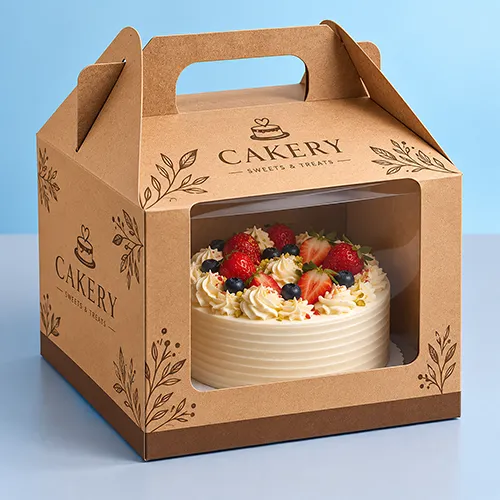
| Product visibility | Die-cut window structure | Soap, bakery and retail merchandise |
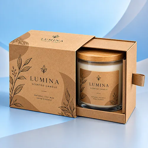
| Slide-open presentation | Sleeve-and-tray construction | Jewelry, cosmetics, stationery and gifts |
This is why a natural brown paperboard carton should not automatically be treated as an ecommerce shipping box. When the primary requirement is fluted construction for transit or distribution, start with Custom Corrugated Boxes and then establish whether Kraft liners or a Kraft appearance are appropriate.
Kraft box is used commercially across several constructions, so the actual board should be identified before the dieline and quotation are finalized.
Kraft paperboard is suited to many lightweight folding cartons used for retail and secondary packaging. It can be die-cut, scored and folded into tuck-style cartons, sleeves, window formats and other paperboard structures.
The material should still be selected around the finished product, loaded weight, dimensions and closure rather than by copying a universal GSM or thickness from another packaging project.
Brands primarily looking for folding-carton construction can compare the more specific Kraft Paperboard Boxes page.
Corrugated board uses liners around a fluted medium. That makes it structurally different from a single-layer folding paperboard carton even when both have a similar natural brown appearance.
The distinction matters because:
Kraft Paperboard → Folding-Carton Direction
while:
Kraft Corrugated Construction → Fluted Packaging Direction
Products exposed to parcel handling, stacking or more demanding distribution conditions may therefore require a corrugated structure rather than simply a thicker-looking retail carton.
Kraft can also contribute to presentation-led packaging where the natural surface is part of the visual direction rather than the sole structural definition.
For example, a package with a separate top and base is a structural decision first. The Kraft material or wrap is then selected to support the desired appearance. Buyers specifically looking for that opening experience can explore Kraft Boxes With Lid.
The parent Kraft category should therefore answer which material/construction direction makes sense, while dedicated child pages should handle the detailed requirements of each structure.
Natural brown Kraft is commonly selected when the visible fiber tone is intended to remain part of the brand presentation. It can complement understated, handmade, botanical, rustic or minimalist visual systems, but the brown substrate also affects printing.
A lighter or white surface creates a different artwork background. If the buyer real requirement is simply a bright white carton rather than Kraft specifically, the broader Custom Cardboard Boxes family may provide a more appropriate starting point.
The practical decision is therefore not:
Brown vs White = Which Color Looks Better?
It is:
Brand Appearance + Artwork Requirements + Actual Material Construction = Suitable Surface
A white-looking package should not automatically be described as White Kraft, and a natural brown package should not automatically be described as recycled Kraft. The actual quoted material should control those claims.
Natural Kraft should be treated as part of the printed design rather than as a neutral background.
Conventional printing inks can interact visually with the brown surface, so pale colors, photographs and some brand colors may appear different from the same artwork printed on bright white paperboard. The final appearance depends on the actual substrate, ink system, artwork coverage and production process.
For that reason, the useful approval relationship is:
Artwork + Selected Kraft Surface + Printing Process → Final Printed Appearance
Logos, product names, usage information, barcodes, QR codes and other branding can be incorporated according to the available printable panels. Inside printing may also be considered where the selected structure and material support it.
Minimal artwork often uses the natural board effectively because the Kraft surface remains visible as part of the design. More complex color work is possible on suitable configurations, but color-sensitive brands should review the actual material and proofing approach rather than assuming a monitor preview predicts the finished print.
Printing and finishing should be treated as separate specification decisions.
The print communicates the artwork. Finishing changes the surface or highlights selected elements.
Depending on the chosen Kraft material and box construction, projects may use matte or gloss treatments, soft-touch finishing, foil stamping, embossing, debossing or Spot UV. The appropriate combination should be selected around a defined design purpose rather than applying every available enhancement to one box.
For example, embossing or debossing can emphasize a logo while leaving more of the Kraft surface visible. Foil can introduce a controlled metallic accent. A broader coating or lamination changes more of the tactile and visual character of the natural stock.
That matters because a brand choosing Kraft specifically for its visible paper texture may not want a finish that covers the characteristic it wanted to preserve.
There is no universal custom Kraft box size that works simply because two products belong to the same industry.
Start with the finished, sale-ready product in the orientation in which it will actually be packed. Record its maximum Length × Width × Height, including caps, pumps, closures, sleeves or other permanent components.
Then establish:
Product Dimensions → Product Weight → Orientation → Quantity per Box → Insert/Wrap → Required Internal Space → Structure → External Dimensions
For packaging fit, internal dimensions are normally the useful starting point because they describe the usable space available to the product. External dimensions become important for logistics, storage and shipping and may differ more noticeably when corrugated material is used.
BoxBaba guide on how to measure box dimensions correctly explains the internal-versus-external distinction in more detail.
Do not add one generic clearance number to every project. The space required depends on the structure, product tolerance, board construction, packing method and whether an insert or protective component occupies part of the interior.
An insert should not be treated as an accessory added after the carton size has already been approved.
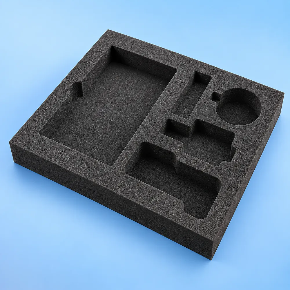
If a bottle, jar, jewelry item or multi-product set needs controlled positioning, the insert becomes part of the internal dimensional system. Its cutouts, folds, walls and clearances consume space and can change the required outer structure.
A useful sequence is:
Finished Product → Desired Position → Insert Layout → Required Internal Space → Outer Box
This is particularly important for sets containing several items because the arrangement of the products can affect both the insert footprint and the overall package dimensions.
For packaging where internal retention is central to the project, compare Printed Boxes With Inserts and determine the insert and outer structure together.
A die-cut window works best when its location is based on what will actually be visible after the product is packed.
Determine:
Product Position → Feature to Show → Available Panel → Window Position
The opening should also remain clear of important folds, glue areas and locking features. Depending on the application, the opening may remain uncovered or may require an appropriate clear patch.
The presence of a window also means less material remains in that panel, so its dimensions and placement should be considered as part of the box structure rather than added only for decoration.
The parent Kraft category should guide buyers to the right branch rather than duplicate every product-specific page.
Jewelry, for example, often requires controlled presentation and internal positioning. Buyers packaging rings, earrings, bracelets or small accessories can move into Kraft Jewelry Boxes once the jewelry application becomes the primary requirement.
Soap brands may need a lightweight folding carton, exposed sleeve or another format depending on the bar dimensions, retail display and desired visibility. Kraft Soap Boxes cover that product-specific Kraft intent.
For apparel, folded dimensions and presentation become more important than the generic Kraft material alone. Kraft Shirt Boxes provide the more focused route for shirt packaging.
Gift buyers who are still comparing material families and presentation formats can also explore the broader Custom Gift Boxes category rather than assuming every gift project requires Kraft.
This relationship keeps the taxonomy clear:
Custom Kraft Boxes → Broad Kraft Material/Category Intent
Kraft Child Page → Specific Structure or Product + Kraft Intent
Generic Cross-Category Page → Product/Structure Intent Regardless of Material
The words Kraft box do not establish distribution performance.
A folding Kraft paperboard carton may be intended primarily for retail presentation or secondary packaging. A parcel or distribution package may require a different corrugated construction selected around the packed product, weight and handling environment.
Keep the packaging levels separate:
Product → Retail / Primary Presentation Box
then, where required:
Retail Box → Ecommerce Mailer or Outer Shipping Package
If the package itself needs to function as an ecommerce mailer,Kraft Mailer Boxes provide more structure-specific guidance.
For broader fluted shipping constructions, use Custom Corrugated Boxes instead of assuming that any brown Kraft carton is suitable for parcel distribution.
No. The word Kraft alone is not enough to establish the environmental characteristics of the completed package.
Kraft describes a paper/material direction, but the finished box may also contain coatings, laminations, window films, adhesives, foils, inks, inserts and other components. Those elements, together with the specific fiber source and the recycling infrastructure where the package is discarded, can affect the final environmental profile.
Therefore:
Natural Brown Appearance ≠ Automatically Recycled
and:
Kraft Material ≠ Automatically Recyclable, Biodegradable or Compostable in Every Finished Configuration
If recycled content, FSC certification, curbside recyclability or another environmental attribute is important to the purchasing decision, ask for that requirement to be verified against the actual material quoted for the project.
This gives the buyer a more defensible sustainability specification than relying on the visual appearance of brown paper.
Kraft appearance alone does not establish direct-food-contact suitability.
For bakery, confectionery, takeout or other food applications, first determine whether the food will touch the packaging directly.
Wrapped / Cup / Tray / Pouch → Secondary or Indirect Packaging Requirement
Unwrapped Food Touching Board → Direct-Food-Contact Material Requirement
The actual board, coatings, inks, adhesives and any required grease or moisture barrier should then be reviewed for the intended contact conditions.
This distinction is more useful than describing every Kraft box as universally food safe.
Proofing should match the risk the buyer needs to check.
A digital proof or 3D mockup is useful for reviewing artwork placement, panel orientation, text, graphics and the general relationship between artwork and structure. It does not reproduce every physical property of the final board or prove actual product fit.
Think of the approval stages separately:
Digital Proof → Artwork / Layout Review
Physical Sample or Material Reference → Physical Surface / Structure / Fit Review
Where material appearance, tight fit, insert layout or a complex opening mechanism is commercially important, discuss the appropriate physical sample before bulk production.
The exact sample type, cost and any shipping or reimbursement arrangement should be confirmed with the quotation rather than assumed from another packaging project.
A useful quotation starts with enough information to define the physical package instead of only the artwork.
Provide the finished product dimensions, loaded product weight where relevant, quantity packed per box, intended orientation, required order quantity, packaging role, preferred structure if already known, natural or alternative Kraft surface preference, insert or window requirements, printing sides, artwork status and delivery destination. For multiple SKUs, also identify the quantity required for each artwork version.
If you are reproducing an existing box, state whether the dimensions you provide are internal or external and whether you want to match the existing construction, fit, appearance or all three.
When several SKUs have the same physical dimensions, structure and internal requirements, they may be candidates for a shared dieline with separate artwork versions. Different dimensions, inserts or structural requirements should be reviewed separately.
BoxBaba develops wholesale Kraft packaging around the product rather than forcing every product into one stock size or construction.
Custom orders start from 100 units, subject to project requirements. BoxBaba can support custom dimensions, structural dielines, artwork review, inside or outside branding, inserts and compatible finishing options.
Standard production is typically approximately 5–9 business days after final artwork approval for qualifying orders, although structure, quantity, sampling and special finishing can affect the schedule. Confirm the final production and in-hand date during quotation.
Free shipping across the USA is available under applicable BoxBaba order terms.
For the strongest quotation, start with:
Finished Product → Dimensions → Weight → Packaging Role → Structure → Kraft Construction → Internal Components → Artwork → Quantity → Delivery Requirement
That gives the packaging team a clearer basis for developing the dieline and production specification.
Start with the finished product and what the package needs to accomplish. Then establish the dimensions, structure, board construction, Kraft surface, inserts or windows, printing and finishing before approving the final production specification.
Share your product dimensions, quantity, packaging use and artwork with BoxBaba to receive a custom Kraft box quotation developed around the actual product rather than a generic stock size.
Find all the urgent questions you may have.