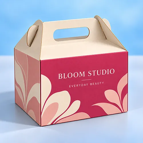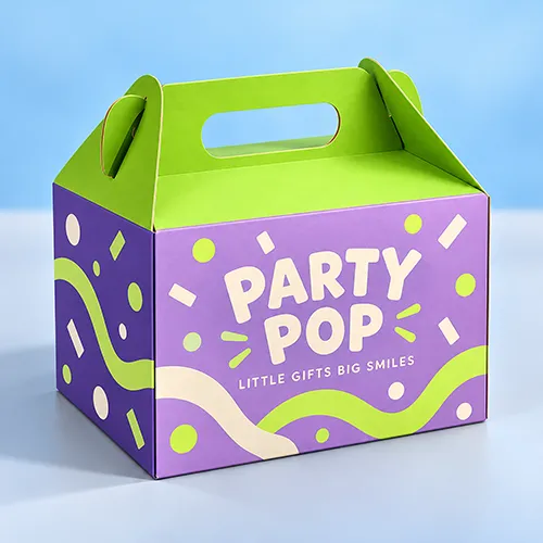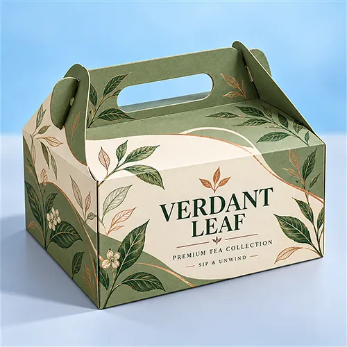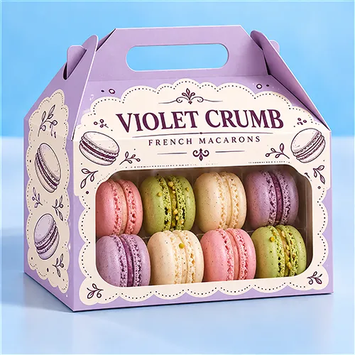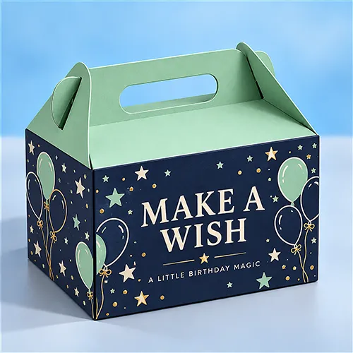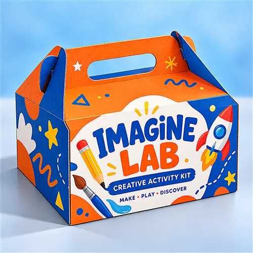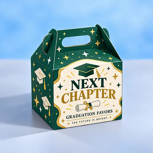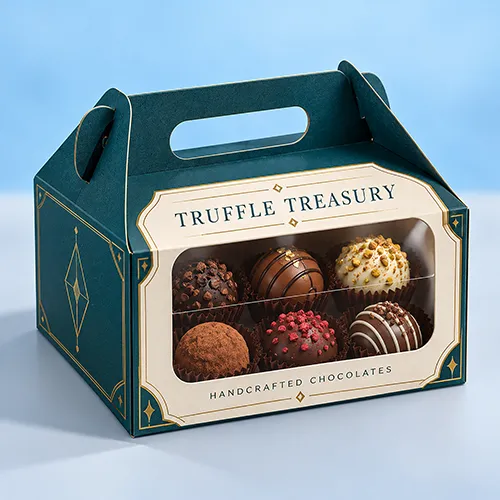
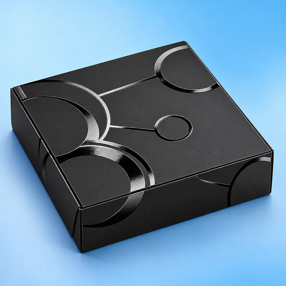
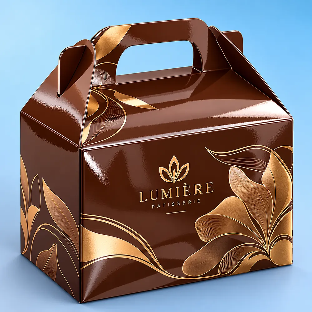
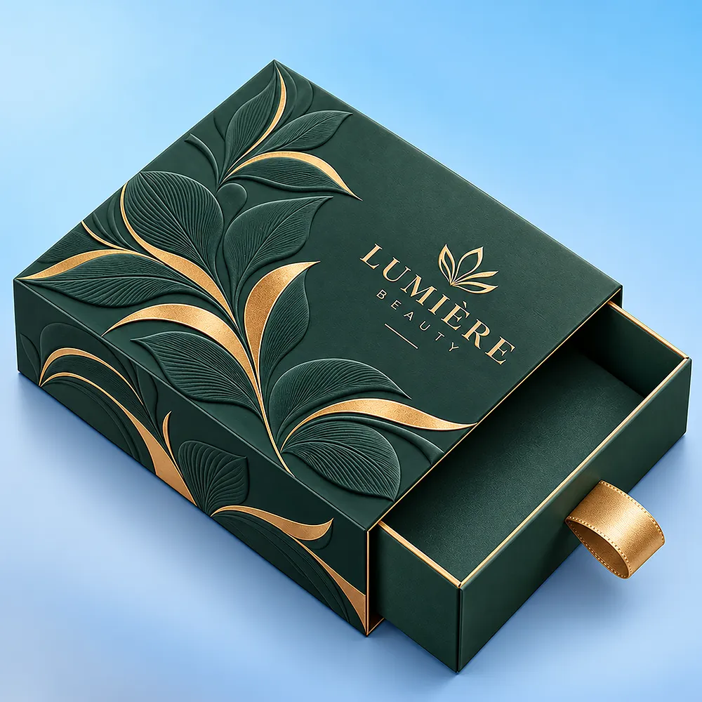
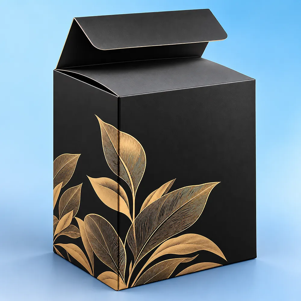
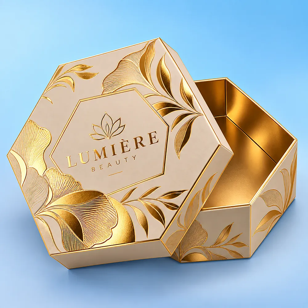
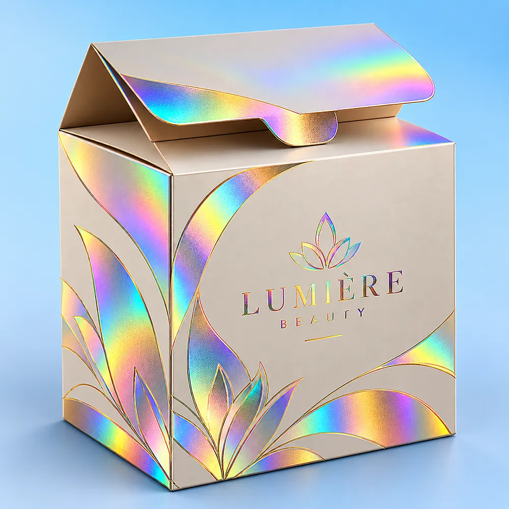
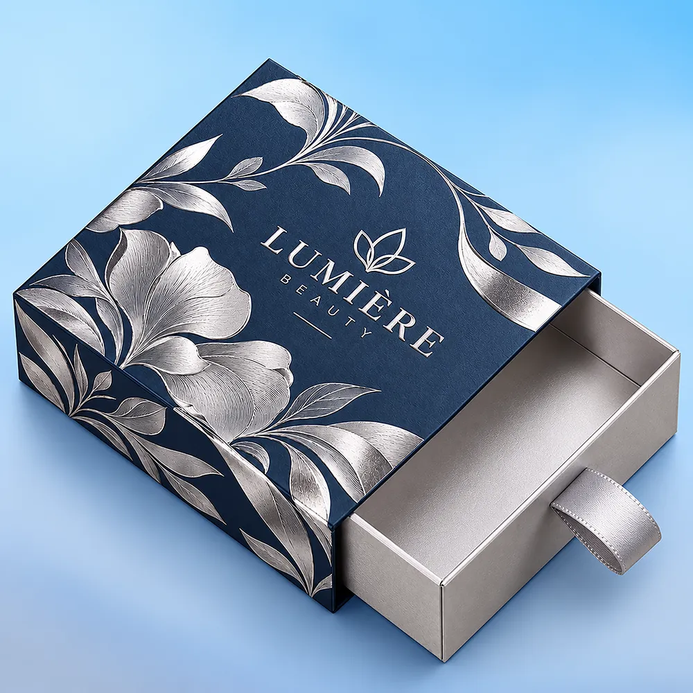
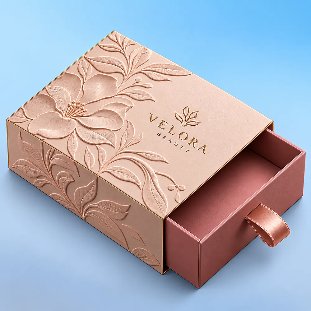
Colored Gable Boxes

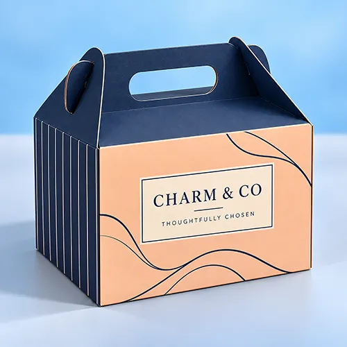
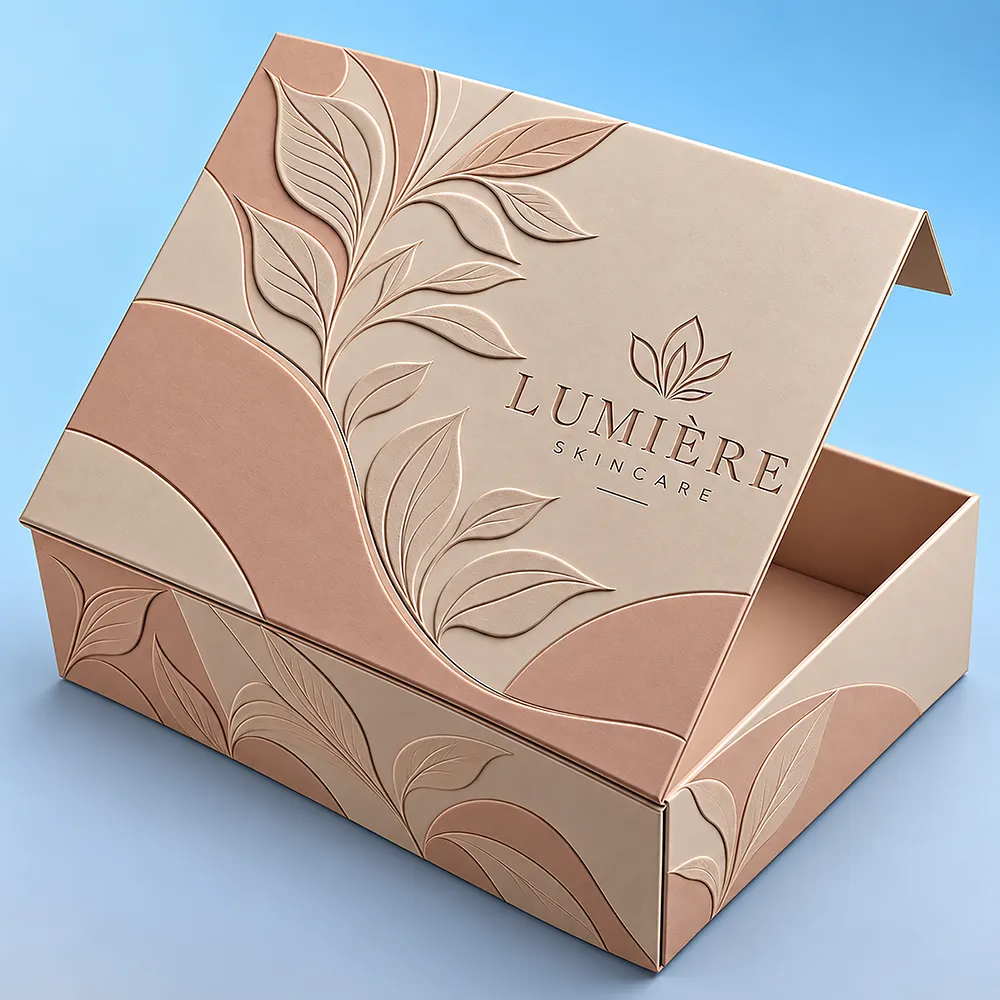
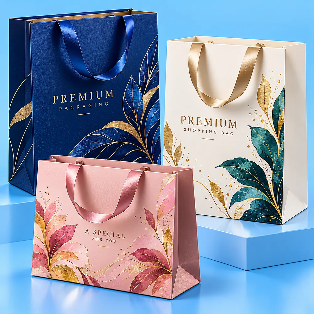
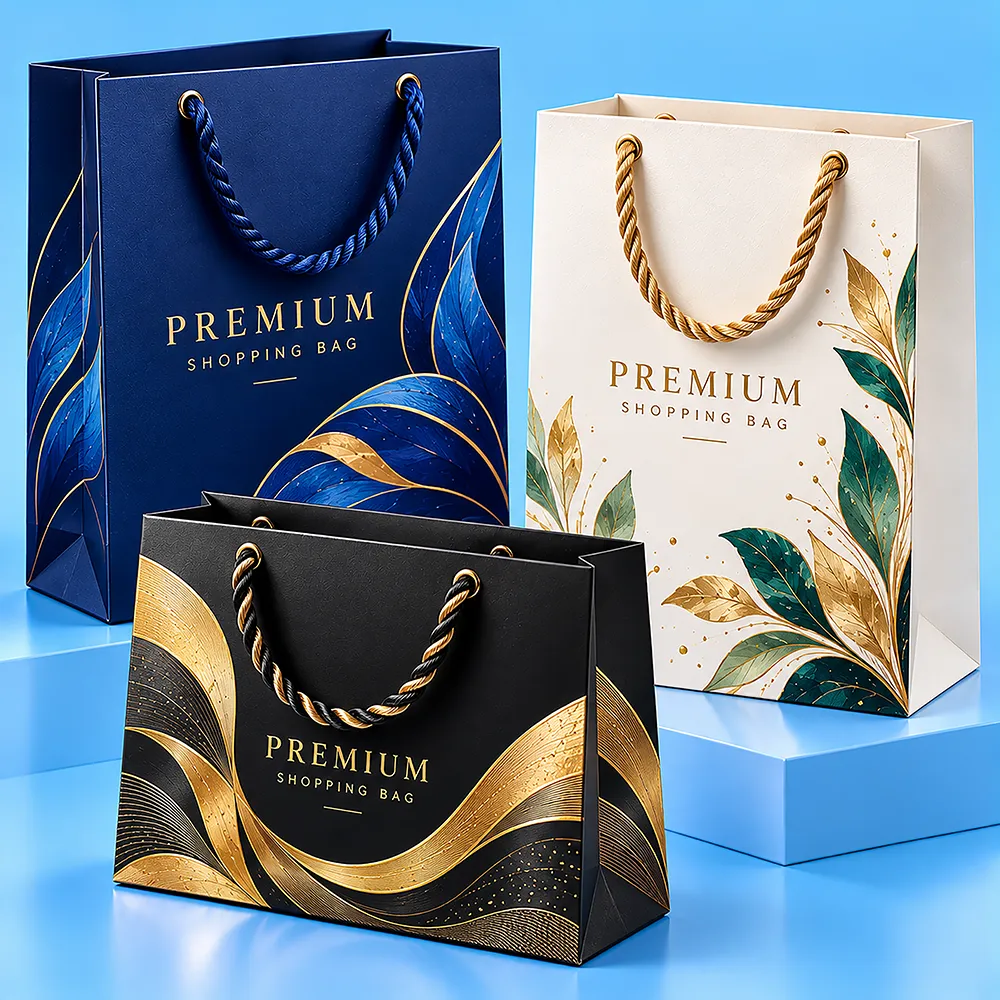
Custom colored gable boxes let brands coordinate the handled gable structure with a defined brand, product, event, or campaign color direction. Black, white, blue, pink, red, green, and other custom colors are visual specifications—not separate materials or one universal production method. The finished appearance depends on the substrate, print process, ink coverage, artwork contrast, coating or finish, and proofing approach. BoxBaba can support custom sizing, artwork, color references, printing, and compatible finishing around the actual packed product. Send your product dimensions, target color or brand reference, quantity by fixed color or artwork version, material preference, and artwork to begin configuration. For broader structural options, explore Custom Gable Boxes.
Trustpilot_Logo
5 out of 5 stars
4.5
Reviews 16 • Excellent

Custom Colored Gable Boxes for Retail, Gifts & Branded Packaging

Custom colored gable boxes designed for retail products, gifts, food-service items, events, favors, and promotional packaging with integrated carry handles, custom color options, branded printing, tailored sizing, and compatible premium finishing features.

What We Give

Create Custom Boxes Quick and Easy

Design

Get your custom boxes made in the required size, shape, and style.

Print

Upload your artwork and get it superbly printed the way you want.

Get it done

Order any quantity, enjoy a wholesale price, pay no extra for die plates.

Related Products

Confirm Product Fit Before Choosing the Color

Color changes the appearance of a Gable Box, but it does not change the basic fit requirements. Before finalizing the color system, define:
  • product length, width, and height;
  • item count;
  • final orientation and arrangement;
  • wrapper or retail packaging;
  • usable rectangular body-height requirement;
  • complete packed weight where relevant;
  • insert or divider requirements;
  • window requirement.
The sloping upper gable panels and handle still reduce the rectangular space available to tall products. A visually correct color specification cannot compensate for a carton that is incorrectly sized for its contents.

A Color Name Is Not a Production Specification

Red, black, blue, or another color name describes the intended appearance, but it does not fully describe how the finished carton should be produced. A useful color brief identifies:
  • target color or brand reference;
  • substrate;
  • full versus partial color coverage;
  • logo and text colors;
  • finish;
  • number of fixed color versions;
  • areas intended to remain unprinted;
  • window openings where applicable.
The same nominal color can appear differently across materials, surfaces, printing processes, and finishes. Color selection should therefore be planned together with the substrate and production method.

Colored Gable Box Selection Matrix

Color Direction Main Artwork Decision Useful Production / Proofing Focus
Black Will logos and essential text maintain enough contrast? Review dark coverage, light artwork, folds, finish, and physical appearance
White Is white the finished appearance or primarily the base for printed artwork? Review substrate shade, print coverage, and colorful artwork against the white surface
Blue Which exact blue—light, navy, corporate, teal-leaning, or another target? Supply a defined reference rather than relying on blue alone
Pink Is the target pale, warm, bright, muted, cool, or brand-specific? Define the shade and review how the selected finish affects its appearance
Red Is the target bright red, deep red, burgundy, orange-red, or another defined shade? Review reference color, broad coverage, substrate, and proofing
Green Is the target bright, dark, muted, blue-leaning, yellow-leaning, or brand-specific? Define the target without implying environmental performance
Custom Brand Color Is consistency with existing packaging or brand assets important? Supply Pantone/PMS or other approved brand references where appropriate
A color name is a starting point—not the complete production brief.

Color-Specific Planning

Black Gable Boxes

Black creates a dark visual field that can support contrasting branding, restrained graphics, or compatible decorative finishes. The first decision is how the black appearance will be produced. When broad dark coverage is printed on a light substrate, artwork and unprinted areas need to be coordinated with the print process. When a genuinely dark substrate is proposed, any opaque light graphics require separate production review. For black packaging, pay particular attention to:
  • logo contrast;
  • small typography;
  • barcode and QR-code readability;
  • broad solid coverage;
  • folds and cut edges;
  • window openings;
  • finish interaction;
  • physical proofing where appearance is critical.

White Gable Boxes

White Gable Boxes can provide a clean visual base for minimal branding, photographs, illustrations, contrasting dark graphics, and full-color artwork. White is not one universal production appearance. Substrate shade, coating, surface texture, print coverage, finish, and lighting can all affect the finished presentation. When white is the main background, decide which areas should remain visually clean and which should carry printed artwork or finishing.

Blue Gable Boxes

Blue can range from pale and pastel shades to navy, royal, teal-leaning, or precise corporate colors. For a brand-led blue project, supply the relevant artwork or color reference and check the contrast between the selected blue and:
  • logos;
  • small text;
  • product information;
  • barcodes;
  • QR codes;
  • decorative finishing.

Pink Gable Boxes

Pink can be pale, warm, cool, bright, muted, or highly brand-specific. Define the intended shade rather than using pink as the entire production instruction. For lighter shades, check whether pale artwork remains visible. For deeper or more saturated pink directions, review how typography, logo contrast, and the chosen finish behave against the background.

Red Gable Boxes

Red may be used as a brand color, campaign color, promotional background, event color, or seasonal component. Bright red, deep red, orange-red, burgundy, and other shades can create very different finished results. Review the target reference together with:
  • substrate;
  • print coverage;
  • print process;
  • finish;
  • proofing.
When Christmas campaign planning is the main buyer task rather than general red packaging, compare Christmas Gable Boxes.

Green Gable Boxes

Green belongs within the same Colored Gable Boxes hub rather than requiring another standalone product page. Define whether the target green is:
  • bright;
  • dark;
  • muted;
  • blue-leaning;
  • yellow-leaning;
  • tied to a brand standard.
Green is a visual choice. The color itself does not establish recyclability, sustainability, natural materials, or environmental performance.

Printed Color vs. Substrate Color

A colored-looking Gable Box can be produced through different approaches.
Color Method What It Means Buyer Consideration
Printed color on a light substrate Printed coverage creates the target visual color Useful for defined brand/campaign colors; substrate, coverage, folds, finish, and proofing still affect appearance
Natural Kraft surface The brown appearance comes from the Kraft paperboard itself The substrate becomes part of the artwork and color system
Colored substrate where available The underlying material itself provides a color Exact availability, shade, print compatibility, and treatment of light graphics must be verified for the project
These approaches should not be treated as visually or technically identical. When natural brown Kraft is the primary buying requirement rather than general color selection, review Kraft Gable Boxes.

Material for Colored Gable Box

Color selection does not replace material selection. The substrate still has to work with the packed product, dimensions, folds, handle, bottom, window, printing, finishing, and intended presentation.

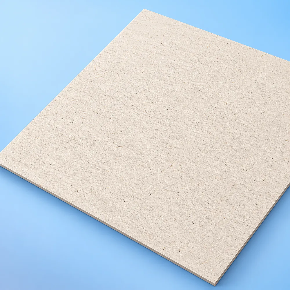
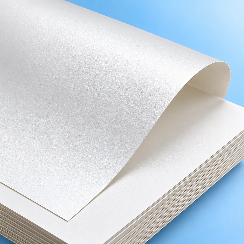
White Paperboard / Cardstock

White paperboard or cardstock may suit colored Gable Box projects where:
  • a folding-carton structure is appropriate;
  • a lighter base is useful for printed graphics;
  • detailed artwork is important;
  • smooth branded presentation is desired;
  • the loaded configuration suits the approved material.
The exact stock should be selected around product fit and the proposed printing/finishing specification. The term paperboard does not establish one universal thickness or carrying capacity.

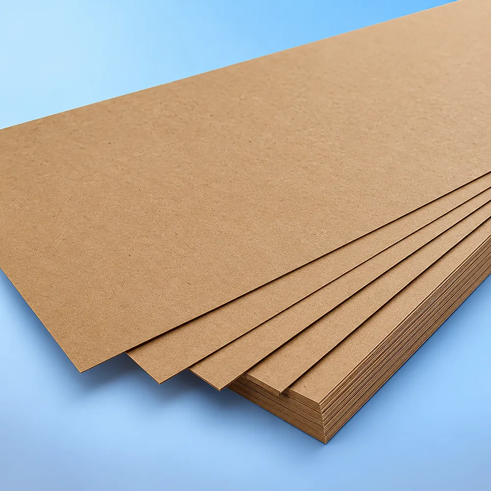
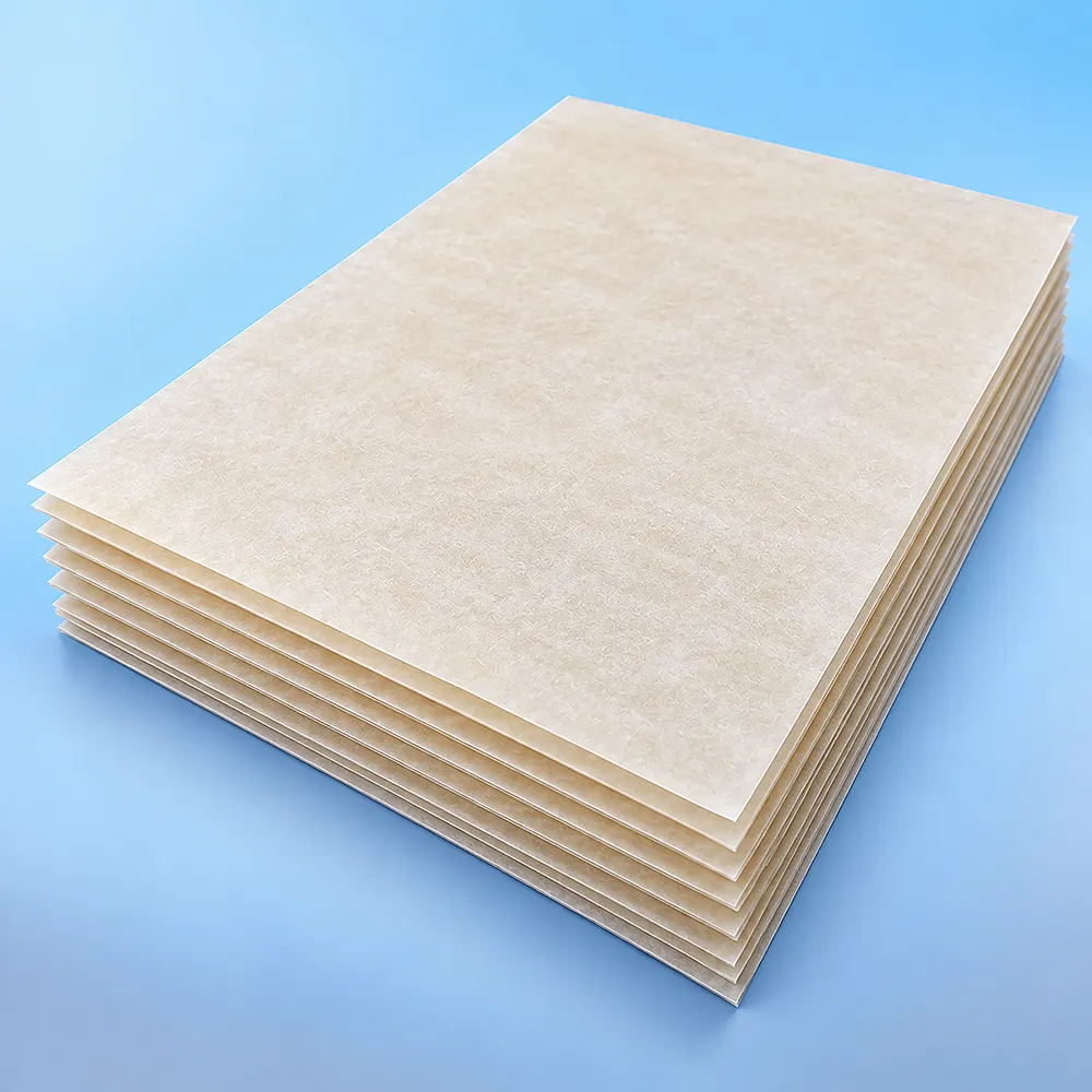
Kraft Paperboard

Natural Kraft paperboard contributes its own brown tone to the finished design. That can influence:
  • contrast;
  • lighter colors;
  • photographs;
  • fine graphics;
  • finish appearance.
Kraft should be chosen because its material and visual characteristics suit the project—not because it is assumed to be recycled, recyclable, biodegradable, compostable, or environmentally preferable.

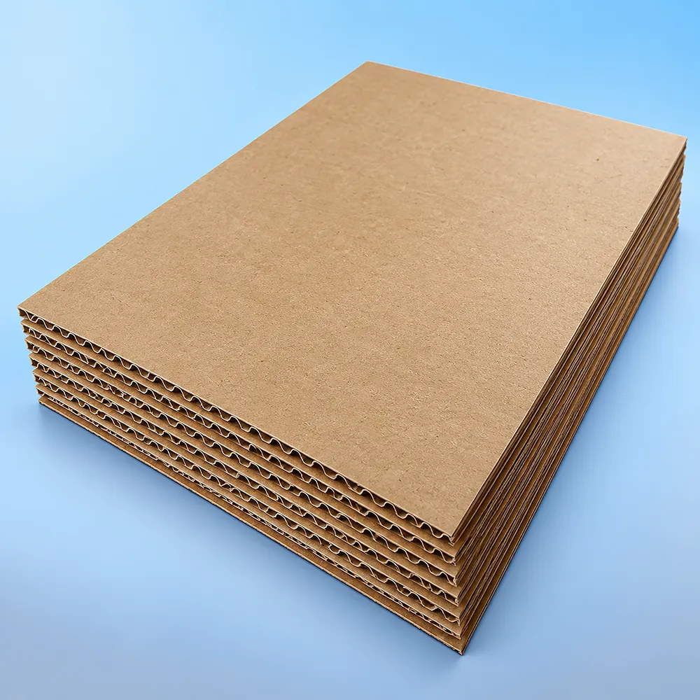
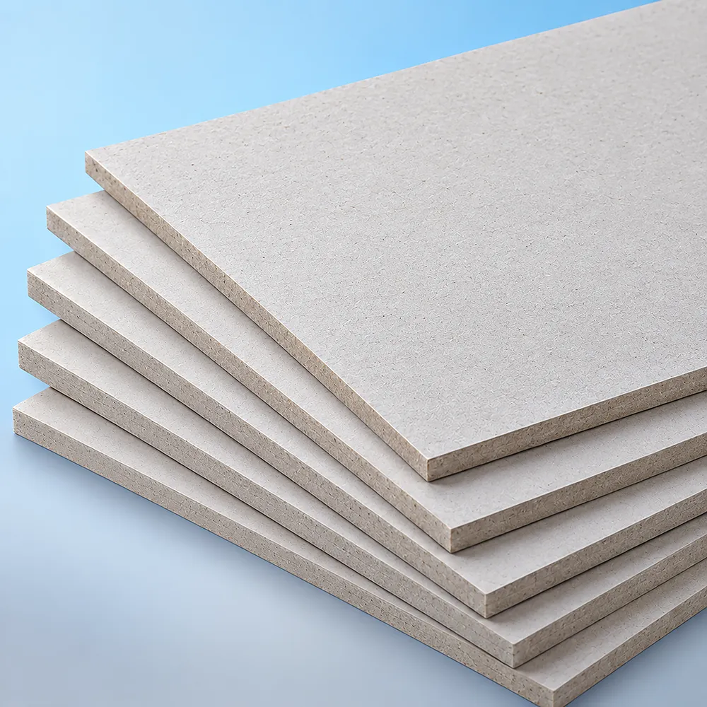
Corrugated Board

Corrugated construction may deserve evaluation where dimensions, packed weight, rigidity, or handling requirements call for a different structural direction. Compared with smoother folding-carton material, the corrugated construction can also change:
  • surface appearance;
  • fold behavior;
  • print result;
  • storage;
  • presentation.
Color should follow the approved structural material rather than determine the structure by itself.

Dark Backgrounds, Coverage and Contrast

Dark Colored Gable Boxes create specific artwork decisions. Review:
  • logo visibility;
  • type size and contrast;
  • barcodes;
  • QR codes;
  • line art;
  • broad solid-color areas;
  • folds and score lines;
  • handle cutouts;
  • windows;
  • finish accents.
A design that appears clear on a bright display may not produce the same contrast after printing. If the project uses a genuinely dark material and requires opaque light graphics, flag that requirement before artwork approval so the feasible production method can be confirmed.

Logo Legibility on Colored Gable Boxes

Color should support branding rather than compete with it. Before approving artwork, ask:
  • Does the logo have enough contrast?
  • Will small text remain readable?
  • Are QR codes and barcodes on suitable backgrounds?
  • Does critical artwork cross a fold or handle opening?
  • Does a window remove part of the intended branding area?
  • Will foil, Spot UV, embossing, or debossing affect how the logo reads?
A strong color concept is not useful if required information becomes difficult to read.

Ordering Multiple Color Versions

Some projects require the same Gable Box structure in several fixed colors or artwork versions. Examples include:
  • product-line differentiation;
  • flavor or variant coding;
  • event themes;
  • retail collections;
  • campaign versions.
Provide:
  • total quantity;
  • quantity by color;
  • quantity by artwork version;
  • whether every version uses the same dimensions;
  • whether material and structure remain the same;
  • target reference for each color.
Do not treat the combined order quantity as sufficient when the production run is divided among several versions.

Windows on Colored Gable Boxes

A display window can create contrast between the box color and the visible product, but it also removes structural material and printable/color area from the panel. Plan the window around:
  • product position;
  • opening size and shape;
  • remaining panel area;
  • folds;
  • handle;
  • bottom;
  • glue or lock zones;
  • logo placement;
  • color coverage.
When product visibility becomes the primary structural decision rather than color, compare Window Gable Boxes.

Printing and Finishing

Printing and finishing determine much of the final appearance of Colored Gable Boxes, but they perform different jobs. Printing applies color, logos, text, images, and patterns. Finishing changes surface appearance, tactile character, or localized visual emphasis. The specification should consider:
  • substrate;
  • target color;
  • quantity;
  • number of color/artwork versions;
  • artwork complexity;
  • image and detail requirements;
  • ink coverage;
  • repeat-order needs;
  • paperboard versus corrugated surface;
  • gable-box functional zones.

Offset Printing

Offset printing may be evaluated where the selected paperboard, artwork detail, coverage, quantity, and repeat-order requirements support the process. It can suit detailed printed graphics and broad color areas on compatible substrates. There is no universal quantity at which offset automatically becomes the correct process.

Digital Printing

Digital printing may be useful for:
  • shorter quantities;
  • test programs;
  • several fixed artwork/color versions;
  • product launches;
  • changing campaigns;
  • projects where reduced plate-related setup is useful.
Suitability still depends on the substrate, artwork, coverage, quantity, and required appearance.

Flexographic Printing

Flexographic printing may be evaluated where the selected paper or corrugated substrate, artwork style, coverage, quantity, and production format suit the process. Print-method selection should follow the substrate and graphic requirements—not the color name alone.

CMYK and Pantone/PMS

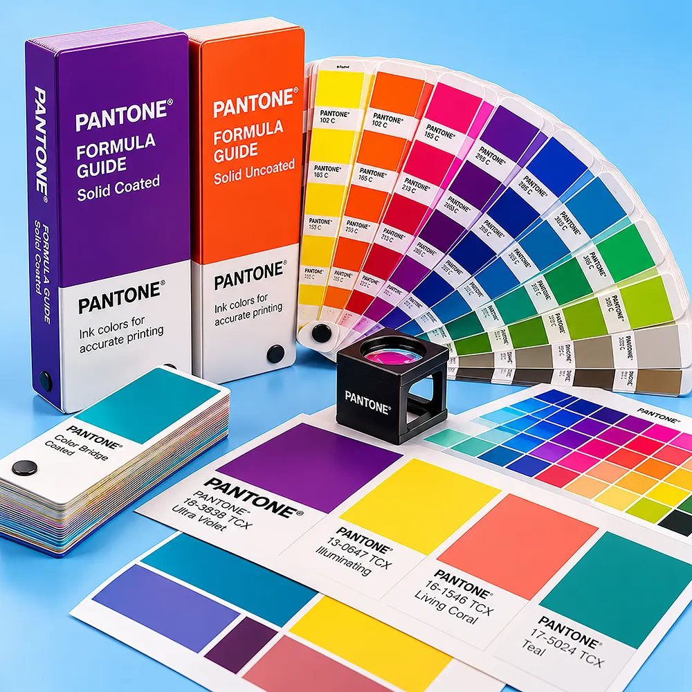
CMYK is commonly useful for photographs, illustrations, gradients, and multicolor artwork. Pantone/PMS references can help communicate defined brand or spot-color targets where appropriate. Neither should be treated as an absolute finished-color guarantee. Final appearance can be influenced by:
  • substrate color;
  • coated or uncoated surface;
  • ink;
  • print process;
  • coverage;
  • proofing;
  • finishing;
  • viewing conditions.
A printed physical reference may be useful where a brand color is especially important.

Artwork for Colored Gable Boxes

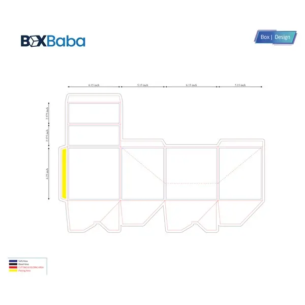
Prepare artwork on the approved gable-box dieline and account for:
  • front and back body panels;
  • side panels;
  • sloping gable panels;
  • handle cutouts;
  • score and fold lines;
  • closure tabs;
  • bottom flaps;
  • glue and lock zones;
  • window openings;
  • barcodes;
  • QR codes;
  • fixed color/artwork-version areas.
Keep critical logos, text, codes, and fine graphics away from folds, windows, handles, locks, and glue zones where production or readability may be affected. For dark designs, identify any opaque light-artwork requirement before final artwork approval so the feasible production approach can be confirmed.

Finishing and Color Interaction

Depending on material and structural compatibility, finishing options may include:
  • matte;
  • gloss;
  • soft touch;
  • foil stamping;
  • embossing;
  • debossing;
  • Spot UV.
The same printed color can present differently with different surface treatments. For example:
  • gloss creates a more reflective surface;
  • matte reduces surface sheen;
  • soft touch changes tactile character;
  • foil creates a separate decorative metallic effect;
  • Spot UV adds localized gloss contrast;
  • embossing and debossing add physical dimension.
Finishes should therefore be coordinated with the color system rather than selected independently. They can also add production setup and cost, so use them where the appearance or tactile effect justifies the additional specification. Finishing should not be treated as evidence of greater structural strength or guaranteed durability.

Proofing Color Before Production

Different proofing methods reduce different risks.

Digital Proof or 3D Mockup

Useful for reviewing:
  • artwork position;
  • color relationships;
  • logo size;
  • panel hierarchy;
  • version differences;
  • window/artwork interaction.
A screen-based proof is useful for layout but is not the same as seeing the final printed substrate.

Structural Sample

Useful for validating:
  • product fit;
  • dimensions;
  • usable body height;
  • folds;
  • handle;
  • bottom;
  • window;
  • assembled appearance.
A blank structural sample may not answer final color or finish questions.

Printed Physical Sample

A printed physical sample may be useful when the buyer needs to evaluate:
  • a critical brand color;
  • broad dark coverage;
  • substrate influence;
  • logo contrast;
  • matte versus gloss presentation;
  • foil or Spot UV interaction.
Choose the proofing method according to the risk the project needs to reduce.

When Another Gable Box Page May Be More Useful

Dominant Requirement Better Starting Point
Natural brown Kraft material is the main requirement Kraft Gable Boxes
Product visibility and window engineering dominate Window Gable Boxes
Christmas campaign planning drives the red/green palette Christmas Gable Boxes
Food, bakery, gift, favor, takeout, large-size, or another application dominates Start with that application/size page and treat color as a configuration
Color should not override the actual structural or application requirement.

What Affects the Cost of Custom Colored Gable Boxes?

Pricing depends on the complete specification, not simply whether the box is black, white, blue, pink, red, or green. Relevant factors may include:
  • finished dimensions;
  • material;
  • amount of printed coverage;
  • printing method;
  • total quantity;
  • quantity by fixed color/artwork version;
  • window;
  • inserts or dividers;
  • bottom/closure requirements;
  • finishing;
  • proof or sample requirements.
One large run using a single color version can have different production requirements from the same total quantity divided among several versions. Provide quantity by version during quotation.

Why Choose BoxBaba for Colored Gable Boxes?

BoxBaba supports Colored Gable Box projects around the relationship between the product, material, artwork, color target, printing, and finishing rather than treating color as an isolated choice. Current project support includes:
  • custom sizing as applicable;
  • standard MOQ starting from 100 boxes;
  • artwork assistance;
  • dieline, 3D mockup, and proofing support as applicable;
  • sample support under the current policy;
  • offset, digital, and flexographic printing according to project compatibility;
  • CMYK and Pantone/PMS references where appropriate;
  • matte, gloss, soft-touch, foil, embossing, debossing, and Spot UV where compatible;
  • standard production generally within 5–9 business days after final artwork approval;
  • free shipping across the USA under the current offer.
Start with the target color, product dimensions, quantity by version, material preference, and artwork so the complete specification can be reviewed together.

Request a Custom Colored Gable Box Quote

Send BoxBaba:
  • product or use type;
  • product dimensions;
  • total quantity;
  • quantity by fixed color or artwork version;
  • desired material if known;
  • window requirements;
  • insert or divider requirements;
  • logo and artwork files;
  • printing preferences;
  • finishing preferences;
  • artwork status;
  • delivery destination;
  • required in-hand date if applicable.
These inputs help BoxBaba review product fit, substrate, color approach, artwork contrast, printing, finishing, proofing, and production requirements as one complete Colored Gable Box project. Request a Custom Quote +1 305 574 4357 sales@boxbaba.com

Frequently Asked Questions

Find all the urgent questions you may have.

Colored Gable Boxes are handled gable-style cartons configured around a selected visual direction such as black, white, blue, pink, red, green, or another brand color. The finished appearance may involve printing, substrate choice, or another approved project-specific approach.
These color directions can be evaluated as part of a custom project. Provide an exact shade or brand reference where possible rather than relying only on a general color name. The material and production approach should be confirmed during quotation and proofing.
It depends on the approved specification. A target appearance may be created through printed coverage on a compatible substrate or, where a suitable colored substrate is verified, through the material itself. These approaches should not be assumed to look or behave identically.
White paperboard provides a lighter visual base, while natural Kraft contributes a brown substrate tone to the artwork. The same printed design can therefore appear different across the two materials.
No. Pantone/PMS can provide a useful shared reference for a target color, but substrate, coating, ink, print process, proofing, finishing, and viewing conditions can influence the finished appearance.
That depends on how the dark appearance is produced. Identify any opaque light-logo or text requirement during quotation so the feasible material and printing approach can be confirmed before the artwork is approved.
Multiple fixed versions may be evaluated. Provide the quantity for each color or artwork version and confirm whether the dimensions, material, and structure remain the same across versions.
A window may be evaluated where visibility is useful. Its position should be coordinated with the product, colored artwork, folds, handle, bottom, glue/lock zones, and remaining printable panel area.
BoxBaba standard MOQ starts from 100 boxes. Multiple color versions, specialized materials, structures, or printing requirements may require separate confirmation.
Standard production generally takes 5–9 business days after final artwork approval. Production is separate from shipping and transit, so the required in-hand date should be reviewed with the complete project specification.