
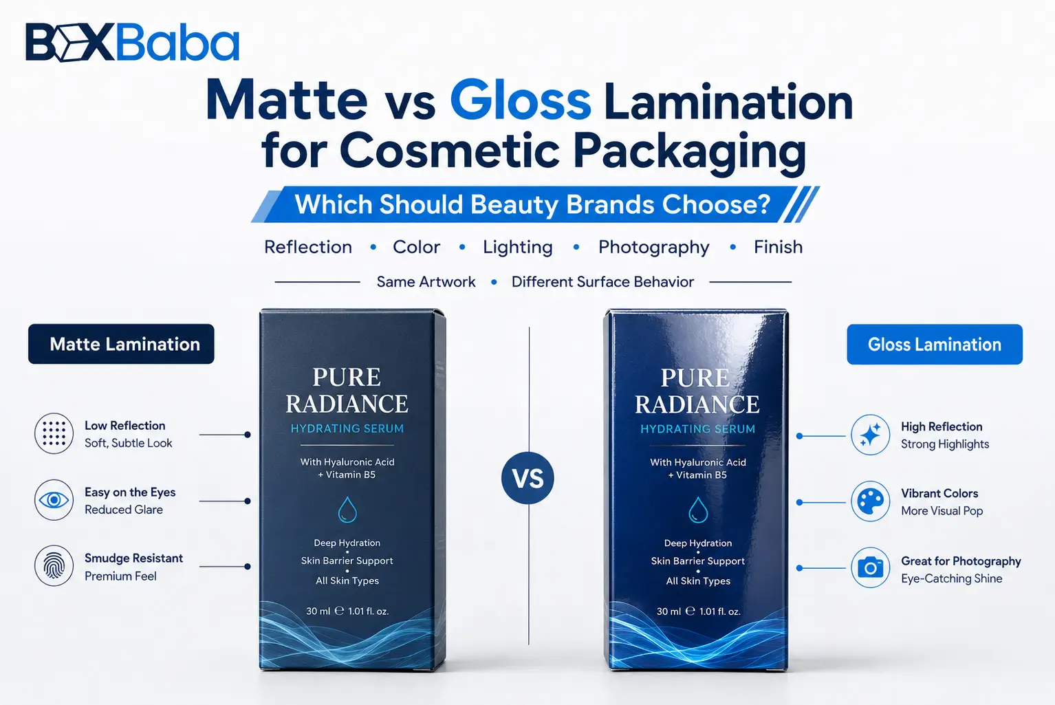
Choose matte lamination when cosmetic packaging needs lower reflection, restrained artwork or a softer visual presentation. Choose gloss when vivid colors, photography or a more reflective shelf appearance are more important. Neither is inherently better. The right choice depends on the artwork, substrate, product positioning, sales environment and an approved physical sample.
For beauty brands, matte vs gloss is not simply a style choice. The surface can change how colors appear, how glare behaves under retail lighting, how easy the box is to photograph, how dark artwork shows handling, and how the package works with foil, Spot UV and other selective effects. The best decision therefore starts with the finished packaging design rather than a rule such as skincare should always be matte or makeup should always be glossy.
Matte vs Gloss Lamination: Quick Comparison
Decision Factor | Matte Lamination | Gloss Lamination |
Surface appearance | Low-reflective, restrained | Shiny, more reflective |
Color appearance | Can look softer or more subdued | Can make colors appear more saturated or vivid |
Typical design direction | Minimal, clinical, natural, understated, premium | Bold, colorful, energetic, promotional |
Retail lighting | Lower direct glare | More reflections at some viewing angles |
Product photography | Usually easier to control reflections | May need more deliberate lighting control |
Dark artwork | Can look refined; rubbing or scuff visibility should be tested | Can look deep and polished; fingerprints and reflections may be noticeable |
Bright graphics | Can soften visual intensity | Often supports vivid, high-impact artwork |
Selective finish combinations | Useful base for Spot UV, foil and embossing | Can also pair with foil and selected decorative effects |
Best approval method | Physical sample using the actual board and artwork | Physical sample using the actual board and artwork |
Use this comparison as a starting point, not a universal specification. The same artwork can look different when printed on different boards, with different inks and different lamination films.
What Is Lamination on Cosmetic Packaging?
Lamination is a post-print finishing process in which a thin film is bonded to a compatible printed surface. On paper-based cosmetic packaging, it is commonly used on folding cartons, sleeves and wrapped presentation packaging to change surface appearance and add a protective layer over the print.
Matte lamination creates a lower-reflective surface. Gloss lamination creates a smoother, more reflective surface. Those terms should not automatically be treated as interchangeable with matte coating, gloss coating, UV coating or soft-touch lamination because different finishing systems can produce different visual, tactile and production results.
When requesting a quotation, specify whether you want matte lamination or gloss lamination rather than simply asking for a matte box or shiny box.
The Main Difference: Reflection Changes How the Design Is Seen
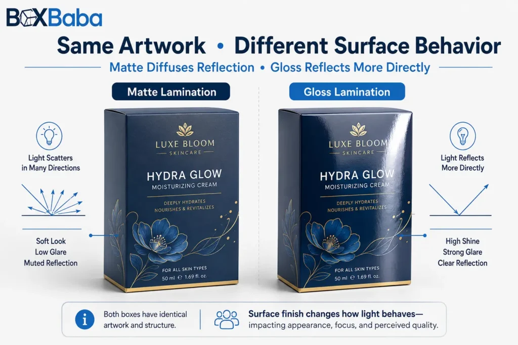
The most important difference is how the finished surface interacts with light. Matte diffuses more reflected light and usually creates a quieter appearance. Gloss reflects more light directly, which can make colors and graphic contrast appear stronger but can also create visible highlights or glare.
This means finish selection should be connected to the design objective. A white skincare carton with fine typography and a restrained color palette may not benefit from the same surface as a lip-gloss collection built around saturated pink, red and purple graphics.
Is Matte or Gloss Better for Skincare Packaging?
Matte is often a strong starting direction for skincare packaging when the brand uses clinical, minimalist, natural or understated visual cues. Serums, moisturizers, eye creams and face oils frequently use quieter artwork where lower reflection can support the intended presentation.
That does not make matte the default for every skincare product. A youth-focused moisturizer, bright sunscreen collection, colorful acne-care line or promotional skincare set may benefit from gloss if strong color intensity is part of the brand system.
For a product-specific example, custom serum boxes can be planned around the finished bottle, artwork and selected finish rather than using a generic skincare rule.
Is Matte or Gloss Better for Makeup Packaging?
Gloss can be useful for color cosmetics when vivid shades, gradients, photography or bold graphics are central to the design. Lip products, eyeshadow collections and promotional makeup launches may gain more visual energy from a reflective surface.
Matte can be the better direction when a makeup brand uses limited color, large areas of negative space, metallic foil or restrained typography. A minimalist lipstick carton and a high-color lip-gloss carton may therefore need different finishes even though both belong to the same broader makeup category.
Brands comparing finishes for wand tubes, squeeze tubes or gloss sets can review custom lip gloss boxes for product-specific packaging directions.
Matte vs Gloss by Cosmetic Product Type
Cosmetic Product | Matte May Suit | Gloss May Suit |
Serum | Clinical, minimal or premium skincare artwork | Colorful treatment lines or promotional collections |
Face cream | Clean beauty, restrained skincare, neutral palettes | Bright mass-retail or youth-oriented graphics |
Moisturizer | Natural, clinical or understated branding | High-color retail artwork |
Face oil | Botanical or luxury positioning | Vibrant wellness or promotional graphics |
Lipstick | Minimal luxury, black/neutral cartons, foil-led designs | Bold shade coding and colorful collections |
Lip gloss | Premium minimal branding | Bright, playful or youth-focused packaging |
Mascara | Restrained premium branding | Strong color blocks and graphic-heavy designs |
Foundation | Clinical or premium positioning | Photography, gradients or vivid shade systems |
Eyeshadow | Minimal palette presentation | Color-led collections and promotional sets |
Perfume | Understated fragrance presentation | High-impact graphic fragrance collections |
These are design directions rather than fixed rules. The actual substrate, print coverage, brand system and physical sample should decide the final specification.
Choose by Artwork, Not Product Type Alone
A more reliable decision sequence is:
Product > Brand Position > Artwork > Sales Channel > Surface Finish > Physical Proof
This sequence avoids forcing one finish across an entire cosmetic category. A serum can be glossy. A lipstick can be matte. The finish should support what the specific artwork is trying to communicate.
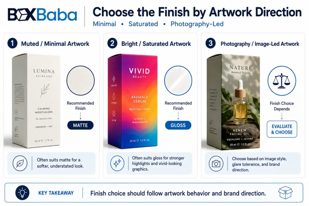
Muted or Minimal Artwork
Matte often supports white space, fine typography, neutral palettes, botanical graphics and restrained layouts because the lower-reflective surface does not compete as strongly with subtle design elements.
Bright, Saturated Artwork
Gloss can make vivid colors, gradients and high-contrast graphics appear more energetic. It can be particularly useful when shade coding or colorful collection artwork needs strong visual presence.
Photography and Image-Led Artwork
Gloss can support image depth and color intensity, but the reflective surface also changes how the finished package looks under lighting. Matte may make image-led packaging feel softer. Approve the printed result rather than judging only from the digital artwork file.
How Matte and Gloss Affect Cosmetic Packaging Colors
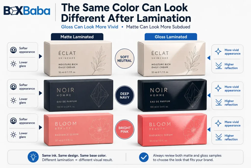
The same printed color can appear different after lamination. Gloss can increase the perception of saturation and contrast because of the way light reflects from the surface. Matte can make the same artwork appear softer or more subdued.
This matters when a cosmetic range uses one brand color across several SKUs. If a serum carton is matte and a moisturizer carton is gloss, the printed color may not appear identical even when the artwork uses the same digital color values.
For Pantone/PMS colors, dark solids, neutral luxury palettes and shade-coded makeup families, evaluate the color on the finished surface rather than approving it only on screen.
Dark Cosmetic Packaging Needs Extra Finish Testing
Black, navy, burgundy, dark green and other deep colors can create strong cosmetic packaging, but they also make surface behavior easier to notice.
Dark matte cartons may show rubbing, polishing or scuffing depending on the exact film, ink coverage, substrate and handling conditions. Dark gloss cartons can make fingerprints, reflections and surface highlights more visible. There is no reliable universal rule that one finish always hides handling better.
If dark solids are important to the brand system, review the actual printed and laminated sample after normal handling. This is more reliable than choosing from a small finish swatch.
Matte vs Gloss Under Retail Lighting
Cosmetic packaging in stores is viewed under overhead LEDs, spotlights, shelf lighting and changing viewing angles. Gloss can create bright reflections that increase visual impact from one angle but reduce legibility from another. Matte generally reduces direct glare.
For packaging with small product names, shade identifiers, ingredient panels or other decision-critical copy, test readability under realistic lighting rather than relying only on a studio proof.
If the finish is being chosen as part of the complete packaging specification, review How to Choose Cosmetic Packaging Boxes before finalizing artwork and surface treatments.
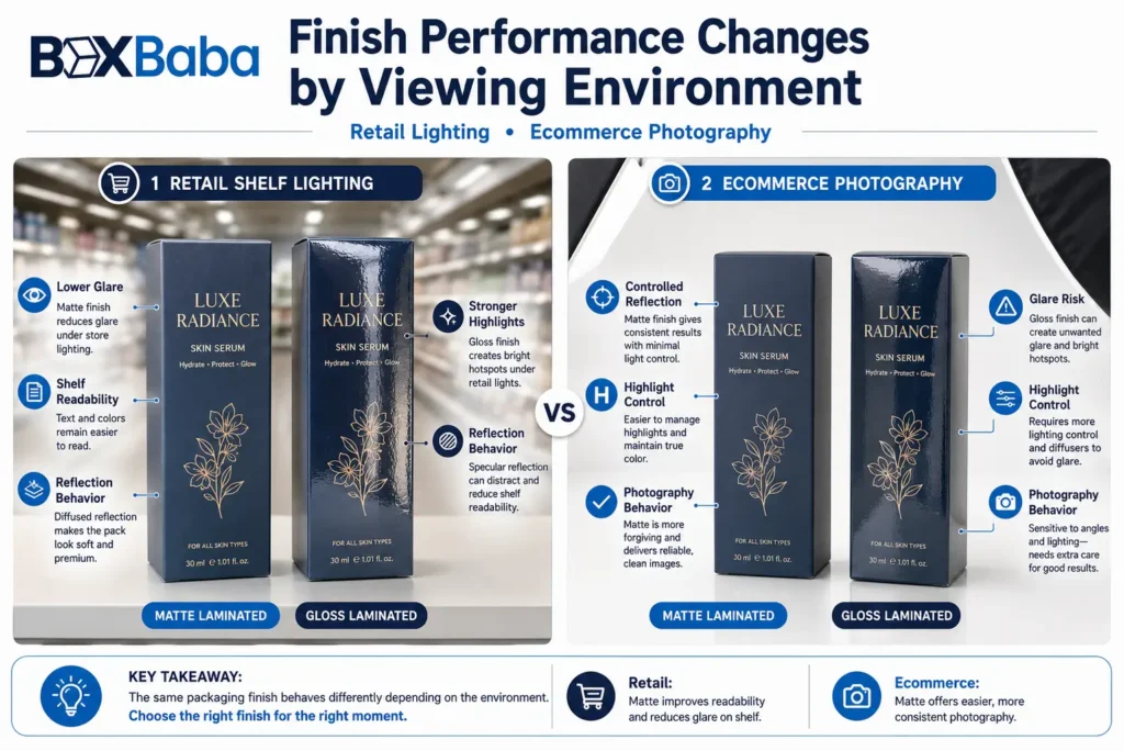
Which Finish Photographs Better for Ecommerce?
Matte usually creates fewer strong reflections, which can make product photography easier in many lighting setups. Gloss can still photograph well, but reflections often need more deliberate control so that highlights do not obscure artwork or text.
The finish decision should also be separated from shipping protection. Lamination changes the retail carton surface; it does not turn a folding carton into a parcel-shipping package. Cosmetic products sold online may still need a suitable outer mailer or shipping carton based on the packed product and order configuration.
Small Text, Barcodes and QR Codes
Matte can be helpful when lower glare improves the viewing of dense information panels, but lamination cannot compensate for poor typography, weak contrast or undersized text. Ingredient lists, directions, quantity statements and other required copy should first be designed for legibility.
Barcode and QR-code performance depends on the complete printed result, including code size, contrast, quiet zone, print definition, surface reflectivity and placement. Keep machine-readable codes away from folds, glue seams and heavily distorted areas where practical, then test the finished package with the intended scanning devices.
Can Matte Lamination Be Combined With Spot UV or Foil?
Yes. A matte base with selective Spot UV is a common way to create low-gloss/high-gloss contrast. The matte surface stays restrained while Spot UV can highlight a logo, product name, pattern or selected graphic element.
Matte can also provide a controlled background for metallic foil. Gold, silver, rose-gold or another foil direction may become more visually distinct when surrounded by a lower-reflective surface.
The goal should be hierarchy rather than adding every available finish. When matte, foil, embossing, Spot UV and dense artwork are all used together, individual effects can begin to compete with each other.
For the broader finish taxonomy – including foil, embossing, debossing, Spot UV and soft touch – use the Cosmetic Packaging Finishes Guide rather than expanding this matte-vs-gloss decision into every finishing method.
Is Soft-Touch Lamination the Same as Matte Lamination?
Not necessarily. Matte lamination and soft-touch lamination may both create low-reflective surfaces, but they should not automatically be treated as identical specifications. Soft-touch is normally selected when a more pronounced tactile character is part of the design objective.
When comparing supplier quotations, confirm the actual film or finishing system rather than assuming that matte,soft touch and velvet feel describe the same production specification.
Is Lamination the Same as a Matte or Gloss Coating?
No. Lamination generally involves bonding a film to the printed substrate, while coatings are applied through different finishing processes. Both may be described as matte or gloss, but the production method, appearance, tactile result, cost and recycling considerations can differ.
Compare the actual finishing specification, not only the surface description.
Does Lamination Make a Cosmetic Box Structurally Stronger?
Lamination can protect the printed surface from normal rubbing and handling, but it should not be selected as a substitute for the correct carton material, board thickness, box structure or insert.
A heavy glass serum bottle still needs a carton planned around its dimensions, filled weight and closure. A perfume bottle may need fitted support. An ecommerce order may need an outer shipping package. Structural decisions should therefore come before decorative finishing decisions.
Finished Product > Measurements > Weight > Box Structure > Material > Insert > Artwork > Finish
For measurement planning before structure and finishing, use the Cosmetic Box Size Guide.
Retail vs Ecommerce: How the Sales Channel Changes the Decision
For retail, evaluate shelf lighting, viewing angle, handling frequency, color impact from a distance and readability of important front- and side-panel information.
For ecommerce, evaluate how the finish photographs, how it fits the digital brand aesthetic, how the retail carton will be protected inside the shipping system and how it appears during unboxing.
Brands selling through both channels do not necessarily need two different laminations. They need a finish that supports the artwork across both environments while the outer distribution packaging changes where required.
Should Every Cosmetic SKU Use the Same Lamination?
Not always, but variation should be intentional. Using the same lamination across serum, moisturizer, eye cream and face oil cartons can help the range feel visually connected. Changing finishes can also create hierarchy when a limited edition, premium tier or special launch needs a different surface treatment.
Before mixing finishes, compare the cartons together on a shelf, in ecommerce collection photography and in the complete brand system. A difference should communicate something meaningful rather than appear accidental.
Does Matte or Gloss Change How Consumers Perceive Packaging?
Research suggests that visual finish can influence consumer judgments, but the effect is contextual rather than a universal rule that matte always feels more premium or gloss always performs better.
A 2021 Marketing Letters study found situations in which glossy packaging reduced perceived brand trust, while a 2023 Psychology & Marketing study found that matte-versus-gloss effects on perceived product effectiveness varied with the type of problem-solving product and consumer goal orientation. These studies were not cosmetic-packaging rules, but they reinforce a practical point: surface finish can affect perception, so beauty brands should match the finish to the intended positioning rather than treating one option as inherently superior.
Research references: Han & Pandelaere (2021), Marketing Letters; Huang, Song & Yang (2023), Psychology & Marketing.
Does Matte or Gloss Lamination Affect Recyclability?
The answer depends on the complete material system, including the paperboard, lamination film, adhesives, other decorative layers and the recycling infrastructure in the target market. Do not describe matte or gloss lamination as automatically recyclable, compostable or sustainable without confirming the actual construction and local acceptance.
If recyclability is a project priority, ask the packaging supplier to identify the proposed film and material combination before making environmental claims on the finished package.
Is Matte or Gloss Lamination More Expensive?
Do not assume that one option is always more expensive. Pricing can depend on the film specification, substrate, sheet size, print process, run quantity, lamination area, setup requirements and any additional effects such as foil or Spot UV. Compare quotations using the same box, board and artwork specification.
How to Choose Between Matte and Gloss Lamination
Define the brand direction. Decide whether the design needs restrained, clinical, natural, premium, bold, colorful or promotional presentation.
Review the artwork. Check color saturation, photography, fine typography, dark solids and how much visual impact depends on reflection.
Check the sales environment. Consider retail lighting, ecommerce photography, handling and how the package will be viewed.
Review the substrate and print. The same finish can look different on different boards, inks and print coverage.
Add selective effects only where they have a purpose. Use Spot UV, foil or embossing to create hierarchy rather than decoration for its own sake.
Approve a physical sample. Handle it, photograph it, scan codes and review color and glare before bulk production where finish quality is important.
What to Check Before Approving Matte or Gloss
A physical sample can reveal surface behavior that a digital mockup cannot show. Check:
- Brand-color appearance on the final substrate
- Dark solid areas after normal handling
- Glare under overhead and angled lighting
- Fingerprints, rubbing and visible scuffs
- Readability of fine copy and side-panel information
- Barcode scanning
- QR-code scanning
- Foil or Spot UV registration where used
- Fold, score and cut-edge appearance
- Consistency across related SKUs
- Appearance in ecommerce or campaign photography
Common Mistakes When Choosing Matte or Gloss Cosmetic Packaging
Assuming matte automatically means luxury. Premium presentation comes from the complete packaging system – structure, material, print quality, typography, color control and finishing – not from matte alone.
Choosing gloss only to make the box stand out. High reflection can support vivid artwork, but glare and photography should still be tested.
Making the decision from a screen mockup. Digital renders cannot reproduce the exact reflectivity, texture, handling marks or final color appearance.
Ignoring the substrate. SBS paperboard, kraft board and wrapped rigid board do not produce identical results simply because the same finish name is used.
Using finish to solve a structural problem. Lamination does not replace correct sizing, board selection, inserts or outer shipping protection.
Changing finishes across SKUs without a reason. Variation should support hierarchy or product-family logic rather than create accidental inconsistency.
Matte or Gloss: Final Decision
Choose matte lamination when the cosmetic packaging needs lower reflection, restrained artwork or a softer visual presentation. Choose gloss when saturated color, photography or a more reflective shelf appearance is central to the design. Consider matte with selective Spot UV or foil when the artwork needs a quiet base with targeted visual emphasis.
Most importantly, choose the finish using the actual product, substrate, artwork and sales environment. For beauty brands, the best finish is not the one that is currently fashionable. It is the one that supports the product positioning and performs correctly on the approved physical package.
Request a Custom Cosmetic Packaging Quote
Choosing between matte and gloss? Share your cosmetic product type, finished product dimensions, preferred box structure, material direction, artwork, quantity, SKU count and preferred finish. BoxBaba can use those specifications to review the packaging direction and prepare a project-specific quotation rather than forcing the product into a generic box or finish.
For broader artwork and finish planning, review Cosmetic Packaging Design Tips before final artwork approval.
Frequently Asked Questions
Is matte or gloss better for cosmetic packaging?
Neither is universally better. Matte generally suits lower-reflective, restrained or minimalist designs, while gloss can support vivid colors, photography and stronger visual reflection. The final choice should be tested with the actual artwork and substrate.
Is matte lamination better for skincare packaging?
Matte is often a good starting direction for clinical, minimalist, natural or premium skincare artwork, but colorful or youth-oriented skincare collections may benefit from gloss. Product category alone should not determine the finish.
Is gloss lamination better for makeup boxes?
Gloss can work well for makeup packaging when bright shades, gradients or graphic-heavy artwork need stronger visual intensity. Minimalist or foil-led makeup packaging may be better suited to matte.
Does matte lamination make colors look dull?
Matte can make colors appear softer or less reflective than gloss. Whether that is a problem depends on the artwork. A muted skincare palette may benefit from the effect, while a high-color makeup collection may prefer gloss.
Which finish is better for black cosmetic boxes?
Both can work. Dark matte packaging should be checked for rubbing or scuff visibility, while dark gloss packaging can show fingerprints and strong reflections. Test the actual construction after normal handling.
Can Spot UV be used with matte lamination?
Yes. Matte lamination with selective Spot UV can create contrast between a low-reflective background and glossy logos, patterns or product names. Placement should be reviewed against folds, cuts and other structural areas.
Is matte lamination the same as soft-touch lamination?
No. They may both create low-reflective surfaces, but soft-touch is normally selected for a more pronounced tactile character. Confirm the actual film or finishing system when requesting a quote.
Should I approve a physical sample before choosing matte or gloss?
For packaging where brand color, dark artwork, surface quality or premium presentation matters, a physical sample is the safer basis for approval because screen mockups cannot accurately reproduce reflectivity, texture or handling behavior.