
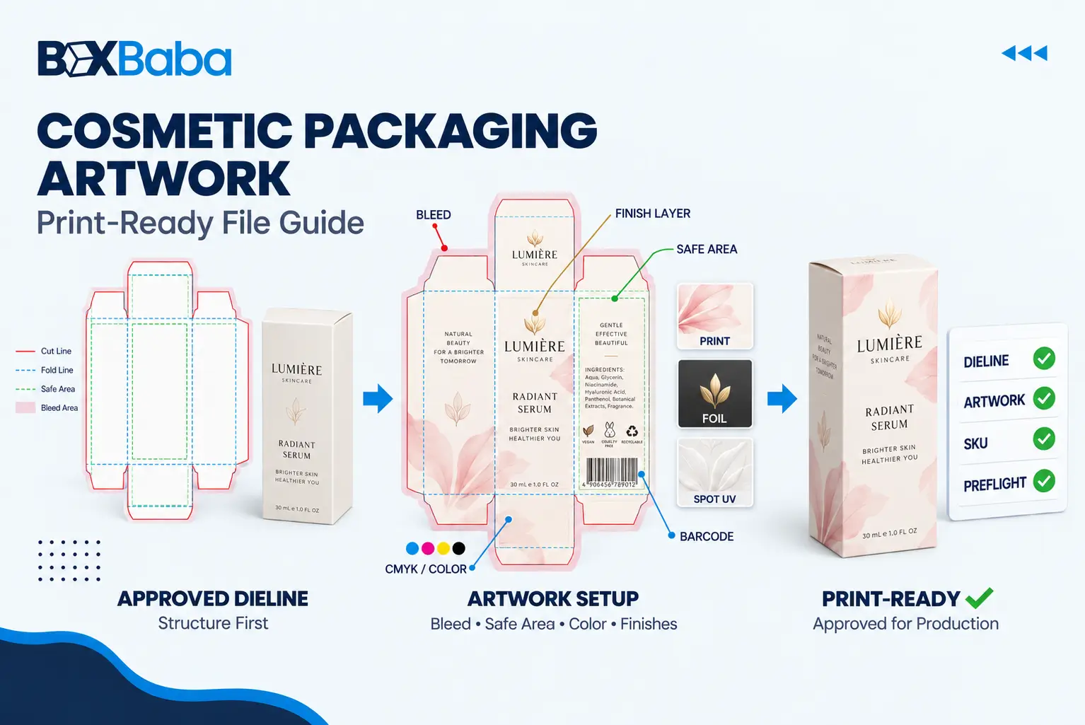
To prepare cosmetic packaging artwork for printing, use the final supplier-approved dieline, build the file at the required scale, extend edge-to-edge artwork into the specified bleed, keep critical content inside safe areas, prepare colors for the correct print workflow, use suitable image resolution, handle fonts correctly, separate specialty-finish layers, verify every SKU, and review the final proof before production. Always follow the printer’s project-specific artwork specification.
This guide focuses primarily on artwork for printed secondary cosmetic packaging such as folding cartons, sleeves, paperboard boxes, rigid-box wraps and related printed components. Labels, direct bottle printing, decorated tubes and other primary packaging formats can use different artwork requirements. For label-specific planning, see BoxBaba’s Cosmetic Label Size Guide.
Project-specific rule: general prepress conventions are useful for planning, but the supplier-issued dieline and prepress specification take priority. If the supplied template calls for a different bleed, safe area, scale, file type, color setup or layer convention, follow the project specification. |
Cosmetic Packaging Artwork Preparation at a Glance
Artwork Area | What to Prepare | Main Risk to Avoid |
Dieline | Final supplier-approved structural template | Using an outdated or resized template |
File setup | Editable artwork plus the requested print-ready output | Sending only a flattened web image |
Colors | CMYK and/or specified spot colors for the print workflow | Leaving production artwork dependent on RGB screen colors |
Images | Suitable effective resolution at final output size | Enlarging low-resolution images |
Bleed | Backgrounds extended beyond trim as specified | Unprinted edges after cutting |
Safe area | Critical text and logos inside approved safe zones | Copy too close to cuts, folds or windows |
Fonts | Approved typography prepared as requested | Missing or substituted fonts |
Barcodes / QR | Correct data, size, contrast and placement | Codes across folds or finish areas |
Special finishes | Separate clearly named production layers or masks | Printer guessing where foil or Spot UV applies |
SKU control | Controlled artwork schedule and version names | Wrong shade, barcode or copy printed on a SKU |
Proofing | Panel-by-panel and assembled-orientation review | Approving only the front panel |
Release | One clearly identified approved production version | Multiple ambiguous final files |
What Is Print-Ready Cosmetic Packaging Artwork?
Print-ready cosmetic packaging artwork is a production file built on the approved packaging dieline with the correct graphics, colors, typography, images, bleed, safe areas, SKU information and finishing instructions needed for prepress review. It is different from a logo file, mood board, ecommerce image or 3D mockup.
A 3D mockup can help a beauty brand visualize a serum carton, lipstick box or skincare set, but the printer still needs the flat artwork positioned across the actual structural panels. The dieline may include the front, back and side panels, top and bottom flaps, glue areas, cuts, creases, windows, perforations and other structural features.
Finalize the Product and Box Structure Before Detailed Artwork
A common artwork failure happens before design starts: the brand builds artwork on an estimated box size or temporary template. Changing dimensions later can move folds, alter panel widths, change flap geometry, affect window or insert alignment and reduce the available space for cosmetic copy.
Confirm the finished retail-ready product first. Measure the complete bottle, jar, tube, compact or palette with its closure attached, record its maximum external dimensions and filled weight, and confirm the intended packing orientation. BoxBaba’s How to Measure Cosmetic Products for Custom Boxes explains that measurement step in detail.
Then confirm the box structure, material direction, insert or window requirements and the basic packaging route. If those decisions are still open, use How to Choose Cosmetic Packaging Boxes before finalizing production artwork.
Recommended sequence: Finished Product → Packaging Structure → Final Dieline → Approved Copy → Artwork → Preflight → Proof → Physical Sample if Required → Production Release |
Understand and Use the Approved Dieline
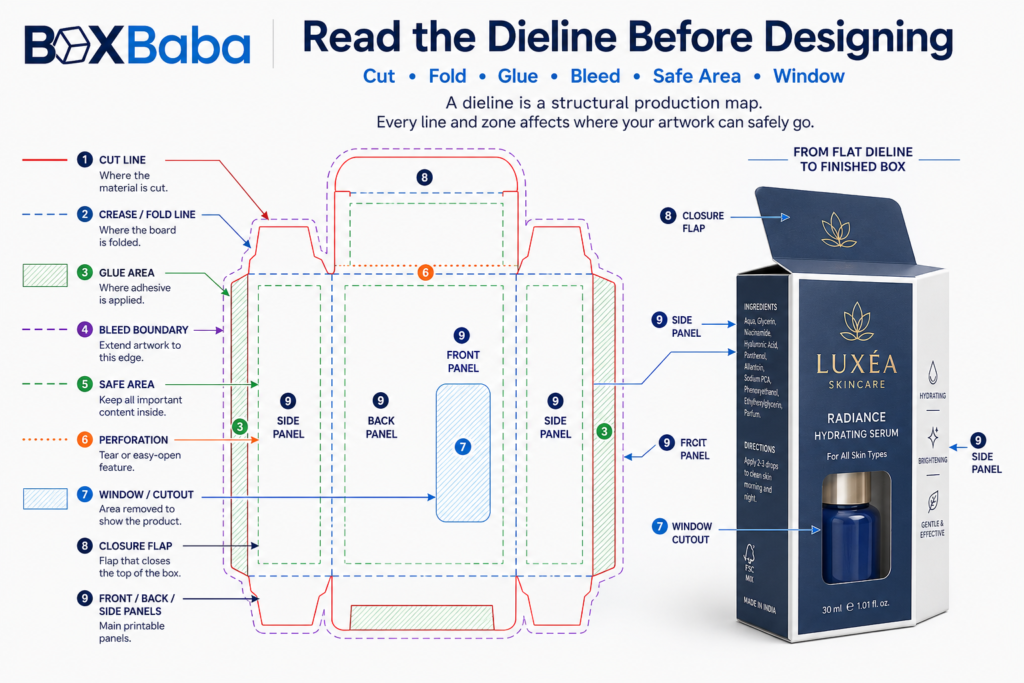
A dieline is the flat structural drawing used to position artwork and manufacture the finished package. It is a production map, not simply a decorative template.
Dieline Element | What It Represents | Artwork Consideration |
Cut line | Where the board will be cut | Keep essential copy away from the edge and extend required backgrounds through bleed |
Crease / fold line | Where the carton folds | Check whether any text or graphic crosses the fold intentionally |
Glue area | Area reserved for adhesive or structural joining | Avoid critical artwork unless the printer confirms it is appropriate |
Bleed boundary | Artwork extension beyond final trim | Continue edge-to-edge backgrounds into this area |
Safe area | Recommended area for critical content | Keep logos, small text and codes within approved limits |
Perforation | Controlled tear line | Keep important text away unless the design specifically requires it |
Window / cutout | Area removed or patched to reveal the product | Coordinate artwork with product position and remaining structural border |
Closure panel | Tuck, lock or other closing component | Check orientation after assembly |
Insert / product position | Relationship between the product and internal support where provided | Align windows and product-facing artwork with the real pack-out |
Do not assume every supplier uses identical line colors. A red line may represent a cut in one workflow and a crease in another. Use the legend supplied with the actual file.
Do not casually resize, stretch, redraw or reposition the approved dieline to make the artwork fit. If a panel is too small for required copy, resolve the structure or content hierarchy before production rather than changing structural geometry inside the artwork file.
Prepare Files, Vectors and Images Correctly
Vector artwork is generally the safest foundation for logos, typography, icons, line graphics and finishing masks because it can scale without pixelation. Common workflows may accept AI, EPS or print-ready PDF, but the accepted format should be confirmed for the project.
A JPG or PNG can be useful as a visual reference or for raster imagery, but it should not automatically be treated as the complete production file. A flattened image cannot reliably communicate separate structural, foil, Spot UV or embossing instructions.
Retain an editable master even when a print-ready PDF is supplied. If one shade name, ingredient line or barcode later changes, the editable master provides a controlled way to update the artwork rather than rebuilding text from an outlined or flattened file.
Check Raster Images at Final Output Size
Photographs, textures and other raster graphics need suitable effective resolution at their final printed dimensions. Around 300 DPI at final size is a common packaging-artwork target, but it is not a universal rule for every process.
The key phrase is at final size. A small 300-DPI image enlarged several times may no longer provide sufficient effective resolution. This matters for model photography, botanical imagery, skin textures, ingredient visuals, gradients and campaign graphics. Keep logos and line artwork vector where practical.
Prepare Colors for the Actual Print Workflow
Digital screens create color with light; printed packaging reproduces color with inks or toners on a physical substrate. An RGB color viewed on a bright monitor should therefore not be assumed to print identically on a cosmetic carton.
CMYK is commonly used for full-color packaging. Specified spot colors such as Pantone/PMS may also be used when the print process and brand-color requirement support them. The printer’s specification should determine the final setup.
Treat Brand Colors as Production Specifications
If a skincare range uses one signature green across serum, toner and moisturizer boxes, identify how that color should be reproduced: CMYK values, a specified spot color or another approved production method. Do not rely on an instruction such as match the green on our website. Screens, substrates, inks and finishes can all change appearance.
Matte, gloss, kraft, white paperboard, specialty paper and other surfaces can change how printed colors are perceived. If exact appearance matters, establish the proofing method before bulk production. For finish-selection questions, use BoxBaba’s Cosmetic Packaging Finishes Guide.
Do Not Use a Universal Rich-Black Formula
Large black areas and small black typography may need different production treatment. There is no single rich-black CMYK build that should be copied into every cosmetic packaging file. Ink limits, registration, board and print process matter. Ask the printer how black elements should be prepared for that production route.
Set Bleed and Safe Areas Correctly
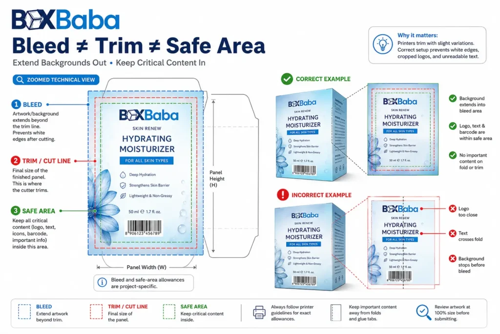
Bleed extends background artwork beyond the intended cut line so normal cutting tolerance does not reveal an unwanted unprinted edge. Around 3 mm or 0.125 inch is common in packaging artwork, but use the value specified on the supplied dieline.
Safe areas work in the opposite direction. Keep critical information—brand name, product identity, shade, net quantity, instructions, ingredients, warnings, barcode and QR code—inside the approved printable areas and away from cuts, folds, windows and glue seams.
Bleed and safe area are not the same measurement. Use the exact project specification for both. |
Plan Cosmetic Copy Around the Assembled Panels
A flat dieline can make every panel appear equally important. The assembled carton has a hierarchy. The front or primary display panel usually carries the most important product identity and brand information; side and back panels carry supporting content according to the approved labeling plan; top and bottom panels may carry shade identifiers, lot-coding areas or repeated branding where appropriate.
Do not fill every available area just because it can be printed. Good cosmetic packaging artwork creates a deliberate relationship between the principal display panel, secondary information panels and operational areas.
Freeze Approved Cosmetic Labeling Copy Before Production Release
Artwork should not move into final production approval while essential product copy is still changing. For U.S. cosmetics, labeling requirements can affect where product identity, net quantity, business information, ingredient declarations, warnings and other information appear.
The artwork designer or packaging supplier can help organize available space, but the brand remains responsible for appropriate regulatory review of its final wording, claims and labeling. The U.S. FDA states that cosmetic labels do not receive FDA premarket approval and that manufacturers and distributors are responsible for proper labeling. Review the FDA Cosmetics Labeling Regulations when the U.S. market is relevant.
A packaging proof can confirm that a statement is printed in the approved location; it does not automatically confirm that the statement is legally appropriate.
Treat Product Claims as Controlled Artwork Content
Claims are not merely decorative phrases. Statements involving acne treatment, sun protection, wrinkle removal, collagen production or other disease/structure-function effects can involve requirements beyond ordinary cosmetic claims. Have claims reviewed before they are locked into production artwork. FDA guidance also states that cosmetic claims must be truthful and not misleading. See FDA Cosmetics Labeling Claims.
Apply the same discipline to certification marks, sustainability icons and regulatory symbols. Include only claims and marks the brand has verified it is entitled to use.
Prepare Fonts and Small Text Carefully
Missing fonts can cause substitution, reflow or spacing changes when artwork moves between computers. Printers commonly request fonts to be embedded or converted to outlines in final production artwork.
Keep a separate editable master before outlining. Once text is converted to outlines, ordinary text editing is lost. Proofread product names, ingredients, addresses, shade codes, numerical values and warnings before the final font-preparation step.
Do not assume one minimum font size works for every cosmetic carton. Readability depends on typeface, weight, contrast, substrate, printing process, reverse printing, line spacing, finish and applicable regulatory requirements. Inspect small type at actual print size and follow legal requirements where they apply.
Prepare Barcodes and QR Codes as Functional Elements
Barcodes and QR codes should be treated as functional production elements, not decoration. Protect their required clear areas, preserve aspect ratio, maintain suitable contrast and keep them away from folds, cut edges, glue seams, perforations, windows and specialty effects that could interfere with scanning.
Do not stretch a barcode to make it fit a narrow panel. Confirm the required barcode type and dimensions for the retail or distribution system using it, and test the actual printed result where possible.
For QR codes, verify both the printed code and its destination URL. Multi-SKU beauty ranges should check each code against the exact product artwork version so a shade, formula or campaign does not point to the wrong destination.
Create Separate Layers for Foil, Spot UV and Other Finishes
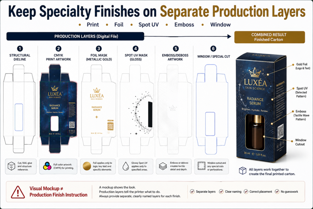
Foil stamping, Spot UV, embossing, debossing, die-cut windows, white ink and other selective treatments require clear production instructions. Do not communicate them only through a visual mockup.
A clean production file may conceptually separate the following elements:
- Structural dieline
- Print artwork
- Foil mask
- Spot UV or varnish mask
- Emboss / deboss artwork
- White-ink layer where required
- Window or special cut
Actual layer names, spot-color naming, overprint/knockout settings and tolerances should follow the supplier’s prepress instructions. Do not invent technical settings when a production specification has already been issued.
Keep selective effects intentional. If only the logo receives foil, the foil mask should identify that logo rather than duplicate unrelated printed artwork. Review finish placement against fold lines, cut boundaries, narrow edges, glue areas, window borders and locking sections before release.
Prepare Inside Printing and Panel Orientation
If the package includes inside printing, clearly identify which artwork belongs to the exterior and which belongs to the interior. Check orientation after folding and assembly. A message that looks upright on a flat dieline can appear upside down when the carton, sleeve, drawer or rigid component is assembled.
Use a physical mockup or structural visualization when orientation is difficult to interpret, especially for sleeves and trays, drawer boxes, mailer interiors, reveal messages and printed inserts.
Control Artwork Across Multiple Cosmetic SKUs
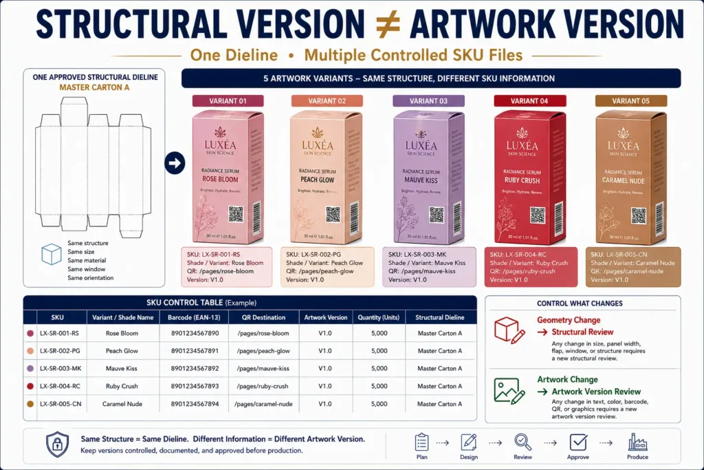
Beauty brands often reuse one structure across several shades, fragrances or formulas. A lipstick range may use one physical tube and one structural dieline while requiring different shade names, color indicators and barcodes. A serum line may share a bottle size while changing formula names, color coding, QR destinations and ingredient copy.
Structural Version ≠ Artwork Version. A different shade or formula does not automatically need a new dieline; a change in finished product geometry, insert, window or structure may. |
SKU Field | Example |
SKU / internal code | LIP-01 |
Product | Satin Lipstick |
Shade | Rose 04 |
Shade indicator | Approved swatch/value |
Net contents | Approved copy |
Barcode | SKU-specific barcode |
QR destination | Product-specific URL |
Language / market | USA English |
Artwork version | V4 Approved |
Quantity | Quantity for this artwork |
Structural dieline | Master Carton A |
BoxBaba’s Makeup Boxes page uses the same planning logic for shade and SKU variations: the structure can remain common when product geometry remains compatible, while artwork changes by shade, barcode and product variant.
Reserve Areas for Lot, Batch or Variable Coding
Some cosmetic packaging needs space for variable information added after the main print run, such as a lot number, batch code, production code or date-related marking. Confirm the expected coding method and leave a suitable area before the artwork is approved.
The same principle applies to retailer labels, inventory stickers or other operational marks known in advance. Do not fill every panel with decorative artwork and discover later that required variable information has nowhere practical to go.
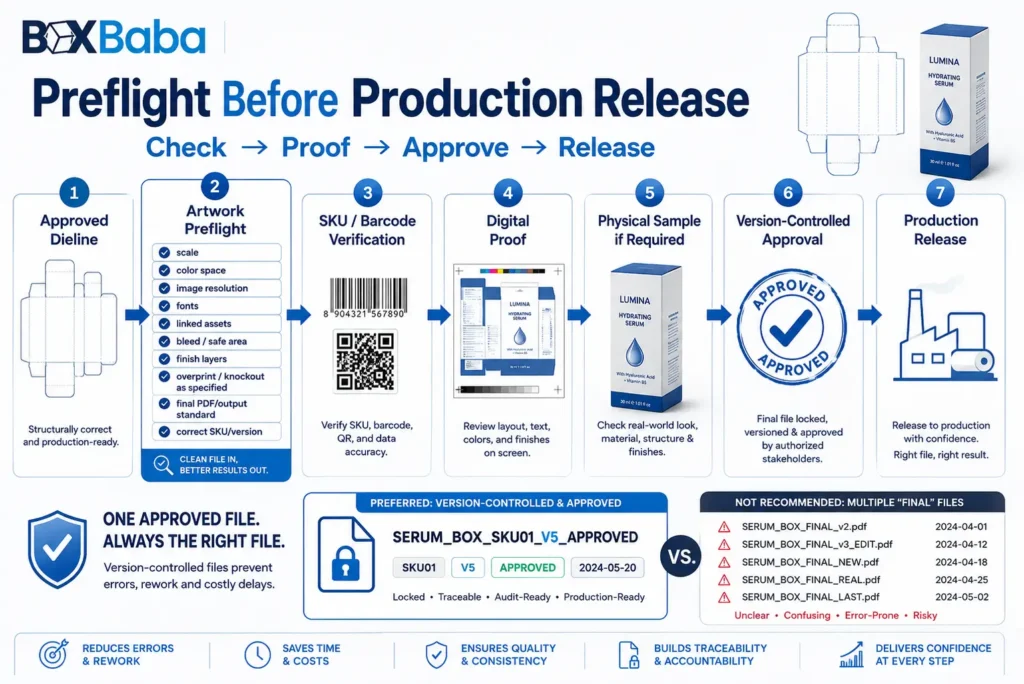
Preflight the Final Artwork Before Release
Preflight is the final technical review that checks whether the approved design has been prepared in the form required for production. This step should be performed against the supplier’s actual specification rather than a generic internet checklist.
Preflight Item | What to Confirm |
Artwork scale | File is at the production scale requested by the printer, commonly 1:1 where specified |
Dieline layer | Structural lines remain separate and non-printing as instructed |
Color space | Process artwork and spot colors match the requested workflow |
Spot-color names | Pantone and technical spot colors use the required names |
Overprint / knockout | Foil, varnish, white ink and technical elements use the printer’s specified settings |
Linked assets | Required images are embedded or packaged as requested |
Image resolution | Raster graphics have suitable effective resolution at final size |
Transparency / effects | Effects are compatible with the required output workflow |
White ink | Separate white-ink artwork is supplied where required for compatible substrates |
Fonts | Fonts are embedded or outlined as specified, with an editable master retained |
PDF/output standard | Export follows the requested PDF preset or PDF/X standard when one is specified |
Production layers | Foil, Spot UV, embossing, windows and other effects remain clearly separated |
SKU/version | File name, product, shade/formula, barcode and quantity match the approved schedule |
Do not prescribe a PDF/X standard universally. If the printer requests PDF/X-1a, PDF/X-4 or another export preset, follow that project-specific requirement.
Proof the Whole Carton, Not Just the Front
Beauty brands naturally focus on the front panel because it carries the main visual identity. Many production errors occur on side, back, top and bottom panels. Review the complete dieline and then review the assembled package as one object.
☐ The artwork uses the latest approved dieline.
☐ The dieline has not been unintentionally resized or altered.
☐ Every panel has been checked in assembled orientation.
☐ Product name, variant, shade and net contents match the approved copy.
☐ Ingredients, directions, warnings, claims and business information have been reviewed by the responsible party.
☐ Colors follow the approved CMYK/spot-color workflow.
☐ Raster images have suitable effective resolution at final size.
☐ Bleed follows the supplied production requirement.
☐ Important content remains inside approved safe areas.
☐ Fonts are handled according to the required production method.
☐ Barcodes and QR codes have correct data, placement and clear areas.
☐ Foil, Spot UV, embossing, debossing, windows and other special elements are separated clearly.
☐ Inside and outside artwork orientation has been checked.
☐ SKU-specific names, shades, barcodes and QR destinations match the artwork schedule.
☐ Variable-coding areas remain available where required.
☐ Spelling, punctuation and numerical values have been proofread.
☐ The correct artwork version is attached to the correct quantity.
☐ The final proof has been reviewed before production authorization.
Digital Proof vs Physical Sample
A digital proof is useful for checking panel placement, text, orientation, artwork scale, dieline alignment, SKU information and the location of finishing instructions. It cannot reproduce every physical property of the finished package.
A screen proof may not accurately demonstrate final substrate color, foil reflection, matte/gloss behavior, tactile effects, exact ink appearance or product fit. Physical review becomes more valuable when the project involves dark solids, precise brand colors, luxury finishes, complex windows, inserts, small cartons, tightly positioned artwork or multi-component presentation packaging.
The appropriate proof or sample route depends on the printing process, project specification, quantity, timing and budget. A blank structural sample can help review fit and assembly; a printed sample can add information about artwork and surface appearance.
Example: Preparing Artwork for a Serum Box
Consider a skincare brand preparing a folding carton for a 30 mL serum bottle. The brand should not begin by downloading a generic 30 mL serum box template. Two bottles with the same fill capacity can have different heights, shoulders, droppers, pumps and base profiles.
First, measure the actual finished bottle with its dropper or pump installed and confirm its maximum dimensions, filled weight and orientation. Then determine the carton structure and whether internal support is required. BoxBaba’s Custom Serum Boxes page uses this product-first planning approach.
After the structure is approved, place the final artwork on the supplier-issued dieline. The front panel may carry the brand, serum name and approved product identity; other panels can organize the remaining approved information. Place the barcode and QR code on suitable panels away from cuts and folds.
If the brand wants matte lamination plus foil on the logo, provide the foil as a separate production instruction rather than simulating metallic appearance with a gradient in the print artwork. If three serum formulas share the same bottle and carton geometry, the structural dieline can remain common while the artwork schedule controls each formula name, color system, barcode, QR destination and quantity.
That is the difference between designing a cosmetic box and preparing a cosmetic box for production.
Common Cosmetic Packaging Artwork Mistakes
Mistake | Why It Causes Problems | Better Approach |
Designing before the dieline is final | Artwork may need to be rebuilt | Approve the structure first |
Modifying the printer’s dieline | Can change the finished carton | Request a revised structural file |
Sending only a JPG/PNG | Can remove vectors and production layers | Supply the requested editable/print-ready files |
Leaving artwork dependent on RGB | Screen appearance can differ from print | Prepare colors for the actual print workflow |
Missing bleed | Can expose unprinted edges | Follow supplied bleed specifications |
Copy too close to cuts/folds | Production tolerance can affect content | Use the approved safe areas |
Low-resolution images | Can print soft or pixelated | Check effective resolution at final size |
Missing fonts | Can alter text appearance | Embed or outline as specified |
Wrong SKU barcode | Creates operational and retail problems | Use a controlled SKU matrix |
Finish shown only in a mockup | Production location may be unclear | Create separate finish layers/masks |
Artwork crossing structural areas | Can create awkward or unusable output | Review glue, fold, window and cut locations |
Approving only the front panel | Side/bottom errors are missed | Review every panel and assembled orientation |
Using an old artwork version | Wrong copy can reach production | Use clear version control and one release file |
Treating a screen proof as exact color | Physical output differs from display | Use the appropriate proof/sample route |
Final Artwork Release Checklist for Beauty Brands
Is this the correct structure? The artwork is built on the final approved dieline for the actual product.
Is this the correct content? Every product name, shade, ingredient line, quantity, barcode, QR destination and approved claim belongs to this exact SKU.
Is this the correct production setup? Colors, images, fonts, bleed, safe areas and finishing elements follow the approved prepress specification.
Is this the correct version? There is one clearly identified release file rather than several conflicting final files.
Has the complete package been reviewed? The team has checked every panel and assembled orientation, not only the front artwork.
If any of these answers is uncertain, resolve the issue before authorizing production. |
How to Prepare a Quote-Ready Artwork Handoff
A clean handoff makes the packaging project easier to identify and review. Provide the approved structural dieline and production artwork in the requested format together with the SKU schedule, quantities, finishing direction and any necessary reference files.
Use clear version naming. For example, Brand_Product_Structure_SKU_Artwork_V5_APPROVED is more useful than final-new-use-this-one.pdf.
For broader artwork and brand-layout decisions before prepress, review BoxBaba’s Cosmetic Packaging Design Tips.
Final Takeaway
Preparing cosmetic packaging artwork correctly starts before the final file is exported. Confirm the finished product and packaging structure first. Work from the approved dieline. Freeze the product copy. Build artwork around the actual panels. Prepare colors, images, fonts, bleed and safe areas for the selected print workflow. Separate technical finish layers, control every SKU through a clear schedule, preflight the file and review the complete package before production release.
The key rule: do not ask production to interpret your artwork. Make the approved file clearly communicate what should be printed, where it should appear, which SKU it belongs to and which finishing treatments apply. |
Request a Cosmetic Packaging Quote
Ready to prepare your cosmetic packaging for production? Share the finished product dimensions, box or dieline status, quantity by SKU, available artwork files, printing requirements, finish preferences, insert or window requirements and delivery destination. BoxBaba can review these details with the packaging specification before quotation and production approval.
Frequently Asked Questions
What file format should cosmetic packaging artwork be?
Editable vector artwork and print-ready PDF are commonly used, with AI, EPS and other formats accepted in many production workflows. The correct format depends on the packaging supplier and print process, so follow the actual project specification.
Should cosmetic packaging artwork use CMYK or RGB?
Commercial packaging artwork is commonly prepared for a CMYK and/or specified spot-color workflow rather than being left only in RGB. The printer’s color specification should control the final setup.
How much bleed should cosmetic packaging artwork have?
Around 3 mm or 0.125 inch is common, but bleed is supplier- and project-specific. Use the bleed shown on the approved dieline.
What resolution should images be for cosmetic packaging?
Around 300 DPI at final print size is a common target for raster images. Effective resolution matters, so enlarging a small image can reduce print quality. Keep logos and line artwork vector where practical.
Should fonts be converted to outlines?
Printers frequently request fonts to be outlined or embedded for final production. Keep a separate editable master before outlining so future text and SKU updates can be made safely.
Can I design a cosmetic box before receiving the dieline?
You can develop design concepts and content hierarchy, but final production artwork should be completed on the approved dieline. Designing on estimated panel sizes creates avoidable rework if the structure changes.
Can multiple cosmetic SKUs use the same dieline?
Yes, when the products share compatible finished dimensions, structure, insert, window and orientation. Different shades, formulas or fragrances can often use separate artwork versions on the same structural dieline.
How should foil and Spot UV be prepared in artwork?
Selective finishes should be identified through separate production layers or masks according to the printer’s specification. Do not rely only on a visual mockup to show where the finish should be applied.
Should barcodes and QR codes be tested before printing?
Yes. Check the encoded data, preserve clear areas, avoid problematic structural locations and test the printed result where possible. Multi-SKU ranges should verify each code against the correct artwork version.
Is a digital proof enough before cosmetic packaging production?
A digital proof is useful for layout, content, orientation and dieline relationships but cannot reproduce every physical property of the finished package. Exact color, substrate, tactile finishes, foil reflection and structural fit may require a physical sample or another proofing route.